Neutral colors have a lot going for them. They might initially seem dull or boring, but they’re a popular choice for interior design. And you’ll also find them crucial in creating artwork.
Using neutral colors allows you to set the scene and create a backdrop. They’re gentle on the eyes and can be calm and soothing. Plus, if you use brighter colors alongside neutrals, they will stand out even more.
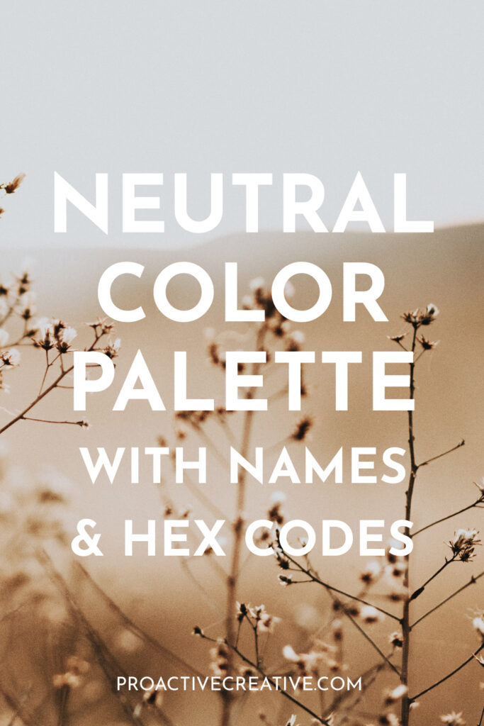
If you want to use more neutral colors, read on. I’ve put together some gorgeous neutral color palettes with hex codes and color names. So, they’re easy to use in your own traditional or digital artwork.
These color palettes are also ideal for interior design or even outfit inspiration! You’ll feel more confident using neutrals with these carefully curated color palettes.
What Are Neutrals – And Why Use a Neutral Color Palette?
So, what is a neutral color if we want to get into definitions? Basically, this term refers to any less saturated color. So, a neutral color is a more muted shade that doesn’t have the same intensity as other colors.
Classic neutral colors include gray, brown, white, and black. You can make these colors by mixing opposite colors on the color wheel.
But many other colors are also considered to be neutrals. For example, tan, beige, sand, ivory, and others are all thought of as neutrals.
You can also have neutral pinks, greens, blues, and so on, depending on the tone and saturation. These are shades that are more muted and not so bright. Technically, these colors are near-neutrals as they have a hue undertone. But in a general sense, they’re classed as neutral colors.
So, you can create a whole range of color palettes using these shades. There are loads of options for neutral color palettes – so browse the suggestions below. As you can see, you can create a variety of moods using neutral shades, from moody and dark to soft and warm.
Neutral Color Palette + Hex Codes
Here are some gorgeous neutral color palettes with hex codes and color names. So you can easily use these color palettes for your work. Or simply browse through for inspiration.
Grayscale Monochrome Color Palette
Hex Codes & Names:
Light Gray: #D1D1D3
Lavender Gray: #C6C6C7
Silver Foil: #AFAFB0
Quick Silver: #A4A4A5
Spanish Gray: #999999
Gray is one of the classic and most popular of all the neutral colors. It’s versatile, so you can use it with almost any other color. But you can also combine different shades of gray for a simple yet effective look.
Feminine Soft Neutrals
Hex Codes & Names:
Alabaster: #F4EEE1
Dark Vanilla: #C4BDAC
Dust Storm: #EBCFC4
Pale Silver: #D3C4BE
Desert Sand: #E9CCB1
These colors take inspiration from the earth with their rich, warm tones. Everything from sand to warm orange and pink shades come together in this palette. It creates a soft, inviting atmosphere that’s gentle and earthy.
Neutral Pastel Color Palette
Hex code & Names:
Ash Gray: #B2C0BE
American Silver: #C9D6CC
White Coffee: #DFE3D5
Gainsboro: #B4B2BE
Queen Pink: #E4D2D6
This color palette contains a range of pretty pastel shades. Each shade is slightly muted, so it’s not too bright or flashy. So it makes an excellent neutral color palette with complementary hues. Each color looks great when combined for a fun neutral look.
If you’re looking for more pastel styles, check out my list of pastel color palettes!
Pale Neutrals
Hex Codes & Names:
Ghost White: #F8FCFD
Bright Gray: #E9EDEE
American Silver: #CFCFD4
White Coffee: #E2DFD7
Dust Storm: #DED0C7
If you want a minimalist color palette, check this one out. It contains the palest neutrals for a very lowkey, gentle color scheme. It’s ideal if you want to keep color to a minimum and prefer a simple aesthetic.
Warm Orange Neutrals
Hex Codes & Names:
Linen: #FDF0E8
Champagne Pink: #F5D7C8
Desert Sand: #F1C7B2
Tumbleweed: #ECAF92
You can’t go wrong with oranges if you’re after a warm, inviting color palette. This color is rich and refreshing, even in neutral pastel shades. At its full vibrancy, orange is energetic and bright. But tone down the saturation, and you get these gentle tones. They’re ideal as background shades that feel cozy and welcoming.
Gentle Blue-Lavender Neutrals
Hex Codes & Names:
Blue Bell: #A5A6CC
Cadet Blue: #B6B5D0
Lavender Gray: #C6C4D3
Light Silver: #D7D3D7
White Coffee: #E7E2DA
One of the best things about neutral, pastel shades is how soothing they are. And this blue-lavender color palette is one of the most tranquil. This color scheme is relaxing and soothing with purple shades and blue undertones. It uses soft, desaturated yellows to create some contrast.
Soft Linen Neutrals
Hex Codes & Names:
Timberwolf: #DFD8D5
Lightest Brown: #D8D5D2
Bone: #E6D4C4
Black Shadows: #BAB1B0
Titanium: #898684
Do you love the gentle tones of soft, organic linens? This color palette features soft and clean neutral shades. You can almost imagine the smell of freshly washed laundry! It’s ideal anywhere you need a subtle color palette with gentle, warm tones.
Mystic Purple Neutrals
Rich Neutral Color Palette
Hex Codes & Names:
AuroMetal: #64777D
Quick Silver: #A4A993
Blast-Off Bronze: #A07669
Independence Blue: #475263
Misty Moss: #C0A974
This color palette is one of the richest on this list. So, you might not initially consider it a neutral color scheme at first. But it contains muted tones that aren’t as bright or vibrant as regular colors. So, it definitely fits the bill.
These muted colors have lovely, rich tones, creating a beautiful aesthetic. It would look wonderful on the canvas or in your home.
Pale Green Color Palette:
Hex Codes & Names:
American Silver: #D0CFCD
Bright Gray: #E9F0F0
Philippine Silver:#B1B6AF
Timberwolf: #D7D8D2
Silver Chalice: #B6AD9E
Green is the color of nature, life, and new growth. But when you tone it down, it becomes a very soft and soothing shade. This color palette contains a range of pale, neutral greens, from mint to olive green. It’s gorgeous for nature paintings or design work and interiors.
Autumn Brown Neutrals
Hex Codes & Names:
Dark Brown Tangelo: #89644A
Grullo: #A7937B
Tan: #CFB088
Pale Silver: #D7C6B6
Coconut: #9E5E46
This color palette captures the gorgeous hues of the autumn season. But, of course, they’re toned down and desaturated to create the perfect neutral color scheme. From muted reds to earthy browns and tans, they’re all here.
Cool Blue Neutrals
Hex Codes & Names:
Platinum: #DFE5E5
Bright Gray: #E4E9EC
Gray X11: #B8BFBA
Morning Blue: #859A9E
Beau Blue: #BDD2E0
Featuring soft shades of blue, this color palette brings to mind the sea and the sky. It captures those pale colors you see as the sun rises, with the lightest blues and greens. The purity of the shades is tranquil and calming. This color scheme combines cool tones from the color wheel, coming together beautifully.
Dark Neutral Color Palette
Hex Codes & Names:
Pine Tree: #302A27
Olive Drab Camouflage: #4E4B44
Grullo: #ADA192
Pastel Gray: #D6D0C8
Timberwolf: #DDD8D5
A neutral color palette doesn’t always have to be light and fluffy. Neutral colors also come in dark shades, and sometimes, they’re just what you need. In that case, this color palette is perfect for you! Deep blacks contrast with tans and grays for an eye-catching neutral color palette.
The Wrap Up
As you can see, there are many ways to use neutral color palettes. You can create a wide range of moods just by using neutral colors. So, go ahead and start incorporating more neutral shades into your art or design work.
Let me know which of these neutral color palettes is your favorite in the comments below!
And follow on Pinterest for more creative tips, guides, and reviews.