
Imagine being a painter in the 15th century, only having access to rudimentary colors. Now, fast-forward to today’s world, where you’re not just dealing with a broader palette but also navigating an array of cultural interpretations tied to each hue.
As a marketer or designer, you must understand that colors aren’t just visual elements; they carry powerful meanings and evoke emotions that vary across cultures. For instance, what signifies danger in one culture might symbolize prosperity in another. Even learning new languages can change our color perception!
So, if you’re aiming for global success, your strategy needs careful consideration of these variations. In this article, we’ll dive into how different cultures perceive and interpret colors – from why blue is universally popular to how green could mean progress or disaster, depending on where you are.
Remember, understanding color isn’t black and white – it’s as multi-hued as a rainbow!
Universal Color Meanings
When you’re engaging with global audiences, it’s crucial to remember that while some color meanings may be universal, like the safety and trust associated with blue or the excitement and danger linked to red, they also come loaded with cultural nuances and historical significances that can stir a whole spectrum of emotions and reactions.
Even if these histories are forgotten over time, color schemes still provoke powerful feelings. Therefore, multinational companies must do their homework regarding local color preferences. A brand that thrives on colors positively interpreted in its home country might face disappointment overseas.
So, always remember that what’s loved at home might not be appreciated abroad!
Blue is the Most Popular Color

You might be surprised that blue is a crowd favorite globally and has been since as far back as the 1940s! A 2015 survey revealed that people of all countries, genders, ages, and races love blue.
- Between 23% (in Indonesia) and 33% (in Great Britain) of folks favor blue over any other color.
- Blue wins out even in Asia, where red, yellow, and green are traditional favorites.
- Blue tends to appeal more to men than women, but ladies still consider this hue their top choice.
- Big digital companies like Facebook and LinkedIn leverage the universality of blue in their branding.
So remember – if you’re ever unsure about what color to use in your marketing strategies or designs – stick with trusty old blue!
Positive Associations with Blue

Just think about all the blue things in our world – the sky on a clear day, tranquil bodies of water. These positive associations might explain why we’re so drawn to this color! And it’s not just us.
The globe seems to have a soft spot for blue, making it a safe bet for businesses worldwide when choosing their branding colors. It’s no coincidence that successful companies like Facebook, LinkedIn, and Skype use different shades of blue in their logos. Even retail giants like GM, Ford, and Walmart incorporate blue into their store designs because they understand its universal appeal.
So whether you’re designing your business logo or decorating your living room, remember how much everyone loves blue!
Safe Color Choice
It’s no surprise that blue is a safe color choice in design. It effortlessly appeals to a broad audience and easily conveys messages of trust and reliability. Whether creating a website or designing a brand logo, incorporating blue can make your design universally attractive.
If you look closely at successful companies like Facebook, LinkedIn, Skype, GM, Ford, Intel, Boeing, and Walmart, they all share one thing – using blue in their branding. They leverage the universal appeal of this color to connect with diverse demographics.
So, if you’re unsure what color to choose for your design or branding project, remember that blue rarely misses the mark. It’s not just popular; it’s also powerfully persuasive in conveying positive emotions and associations.
Pan-Arab Colors
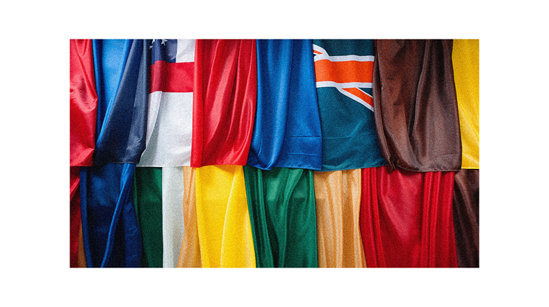
Did you know that the Pan-Arab colors hold significant historical and cultural value in many Middle Eastern countries? Black, white, green, and red symbolize a different Arab dynasty or era. They’re so integral to the region’s identity that they prominently feature on many Arab nations’ flags.
These findings reflect how deeply intertwined color perception is with cultural history and values.
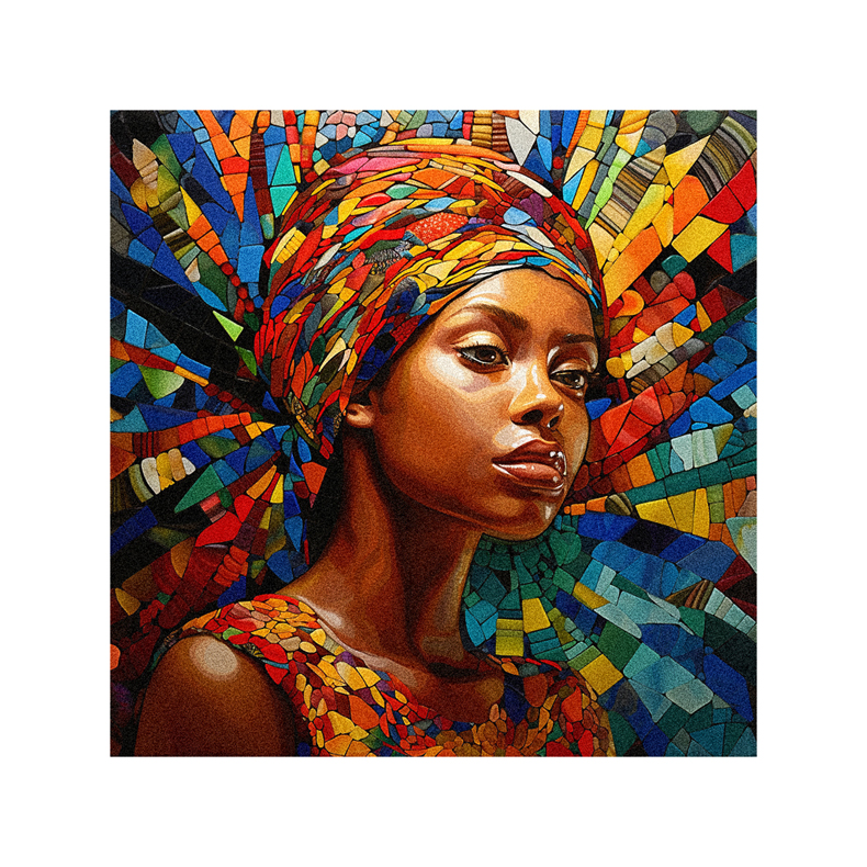
Colors in Indian Culture

You’ll be fascinated to learn how deeply colors resonate within Indian culture, each carrying a wealth of symbolic interpretations and associations.
For instance, red symbolizes power and passion, often used in bridal attire to represent fertility and prosperity.
Green signifies life and happiness, significant in festivals like Eid and Navratri.
Yellow is associated with learning and knowledge and is commonly worn by students during Vasant Panchami to honor wisdom.
White represents purity but also mourning; it’s typically worn at funerals.
The vibrant orange is considered sacred – monks wear saffron robes to symbolize abstinence from worldly pleasures.
Understanding these color meanings can be invaluable for marketers aiming to connect authentically with Indian audiences.
Color Preferences in Asia
Asia’s palette carries unique associations, where shades speak volumes and vividly depict diverse traditions and values. Let’s delve into this colorful tapestry:
- Red: It’s the color of celebration, symbolizing good fortune and joy. Weddings, New Year celebrations, or any festive occasion see a generous splash of red.
- Yellow: This bright hue is closely linked to royalty and power in China, while it signifies courage in Japan.
- Green: While green generally hints at freshness and vitality worldwide, it also has religious implications in some Asian nations.
- White: Unlike in Western cultures, white is often associated with mourning and death.
Understanding these differences can make you more culturally sensitive when interacting with your Asian counterparts or clients.
Color Symbolism in Western Culture
Transitioning from Asia, let’s now delve into the color symbolism in Western culture. You’ll find that certain colors carry specific connotations.
Blue often symbolizes trust and loyalty, hence its widespread use in corporate America. On the other hand, green is associated with growth and prosperity – think about how money is often portrayed!
Red can convey love and danger due to its intensity, while white typically represents purity or innocence. Black tends to be a color of power and sophistication but can also represent mourning or death.
Remembering these varying perceptions when creating marketing strategies for Western audiences is essential. These cultural nuances can make all the difference in effectively connecting with your audience.
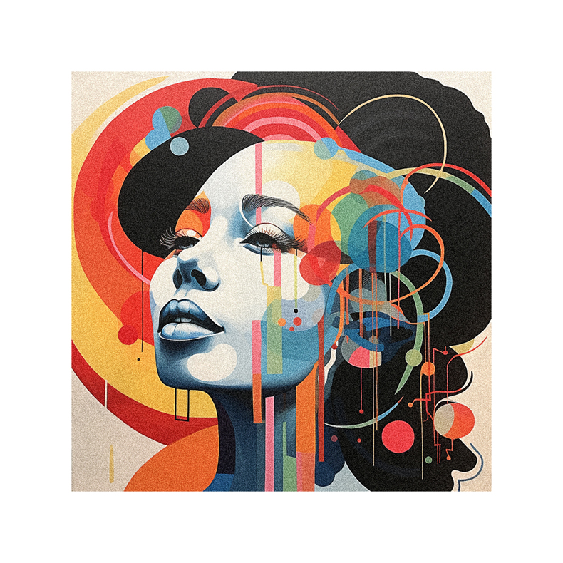
Color Symbolism in African Culture
In the vibrant tapestry of African cultures, it’s fascinating to see how different hues are imbued with unique symbolism and significance.
For instance, red often represents tension or death, while white signifies purity and spirituality.
Blue is associated with love and peace, embodying a calm serenity that mirrors Africa’s vast skies.
Green holds a sacred place as it symbolizes life and natural abundance.
Yellow is revered for its connection to gold, signifying wealth and prosperity.
However, these associations can vary across regions due to diverse tribal customs and traditions.
So, if you’re crafting a marketing message for an African audience, take the time to understand their unique color narratives.
It’ll ensure your communication resonates authentically with their cultural experiences and expectations.
Importance of Market Research
Understanding your target market’s preferences and nuances isn’t just a good-to-know; it’s vital for the success of your business. Conducting thorough market research on color perceptions is crucial, especially when planning to expand into foreign markets.
For instance, while red might symbolize prosperity in some Asian cultures, it could signify danger or warning in Western societies. Similarly, green might be associated with wealth and peace in Saudi Arabia but may carry negative connotations in Indonesia.
So before launching a product or designing an ad campaign overseas, ensure you’ve done your homework regarding local color meanings. This process will help ensure that your brand message resonates with the target audience as intended and aids in fostering positive associations with your product or service.
Follow us on Pinterest for more tips, tutorials, and artist reviews!