Step into a blue room, and you’ll likely feel calm; switch to a red room and sense a burst of energy. Such is the transformative impact of color on our emotions. This principle is a cornerstone in marketing, where color psychology plays a significant role in shaping consumer behavior.
Could a green store interior make customers feel more at ease, increasing their shopping time? Can carefully chosen shades of red spark impulse purchases? Though it may seem trivial, color choice is a powerful element that greatly affects consumer perception and engagement with brands.
- This article delves into the compelling subject of color psychology in marketing, examining how various shades can elicit distinct emotional reactions.
- We will explore how color choices influence consumer decisions, from encouraging more extended store visits to driving impulse buys.
- Ultimately, the article aims to show how the effective use of color can significantly impact a business’s profitability.
So buckle up because we’re going on a colorful journey!
How Colors Impact Perception
You might not realize it, but the colors you see when shopping can deeply affect your perceptions and even steer you toward or away from certain products. That’s because each color evokes different emotions, influencing your purchasing decisions.
For instance, red may make you feel urgent or excited, making it perfect for clearance sales. On the other hand, blue can instill a sense of calm and trustworthiness – think about all those major banks using it! Meanwhile, green is often associated with relaxation and health – no wonder so many wellness brands use this hue in their packaging.
So, next time you shop or browse online, consider how color schemes might subtly nudge your buying behavior.
The Power of Visual Appeal
Did you know that 93% of shoppers focus on visual appearance when purchasing? That’s right!
This is why color plays such a crucial role in marketing. With the power to command attention and evoke emotions, colors can significantly influence consumer behavior. Think about it – bright or unusual colors draw your eye, don’t they? Different color combinations can convey specific messages about products and services.
For instance, certain hues are associated with trust and security. So, next time you’re developing ad campaigns or designing product packaging, remember the impact of visual appeal. You can effectively use color to build brand awareness and change shopper habits.
Emotional Responses to Colors
Feeling excitement when you see red or a sense of calm from blues isn’t just your imagination – it’s the emotional responses of these hues.
Colors can provoke powerful feelings, influencing your shopping habits and decisions.
Ever wonder why fast food chains commonly use red in their logos? It evokes urgency and hunger, driving impulse purchases.
On the flip side, seeing green relaxes you, creating an atmosphere of ease ideal for retail environments.
Bright yellows grab attention, while purples exude luxury.
Yet remember, personal associations with colors can vary based on experiences or cultural backgrounds.
So next time you’re out shopping or browsing online, note how different color schemes make you feel – marketers are likely tapping into these emotional triggers to influence your buying behavior.
The Psychology Behind Color Associations
Ever wondered how certain hues can spark specific associations in your mind? Well, it’s all about color psychology. Each color holds a distinct power to evoke particular emotions and reactions.
For instance, you may associate blue with feelings of calmness and tranquility due to its widespread use in serene environments. On the other hand, red might stir up feelings of excitement or urgency as it’s often utilized in alerts and warnings.
Green typically represents growth, freshness, and relaxation — imagine being surrounded by nature! Colors like black convey sophistication and formality, while white suggests purity and innocence.
Understanding these color associations can help you make informed decisions when shopping or decorating your home!
Cultural Influences on Color Perception
You’ve likely noticed that different cultures uniquely interpret various hues, right?
This is due to the deep cultural ties and traditions associated with specific colors.
For example, while white might symbolize purity and innocence in Western societies, it’s often linked to mourning and death in some Asian cultures.
Isn’t it fascinating how our geographical location and cultural background can shape our perception of color?
Similarly, red can be a lucky charm in China but signifies danger or passion in the UK.
So, when planning your marketing strategy, it’s crucial to consider these cultural nuances.
Missteps could lead to misunderstandings or even offense.
Remember, effective use of color isn’t just about aesthetics—it has profound implications on consumer behavior.
The Role of Color in Branding
Imagine hues’ decisive role in shaping a brand’s identity and how they can subtly sway potential customers.
The color scheme you choose for your brand is more than just aesthetics. It sends messages about your products or services, enhances brand recognition by up to 80%, and plays a crucial part in consumer purchasing decisions.
For instance, yellow grabs attention and makes your messaging seem intelligent, while green relaxes consumers and creates a sense of ease. If you want to create a subconscious call to action, consider using orange.
To make the most of color psychology in branding, you must understand what emotions different colors evoke and use this knowledge to effectively enhance communication with your audience.
Color’s Effect on Brand Recognition
When your brand stands out in a crowded marketplace, don’t underestimate the power of the correct color scheme. Color alone can increase brand recognition by up to 80%.
It’s not just about looking good; it’s about creating an emotional connection with your audience. Your chosen colors can evoke specific feelings and thoughts, influencing perception and behavior.
Think of McDonald’s yellow arches or Coca-Cola’s red label – they’re instantly recognizable because of their distinctive color schemes.
So, when designing your brand, consider what emotions you want to elicit from your customers. Remember, color isn’t just an aesthetic choice – it’s a powerful tool that can help shape how consumers see and interact with your brand.
Using Color to Differentiate Products
After understanding how colors boost brand recognition, it’s equally crucial to consider the role of color in differentiating products. Color can be your secret weapon when launching a new product or revamping an existing one.
It not only grabs attention but also sets your product apart from competitors. Think about it – bold and unique colors immediately jump out at you when browsing shelves or scrolling online. This is because color triggers emotional responses and influences our preferences subconsciously.
However, it’s not just about picking any vibrant shade; the chosen color must align with your brand image and resonate with your target audience. Therefore, carefully selecting colors for your products can elevate their appeal and increase sales significantly.
Creating a Seasonal Color Palette
Crafting a seasonal palette is like painting a new backdrop for your products every few months, drawing in buyers with fresh, vibrant hues that reflect the current mood and trends.
It’s not just about incorporating reds and greens for Christmas or pastels for spring. It’s about using color to tell your brand’s story.
Consider how colors associated with each season evoke certain emotions. For example, warmer tones in fall can trigger feelings of coziness and nostalgia, while bright summer colors might inspire joy and excitement.
Don’t be afraid to think outside the box either; unconventional color choices can set you apart from competitors.
Remember, it’s all about creating an emotional connection between your customers and your products through the power of color.
The Importance of Shoppers’ Feelings
Don’t underestimate the weight of your customers’ emotions in their purchasing decisions. Feelings hold sway, often more important than any other factor.
Your chosen color palette can evoke specific emotions and significantly influence consumer behavior. For instance, red can increase heart rate, representing intense emotions and urgency. Yellow brings warmth, cheerfulness, and optimism, while blue invokes calmness, serenity, and tranquility.
On the other hand, green signifies purity, health, and freshness – a sense of harmony and connection with nature, perhaps? Purple adds a touch of luxury to your product marketing strategy.
It’s all about using color effectively to tap into your customers’ emotions subtly but powerfully enough to guide them toward purchasing.
The Influence of Red
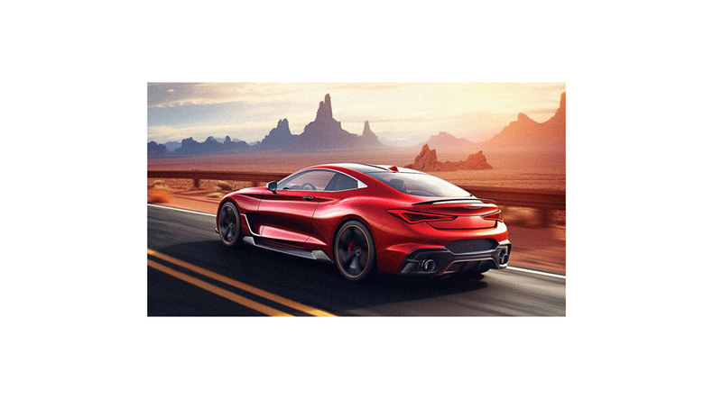
Let’s delve into the power of red and its impact on purchasing decisions, shall we? As a marketer, you can use red to stimulate excitement and urgency.
It’s no coincidence that sales signs are often red; this color triggers impulse buying. But it’s not just about getting customers to spend quickly. Red also increases heart rate and metabolism, making people feel hungrier – hence why so many fast food chains use it in their logos.
However, red can convey a sense of warning or danger when used too much or inappropriately. So, balance is key. Remember to consider cultural differences as well – in Asia, for instance, red is deemed lucky!
Use color wisely to influence your customer’s behavior effectively.
The Warmth of Yellow
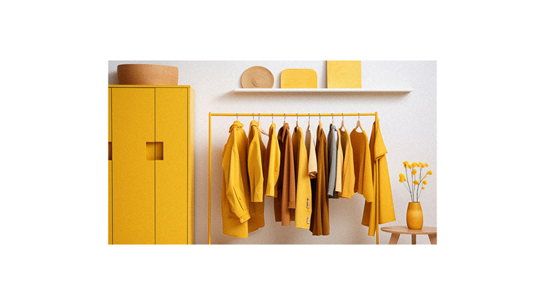
While the fiery red can trigger impulse buying, let’s turn down the heat a bit and bask in the warm glow of yellow.
With its sunny disposition, Yellow grabs your attention effortlessly, making it a popular choice for window displays and packaging. It’s as if it’s saying, ‘Hello there! Look at me!’ And honestly, who could resist?
This color is also perceived as intelligent and joyful, adding more appeal to your products or services. However, don’t go overboard. Too much yellow can overwhelm and cause anxiety. So, use it sparingly to highlight critical information or products you want customers to notice.
Remember, balance is vital when using colors effectively in marketing.
The Energy of Orange
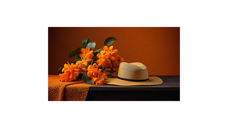
Ready to turn up the dial on energy and excitement? That’s where Orange steps in. This vibrant hue isn’t just for Halloween or autumnal themes – it’s a power player all year round in marketing. Orange is seen as friendly and confident, making it a go-to choice for brands that want to project an approachable image. It creates a subconscious call to action, encouraging consumers to purchase or sign up immediately.
Plus, it’s associated with affordability, which can be ideal if you promote budget-friendly options. But remember, balance is key; too much orange could be overwhelming. So consider combining it with more fabulous shades or neutrals for a balanced palette that’s bold but not brash.
The Calmness of Blue
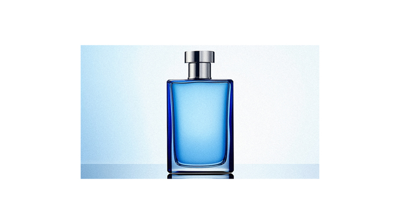
Imagine yourself gazing at a clear sky or a tranquil ocean; that’s the soothing impact of blue on your psyche.
This calming color is often associated with trustworthiness and reliability, making it a popular choice for businesses like banks and insurance companies. It’s no coincidence you feel calm and secure when dealing with these brands; they’re using blue’s psychological influence to their advantage.
Notice how tech companies also lean towards blue? They’re betting on its association with intelligence and communication. But be careful! Overuse can make your brand seem cold or unfriendly. The key is balance – blend in some warm hues to counteract this effect.
Understanding the psychology of colors can greatly enhance your marketing strategy, influencing consumers’ emotions and behaviors toward your brand.
The Freshness of Green
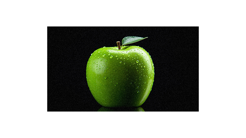
Strolling through a lush forest or biting into a crisp apple that’s the refreshing sensation green brings to our senses. This color is often associated with nature, health, and tranquility. It’s no wonder that many brands use green to convey these feelings.
Ever noticed how relaxed you feel in a store with green hues? That’s because it eases your mind, making you more open to browsing and buying. Green symbolizes growth and renewal, appealing to those seeking fresh experiences.
But remember, as much as green can relax customers, it can also make them complacent. So, balance it with other colors for an optimal shopping environment.
Ultimately, understanding the role of green in consumer behavior can help boost your business success.
The Luxury of Purple
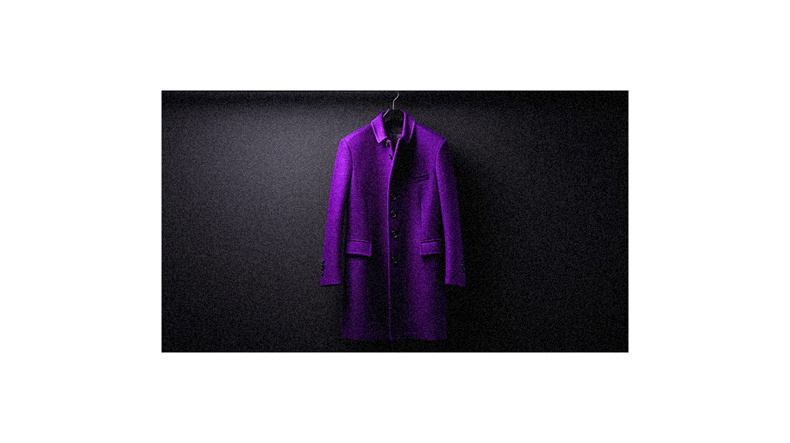
Nothing screams luxury quite like purple, often associated with royalty and luxury. This majestic hue radiates a sense of extravagance, making your products feel high-end. No wonder many premium brands use shades of purple in their logos and packaging.
But it’s not just about luxury; purple also sparks creativity, making it perfect for innovative product lines or services. As you create your retail displays, consider using accents of violet to convey an air of sophistication. Just remember, balance is key. Too much can be overwhelming and turn off potential customers.
Used wisely, the allure of purple could have shoppers reaching for their wallets, eager to partake in your brand’s elegance.
The Gentleness of Pink
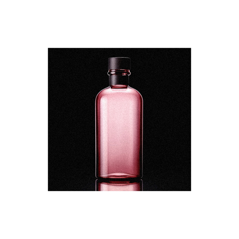
Like a tender hug, pink brings a gentle touch to your displays, effortlessly creating an atmosphere of warmth and comfort. It’s no secret that this color is often associated with femininity, childhood, and youthfulness. But did you know it can also be quite persuasive in retail?
That’s right! This friendly hue isn’t just for girls’ products anymore. With its soothing effect on our emotions, pink has been seen to make us feel relaxed and open-hearted – two feelings that can significantly influence purchasing decisions.
However, don’t forget about the so-called ‘pink tax’. Some customers may perceive products marketed toward women as more expensive due to their color. So, balance is key when using pink in your visual merchandising strategy.
The Versatility of Black
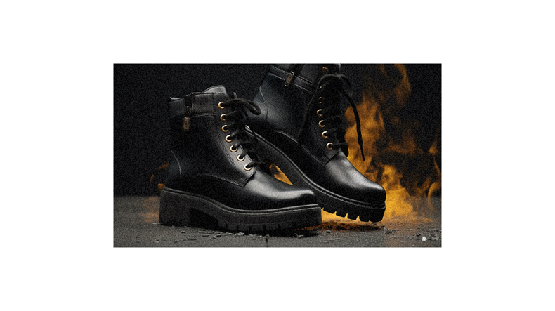
You’ll find that black has a chameleon-like versatility in retail. It can evoke various responses, from elegance and sophistication to power and formality.
It can create an unparalleled sense of luxury when used effectively, making your products appear high-end and desirable. But remember, black also holds associations with mourning, anger, and grief – so use it wisely.
Don’t overwhelm your display with too much black; use it as an accent color to add depth and interest. Black packaging or signage can cut through the noise in a busy store environment, commanding attention without being overly flashy.
So, next time you’re contemplating your retail design strategy, consider harnessing the versatile power of black for maximum impact.
The Elegance of White
Stepping away from the versatility of black, let’s now explore the elegance of white.
White is a color that transcends boundaries in its interpretation. It’s often associated with purity, innocence, and freshness. White can be a practical choice to convey a sense of cleanliness or simplicity with your product or service.
This color symbolizes new beginnings and can make your brand appear innovative and forward-thinking. But remember, context matters! In some cultures, white represents mourning or loss. So always consider your target audience before diving headfirst into any color scheme.
Utilizing the elegance of white effectively can tap into consumers’ subconscious associations and potentially influence their purchasing behavior in your favor.
The Neutrality of Gray
Gray brings a sense of neutrality and balance like a calm sea on an overcast day. The color sits right between black and white, embodying elements of both.
Gray can paint your brand as mature and sophisticated without negative connotations. It’s also associated with hibernation or lack of energy – which isn’t always bad! Think about how you feel when it’s raining outside; there’s something relaxing about it. That’s the power gray holds.
When used effectively in retail spaces or advertising, gray can provide a calming backdrop against which other colors pop. So don’t overlook gray in your branding strategy because its understated elegance might be the secret ingredient you need to connect with customers on a different level.
Targeting the Right Audience
Understanding your audience is paramount to the success of your brand. You’ve got to know who they are, what they value, and how colors influence their behaviors.
For example, if you’re targeting younger demographic, vibrant hues like red or yellow might be more effective as these colors exude energy and optimism. On the other hand, an older clientele may prefer cooler tones, such as blue or green, that invoke feelings of calmness and trust.
Don’t forget about gender-specific preferences too! Women tend to gravitate towards softer shades, while men favor bolder ones. But remember, there’s no one-size-fits-all approach here – cultural context and personal experiences also play significant roles in color perception.
Always keep your audience in mind when choosing your brand’s color palette!
Industry Associations and Color
It’s important to note that different industries have distinct color associations in the business world. For instance, you’d be hard-pressed to find a fast food joint without red in its logo – think McDonald’s golden arches against a bright red backdrop. This isn’t a case of following the crowd but rather understanding how colors can subconsciously influence customers’ appetites and purchase decisions.
Similarly, notice the prevalence of blue in banking or financial institutions. It’s because this hue conveys trust and reliability. It’s not random; it’s strategic.
So, when you’re choosing colors for your brand or product, remember these industry associations. They could be key in connecting with your intended demographic and driving their purchasing behavior.
Creating Attention-Grabbing Displays
You’ve got a killer product line; it’s time to make those store displays pop and draw in potential customers.
Choosing the right colors can be a game-changer. Bold colors command attention, drawing the eye of every passerby. But remember, it’s not just about being loud; your color choice should reflect your brand and resonate with your target market.
Consider their gender, age, preferences – even their energy levels! Yes, that matters.
Warm tones might attract an active, young crowd, while cool hues could appeal to a more mature or relaxed clientele. And don’t forget novelty – changing your display regularly keeps things fresh and encourages return visits.
Experiment with different combinations and watch how color brings life to your retail space and influences consumer behavior.
Follow us on Pinterest for more tips, tutorials, and artist reviews!