Colors are vital and powerful, whether in artwork, nature, or daily life. But as an artist, I’ve found that I pay even more attention to colors.
And while bright colors get a lot of attention, that doesn’t mean you should overlook more muted colors.
A muted color is a subtle shade – often calmer and not as eye-catching. So, some people think that muted colors are boring and dull.
But muted colors have their own allure and are useful when creating art. I’ve used muted colors to add nuance and create different moods in my paintings.
So, let’s take a closer look at muted colors, their meanings, and how you can make them. By the end of this article, you’ll feel much more confident using muted colors in your artwork.
Muted Colors – A Definition
But first, you might wonder, what exactly is a muted color?
That’s a great place to start before we look at the meaning of muted colors in art. Then, we’ll move on to how to mix muted colors and use them in your artwork.
Any color can become muted – from yellow to red, green, and blue. All it means when we’re talking about a muted color is that it’s desaturated.
Each color will be recognizable but more subdued and with less vibrancy. For example, a muted green is clearly still a shade of green, but it appears more of a gray-green. So, you wouldn’t describe it as fresh or bright. It’s like you’ve turned down a notch and made it more muted.
Saturation refers to how bright a color is. So, you can create a muted color by reducing its brightness. This is also known as low chroma, making colors appear duller and less vibrant.
Imagine that every color exists on a spectrum. It goes from very bright – or saturated – down to muted at the other end. But colors can vary in exactly how muted they are, from slightly muted to very muted and dull.
Muted Colors in Art – Their Meanings
Although muted colors might seem less interesting, they play a vital role in artwork. The psychology of colors is a powerful thing. And you can use muted colors to create certain emotions or atmospheres in your paintings.
Artists have used color psychology to influence their art for centuries. But the Swiss psychiatrist Carl Jung made the science of color psychology well-known.
Muted colors have also become more popular in modern culture. They are often seen as cooler and trendier than bright colors. And they’re a common choice for everything from fashion to interior design.
But what are the meanings of muted colors, and how do they influence us?
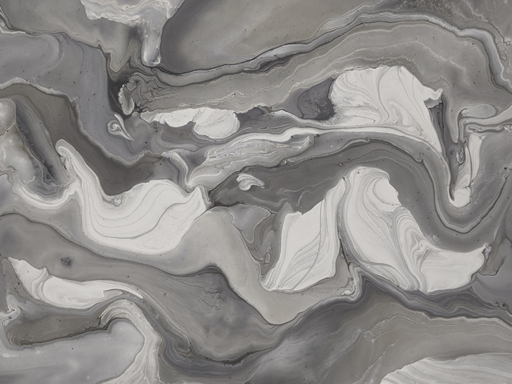
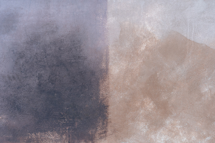
Gray
Gray, for example, is often considered the most muted color of all. And this color is often associated with sadness, loneliness, or boredom. However, certain shades of gray can also create a calm atmosphere.
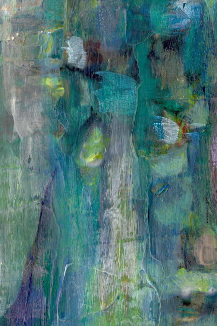
Muted Green
A muted green tends to be a gentler shade that is calming and soothing. It isn’t as bright or vivid as bright or neon greens, but it still evokes the natural world. This color is associated with steadiness – a sense of security and reliability.
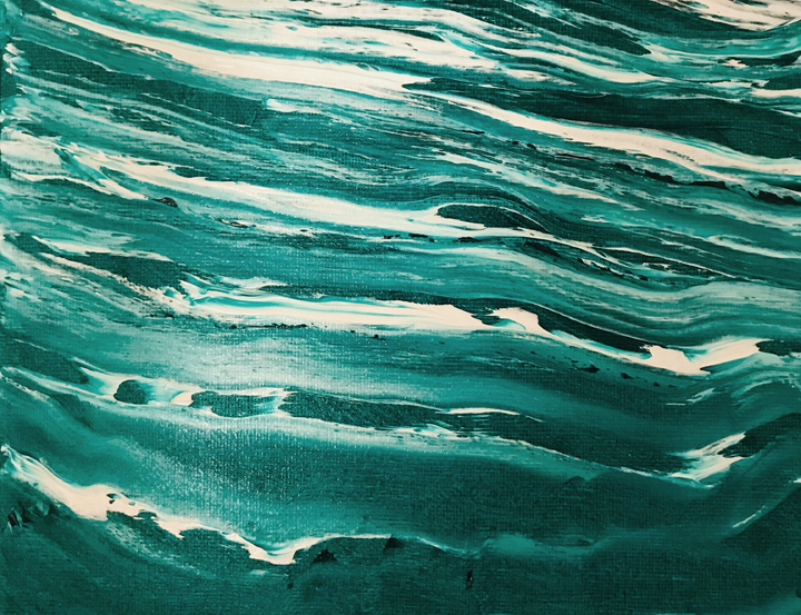
Muted Blue
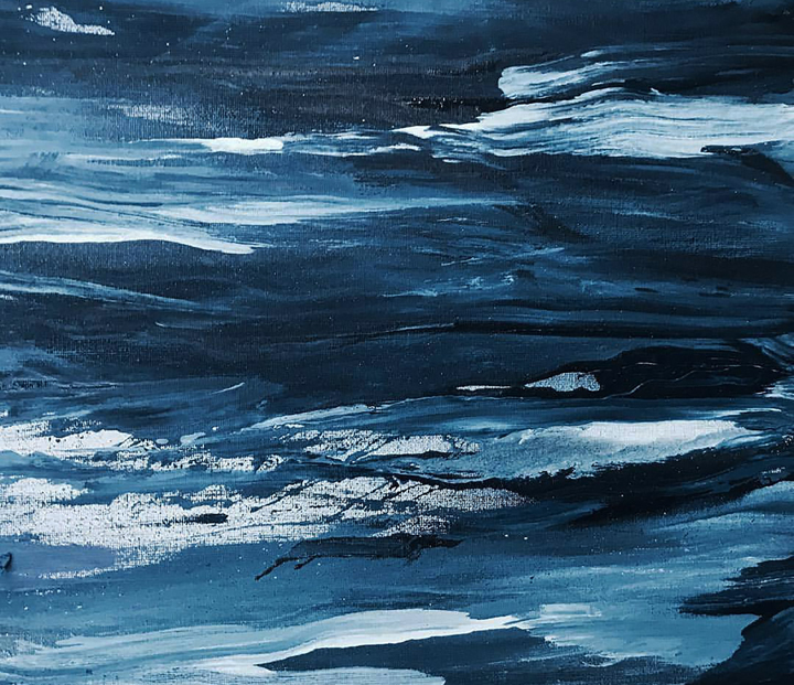
As for muted blue, it can have a range of meanings. It could feel tranquil and serene, bringing to mind ocean waves. But it’s not for nothing that we use the term ‘feeling blue.’ A muted blue shade can also come across as gloomy and foreboding.
Muted Orange

Orange is a rich, fiery color that can be fresh and bright or rich and passionate. But when you desaturate it, you create a muted orange shade.
This color feels less playful and more serious. Interestingly, it also becomes bolder and closer to brown. So, it can create an earthy look and feels more masculine than a lighter, brighter shade of orange.
Muted Yellow
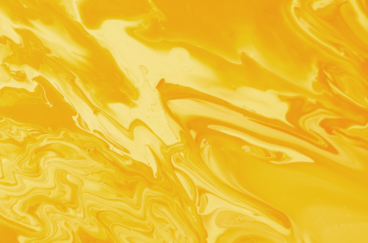
Yellow is another bold, bright, and eye-catching color. But when you tone down the saturation, it becomes a little calmer and less in-your-face.
But if you make it too muted, it can become a sickly yellow shade. It loses its vibrancy and can become quite unsettling. Muted yellow risks being an off-putting color suggesting ill health. So, it all depends on the exact shade of muted yellow and how you use it.
Muted Purple
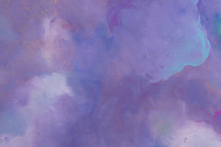
Generally, purple is a rich color with strong meanings. We associate it with power, pomp, and royalty. But when it’s muted, the meaning changes somewhat.
For example, a muted mauve or a pale lilac can appear calmer and gentle. But a dark, muted purple can come across as sad and depressing.
How to Use Muted Colors in Your Artwork
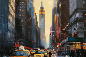
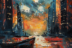
Muted colors are essential if you want to create a nature painting. These muted shades often appear in nature, such as muted greens, browns, blues, and oranges.
So, you’ll need to know how to mix muted shades if you want your paintings to look realistic.
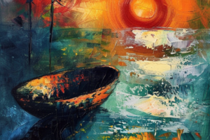
But you can also use muted colors effectively in other styles of artwork, like abstracts. One way I like to do this is by using muted colors with one bold, bright color. That will create a strong contrast that makes the brighter color pop even more.
However, if you want to create a moody or quiet, calm painting, you could use a muted color palette. That means using a few muted shades together to create the desired atmosphere.
How to Make Muted Colors
Now you know all about muted colors and the impact they can have in your art. But how can you mix a muted color for your own painting?
The basic rule is that you’ll need to desaturate a color to make it muted. But there are a few different ways to make colors look muted.
Adding Gray
If you want to make a muted color, adding gray is one of the easiest ways to do so. All you need to do is mix some gray into your chosen color, a little at a time. It will gradually become less bright and look more muted. Stop when you’ve reached your desired shade.
Adding Black
Using black is another way to make a color look more muted. But you’ll need to be careful if you go for this method. Black is such a dark color that it can quickly become overpowering. So, add just a tiny drop and mix thoroughly. Repeat until you get the muted color you’re after.
Using Earthy Shades
Another alternative is to mix your color with an earthy shade. This will make it less bright and vivid, desaturating the color in a more gentle and gradual way.
Using earthy shades is ideal if you want to create a natural tone. For example, you could add umber to yellow to create a muted yellow color.
Mixing Complementary (or Opposite) Colors
The final method involves mixing complementary colors. The easiest way to pick the right colors is by looking at a color wheel. When two colors are opposite each other, we call them complementary colors. Some examples are red and green or blue and orange.
If you mix two complementary colors in an equal ratio, you’ll make a grayish-brown shade. That’s because these two colors absorb opposite wavelengths. So, as a result, all you will see is gray.
You can use this information to desaturate any color. For example, if you want to make green look more muted, add a little red paint. But don’t overdo it, or you’ll end up with gray instead of muted green.
The Wrap Up
Muted colors are not as bright or bold – but you definitely shouldn’t overlook them!
By now, you should have a good idea of what muted colors are. And you’ll understand the impact muted colors will have when you use them in your artwork.
Muted colors can create a calming or serious atmosphere. They can look earthy and natural or gloomy and offputting. It all depends on how you use them. So, these are essential tools for any artist if you know how to use them!
You can follow these tips to mix your own muted paint colors and use them in your paintings.
Let me know what you think about muted colors in the comments below. How do they make you feel? And do you like to use them or avoid them as an artist?
Follow Proactive Creative on Pinterest for more helpful tips and guides to color theory!