Are you a designer or artist looking to add a touch of elegance and tranquility to your creations? Look no further than purple color palettes. With their shades of purple, pink, lilac, and blue-violet, these palettes offer a wide range of options for evoking various emotions and creating visually appealing compositions.
Incorporating complementary colors like green, yellow, orange, and beige, these palettes go beyond just purple hues. Whether you’re aiming for a romantic ambiance or a calming atmosphere, the delicate pastel tones in these palettes will give your designs a soft and soothing aesthetic.
Some palettes even draw inspiration from sunsets or wedding pastels, adding depth and meaning to the color combinations. So why not explore the world of purple color palettes and let your creativity shine?
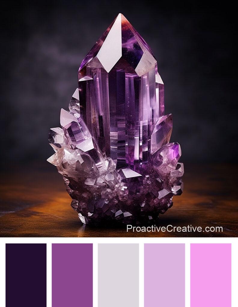
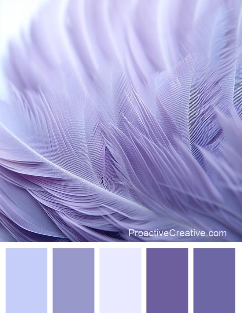
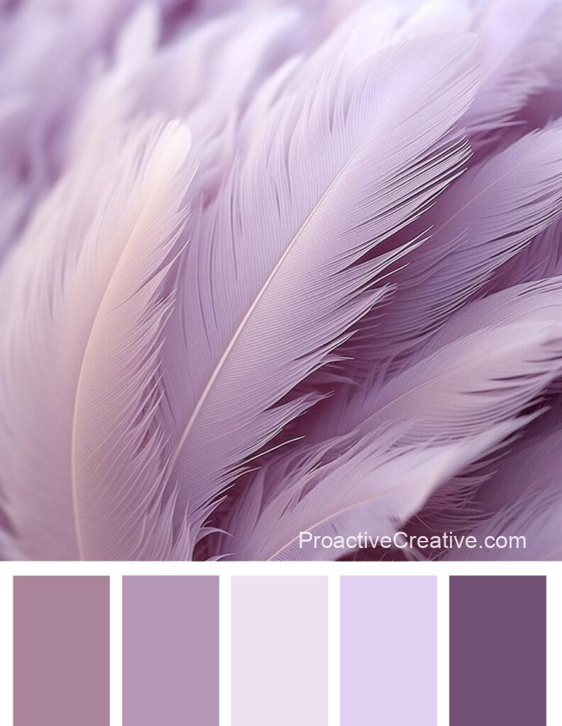
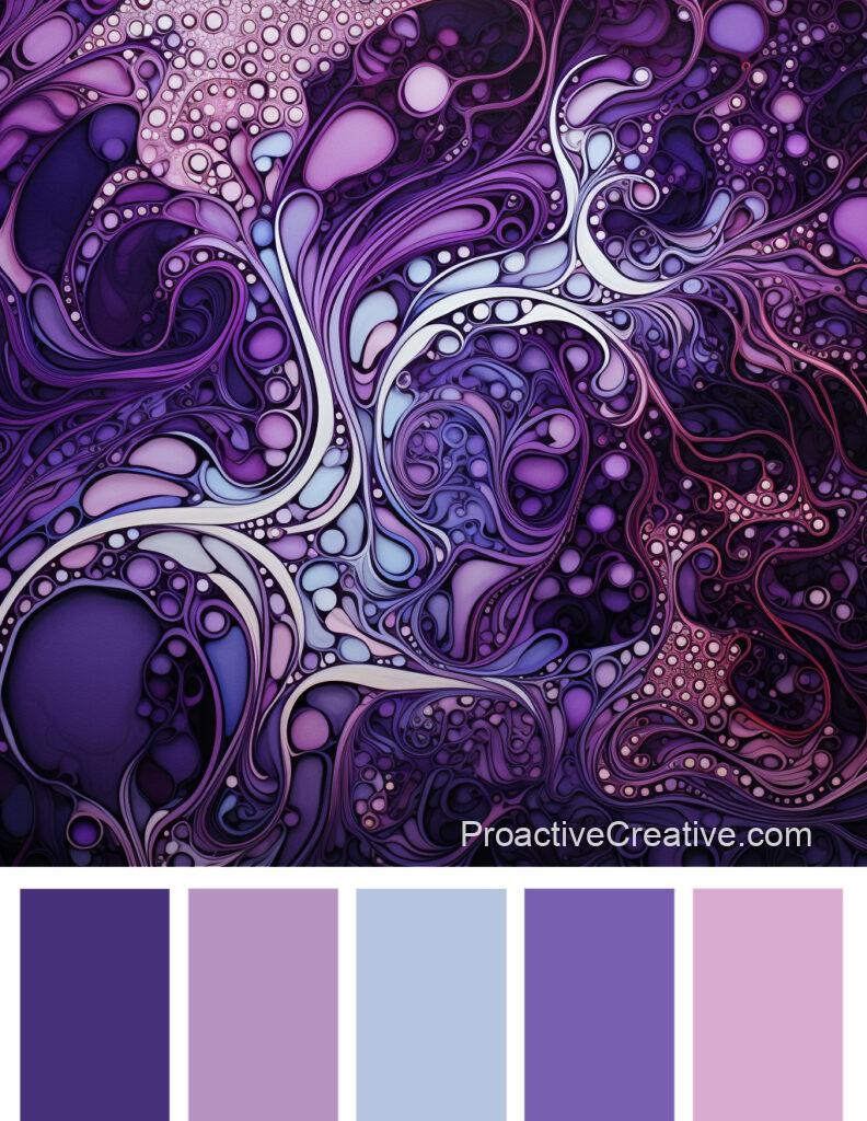
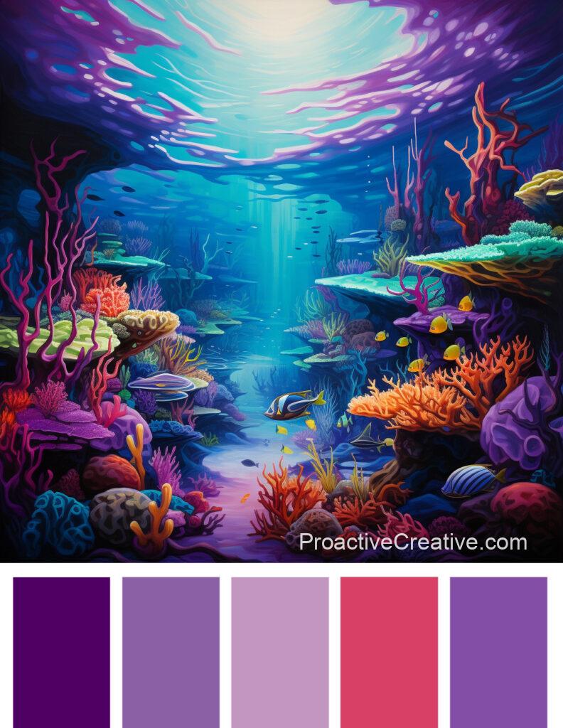
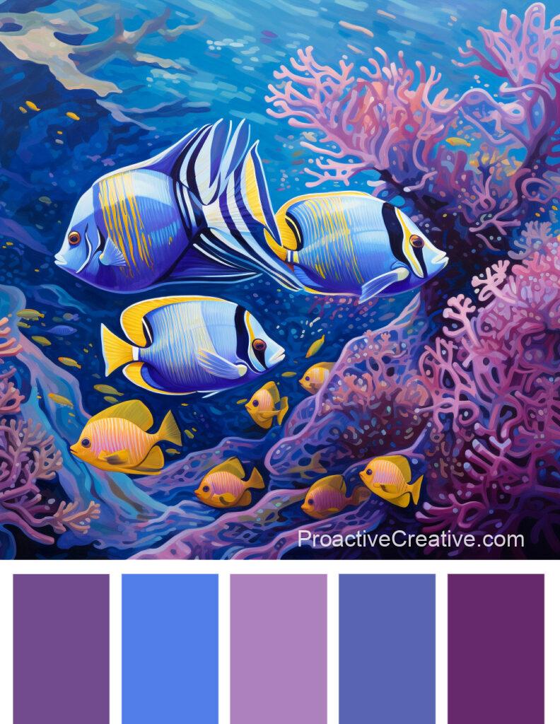
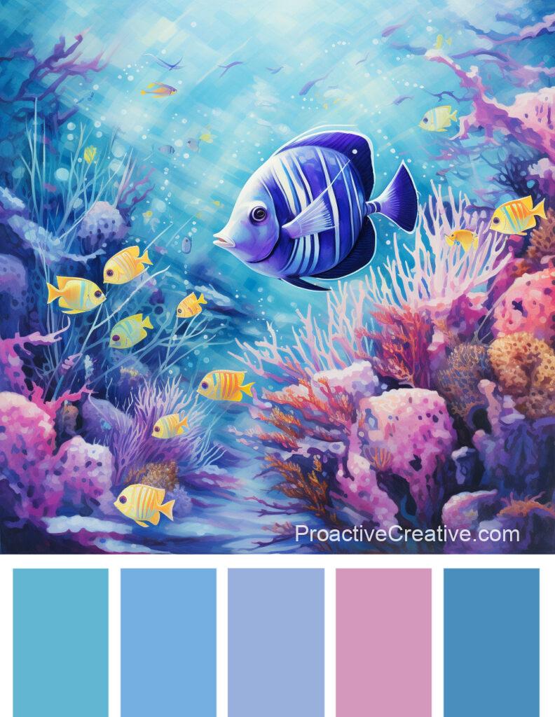
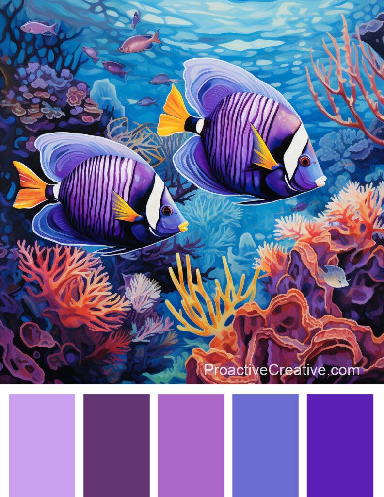
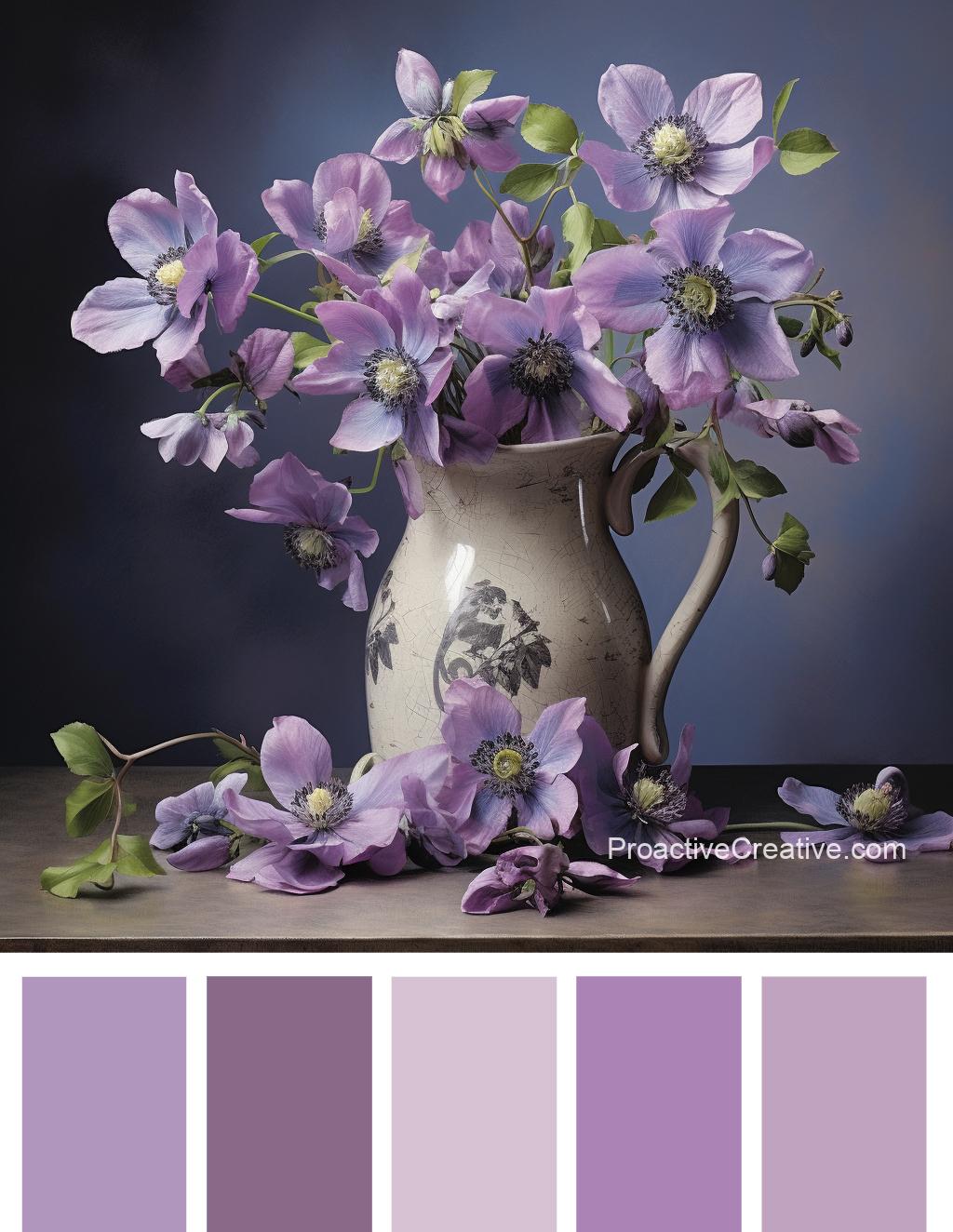
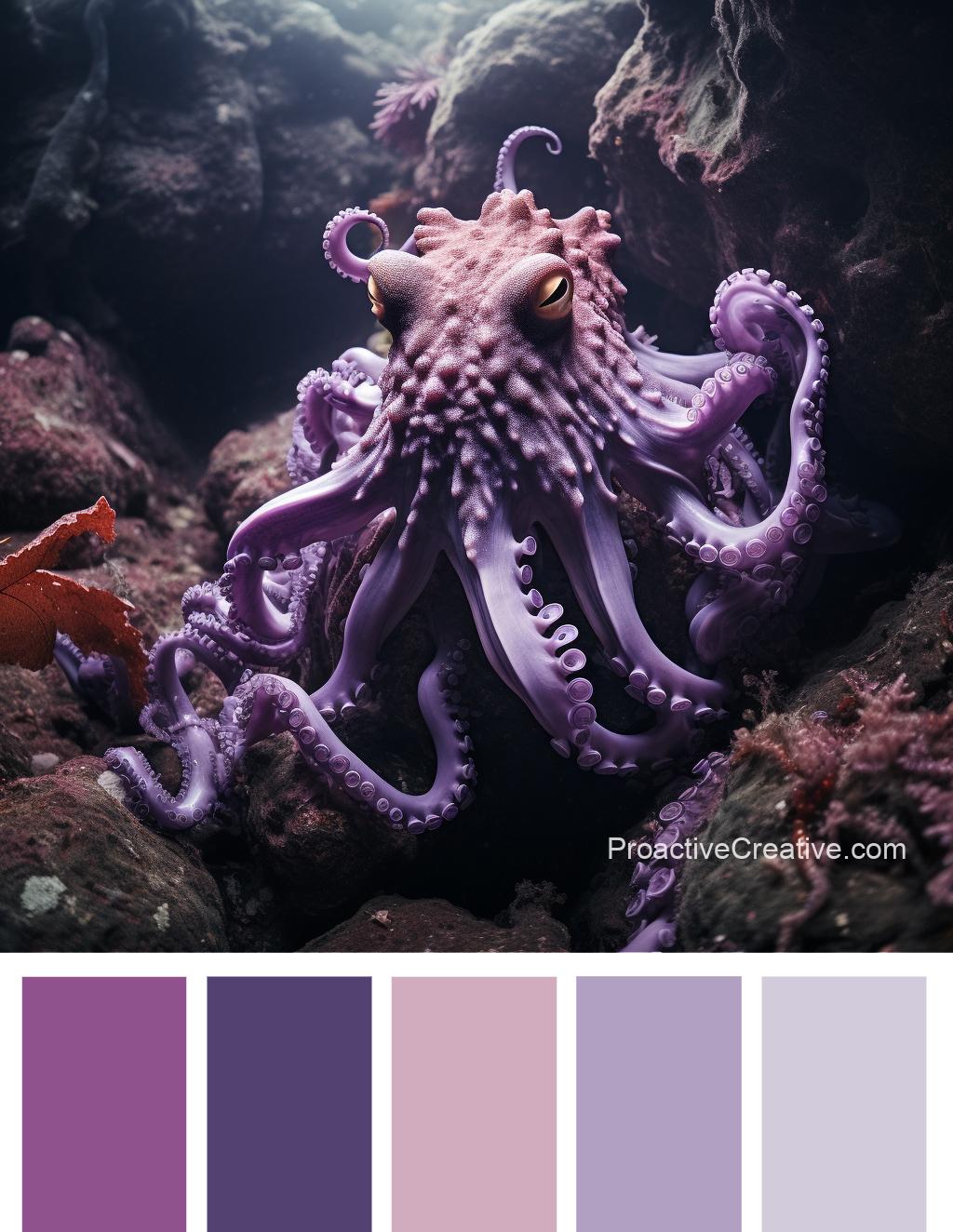
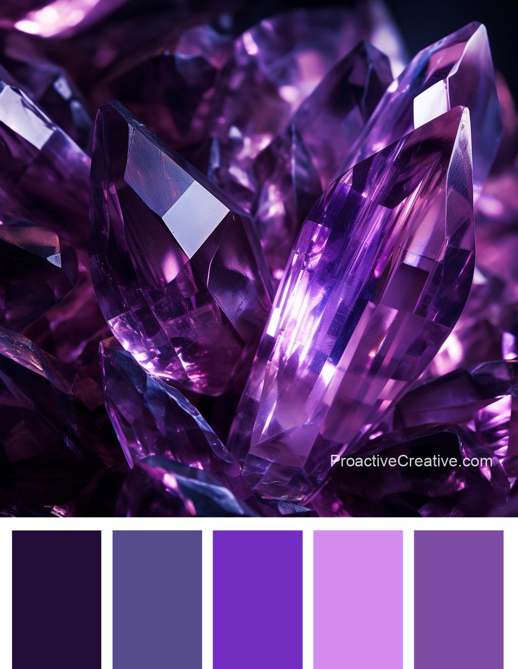
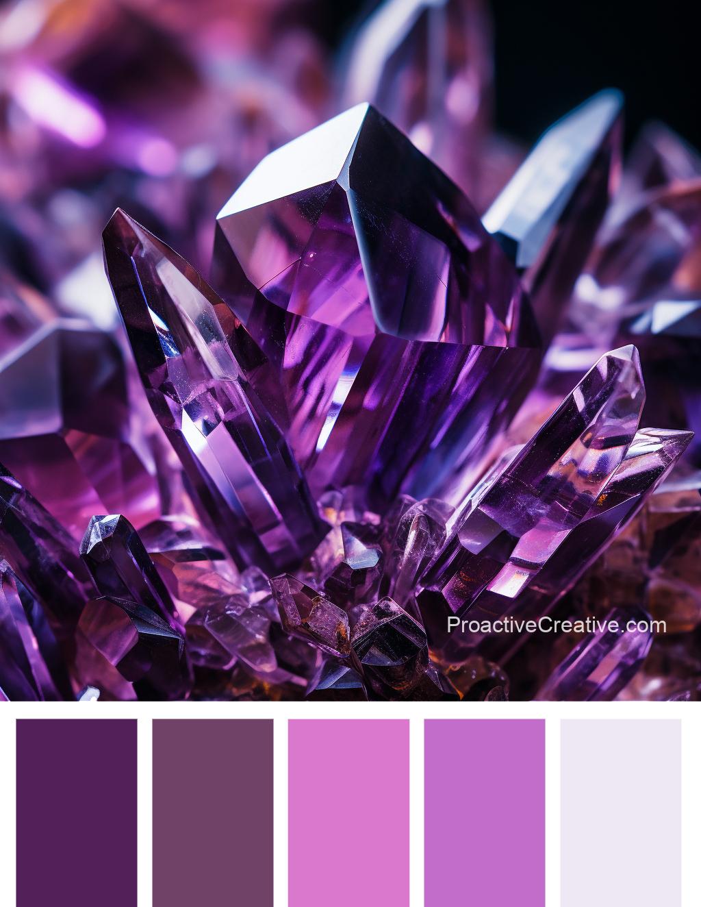
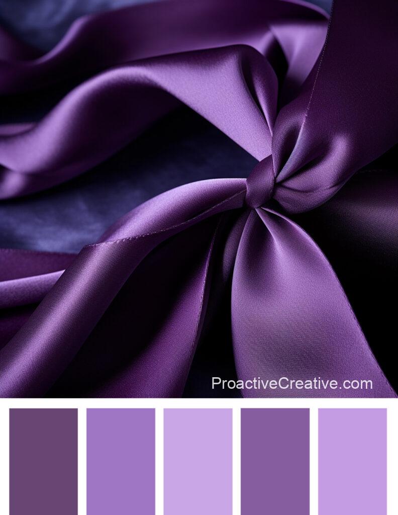
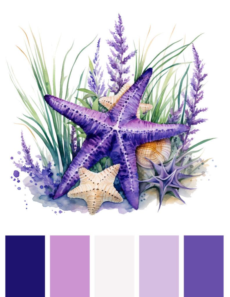
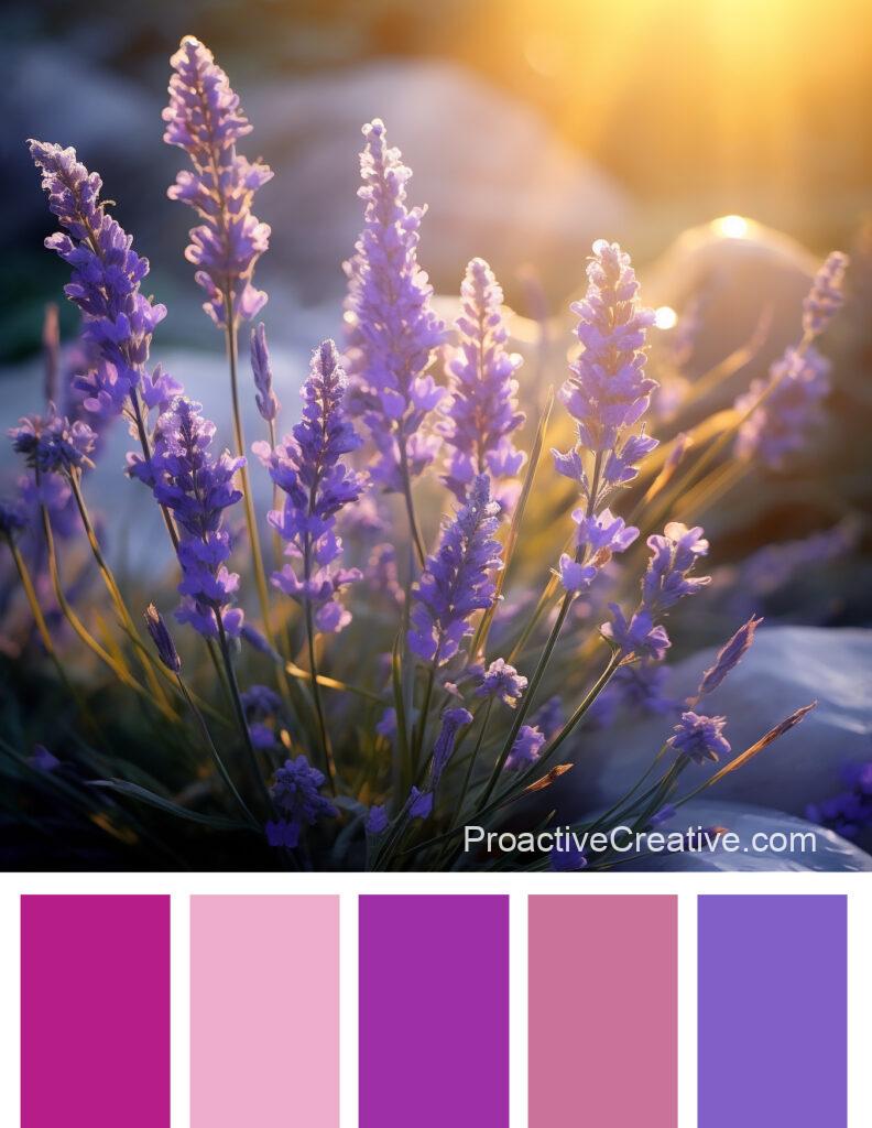
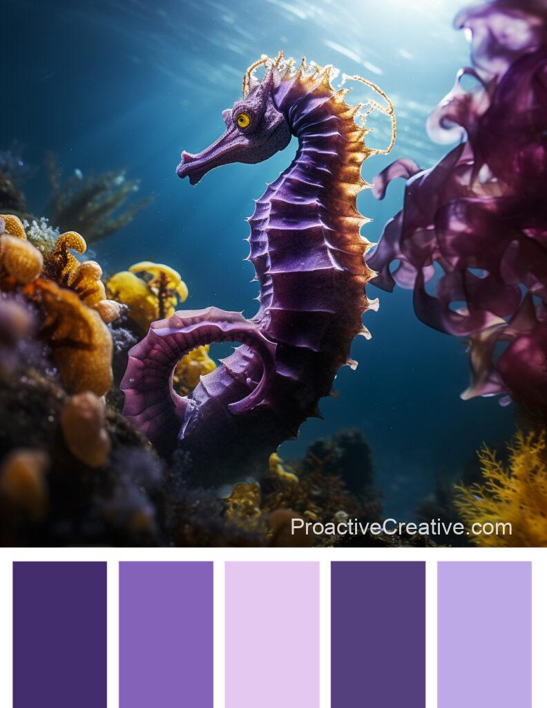
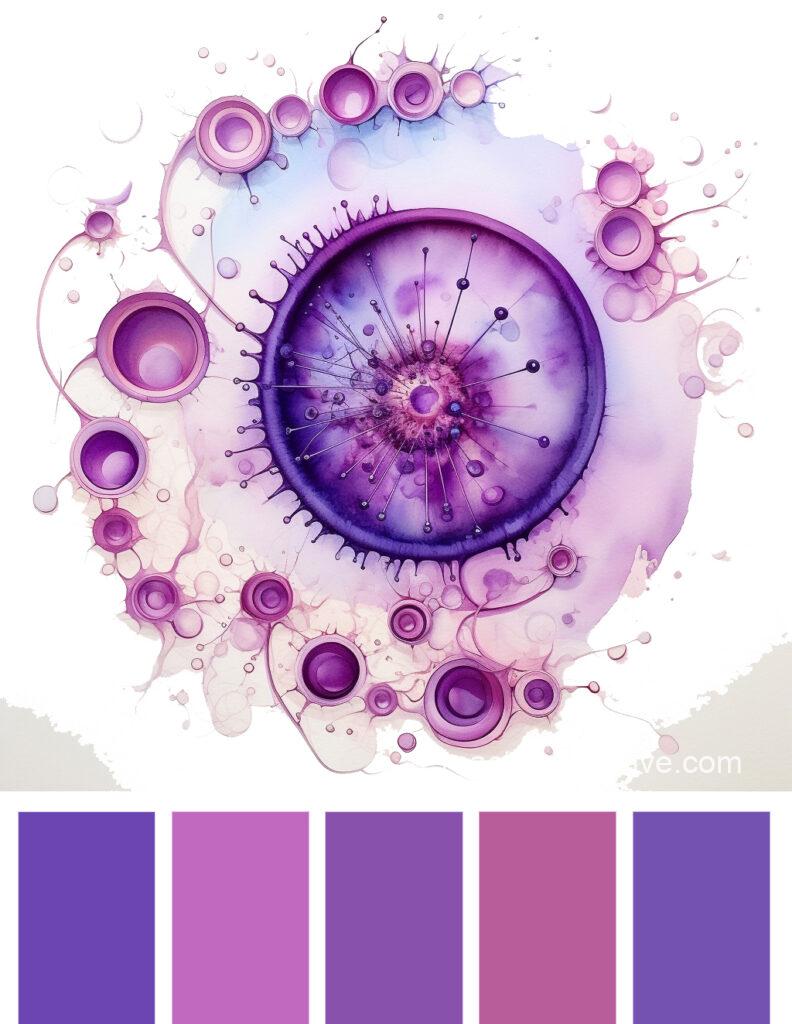
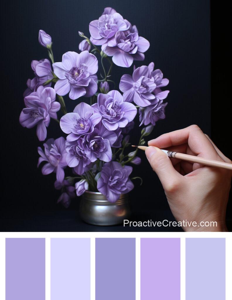
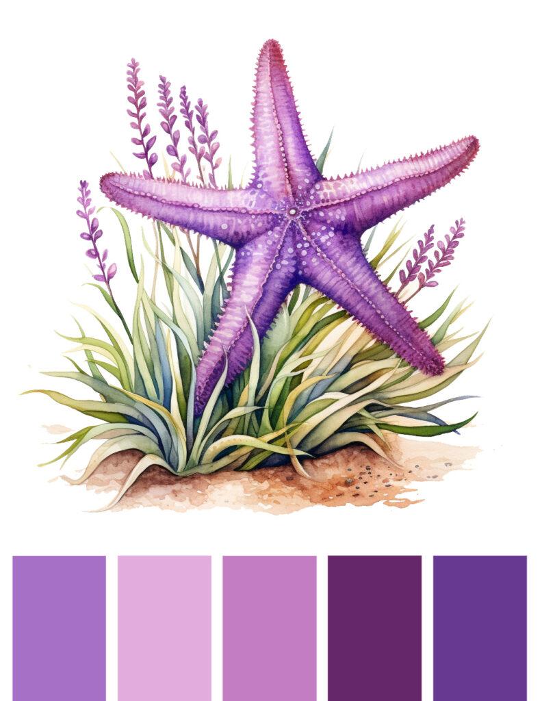
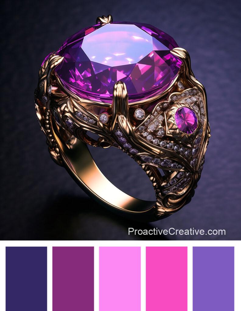
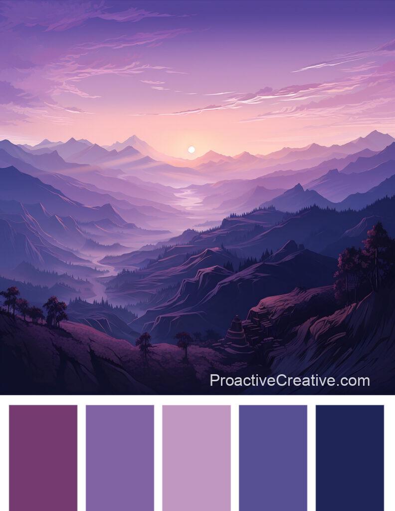
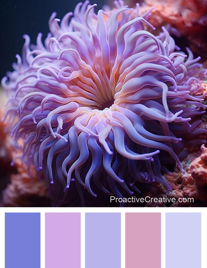
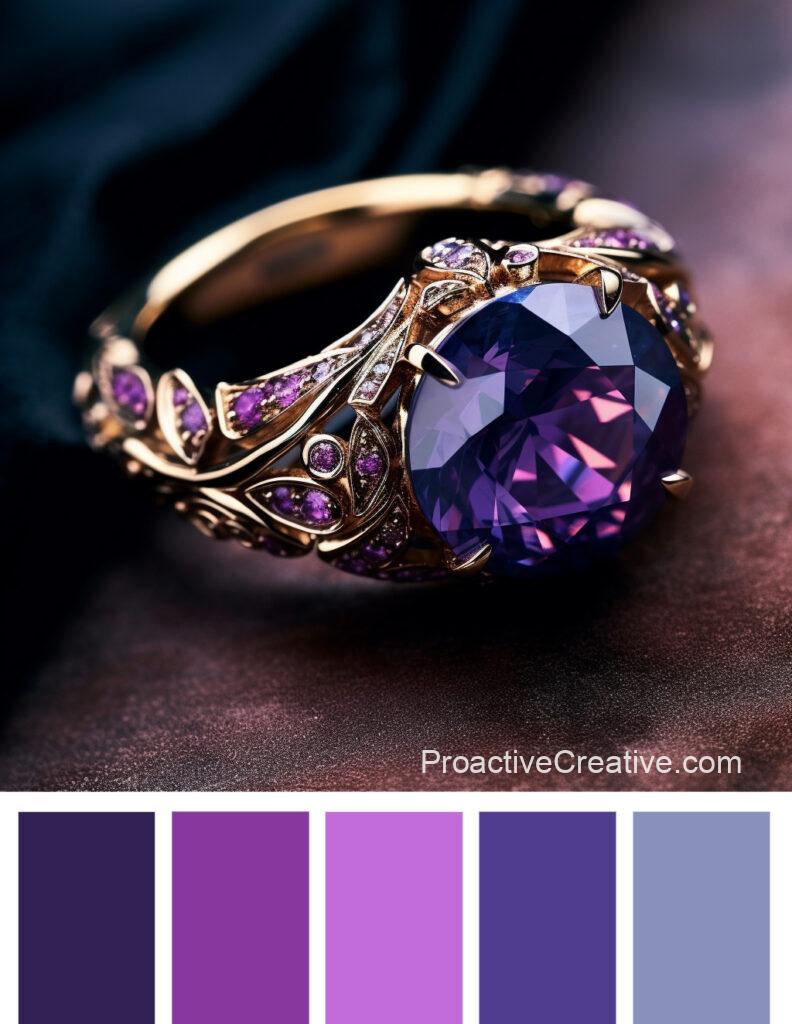
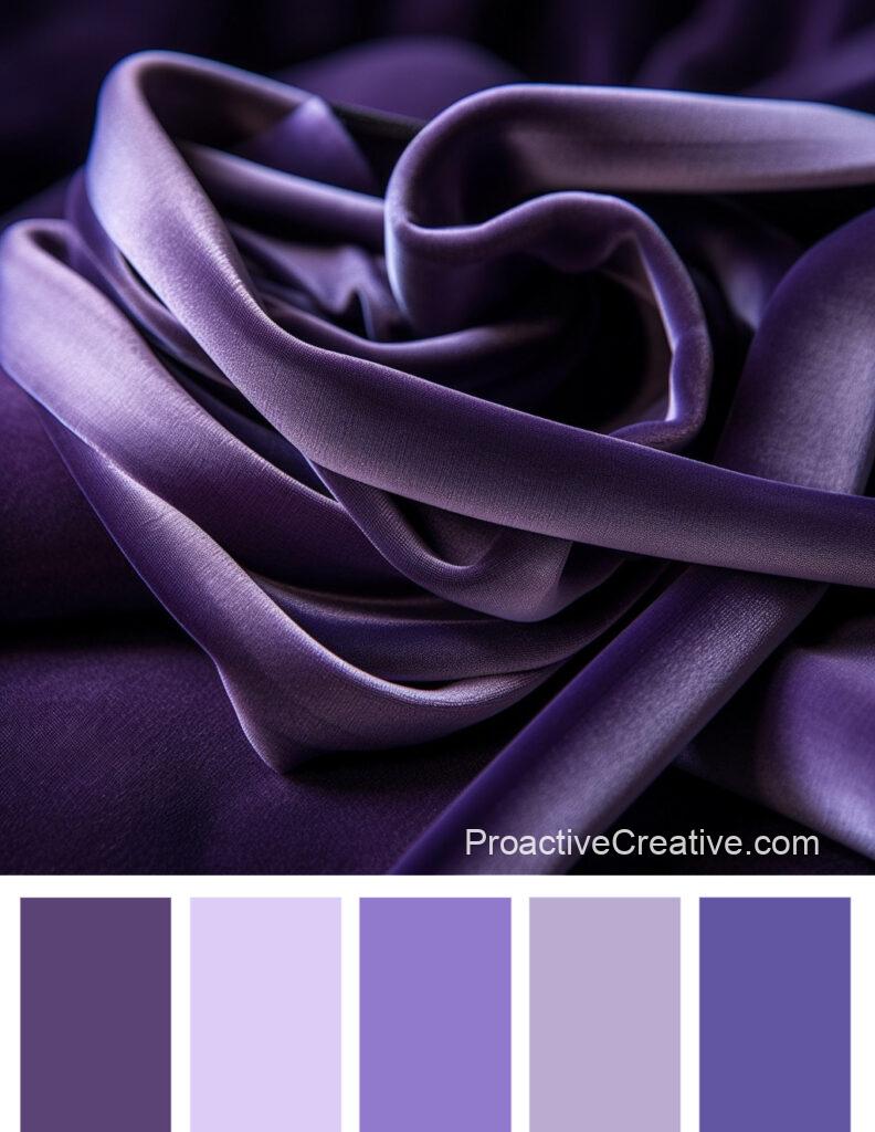
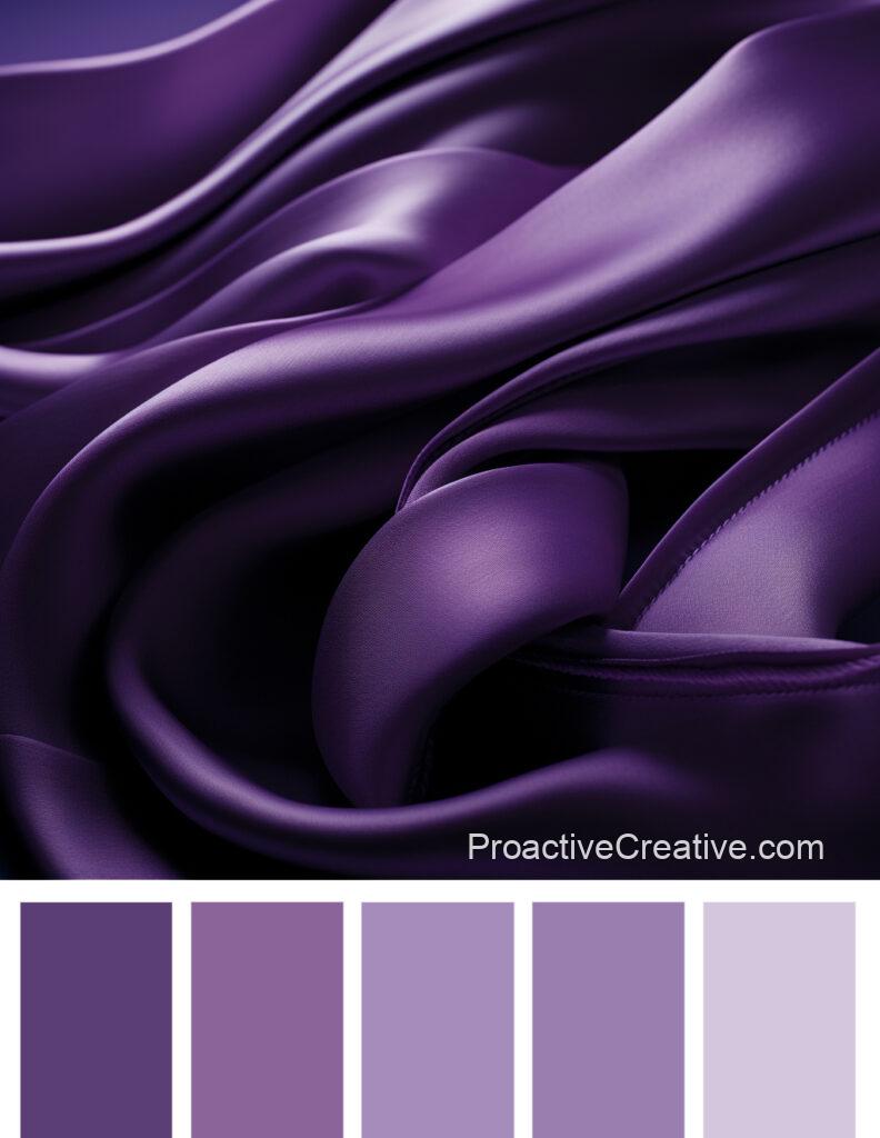
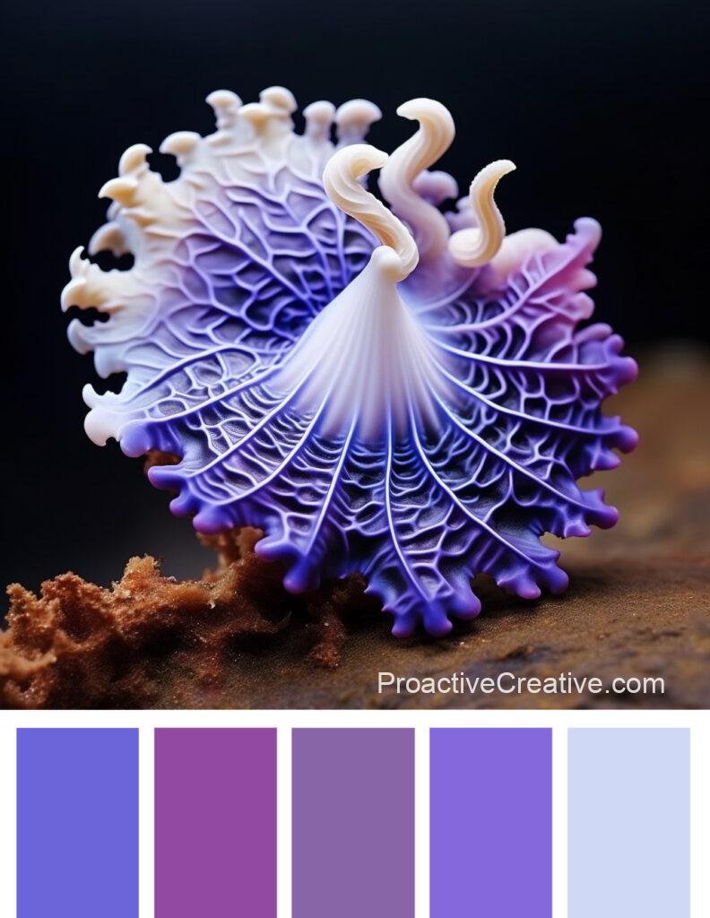
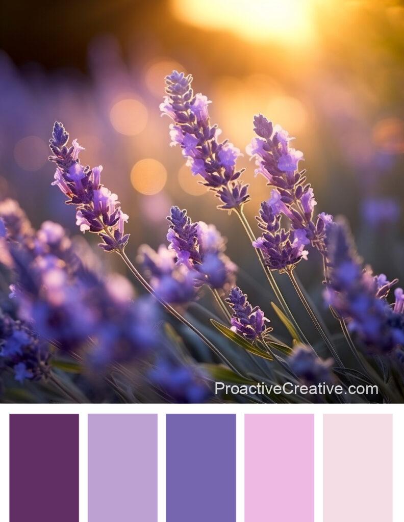
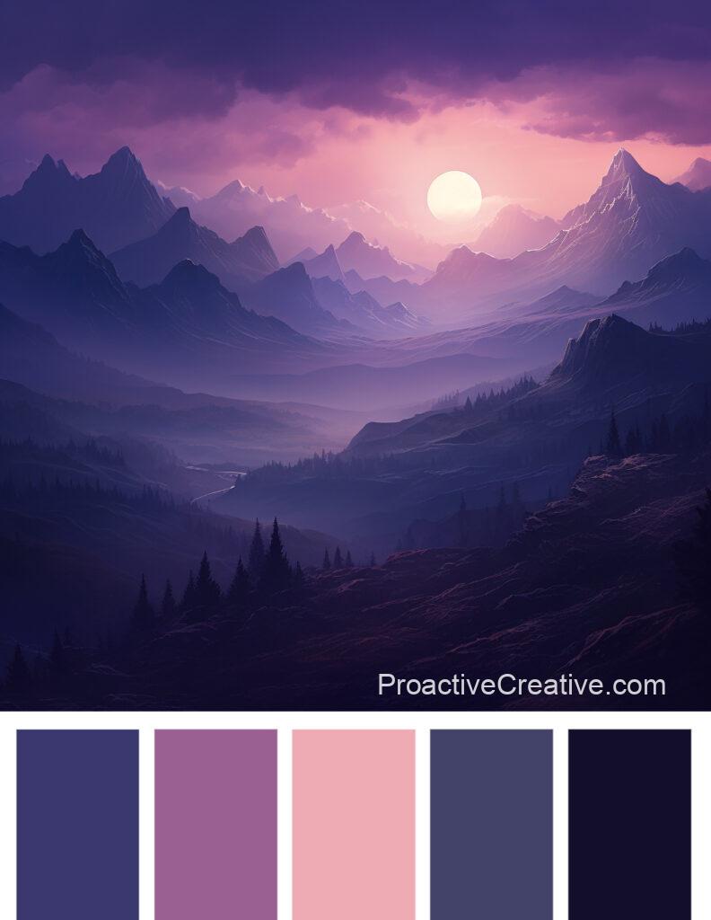
Shades of Purple
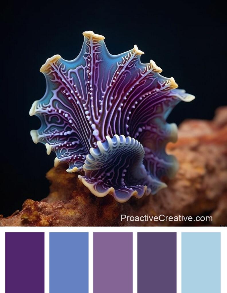
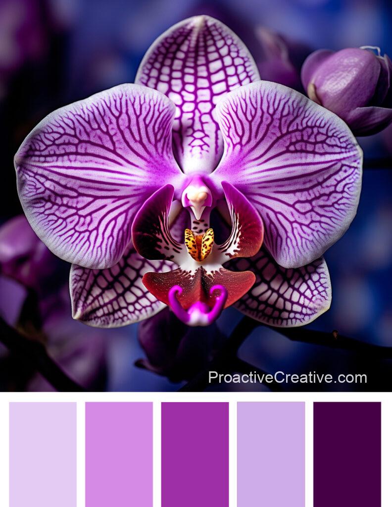
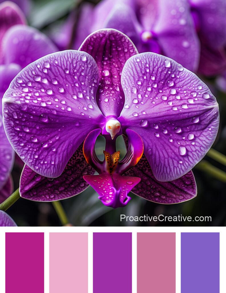
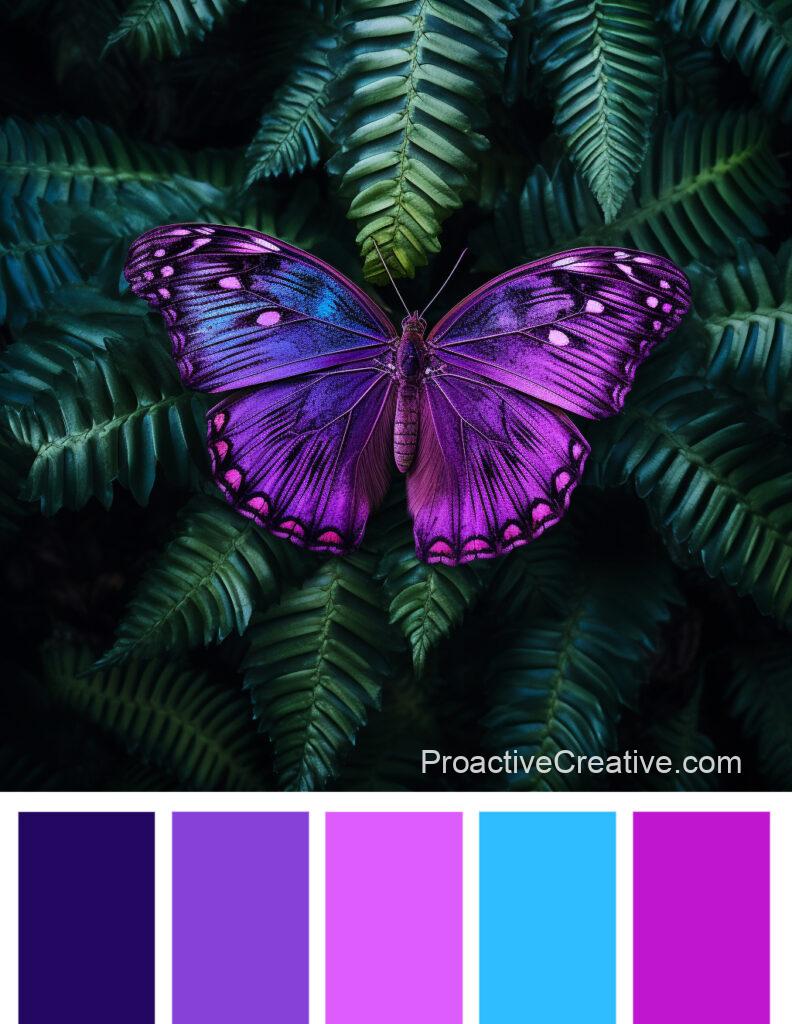
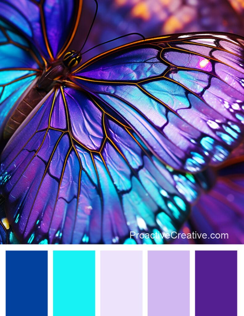
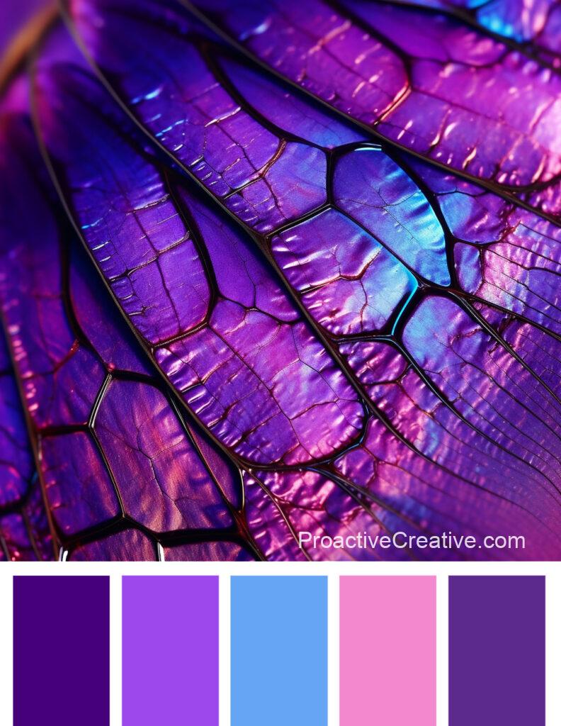
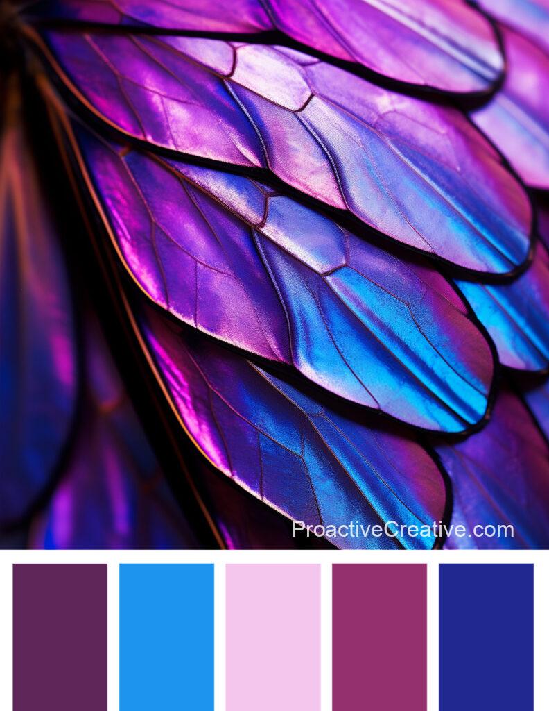
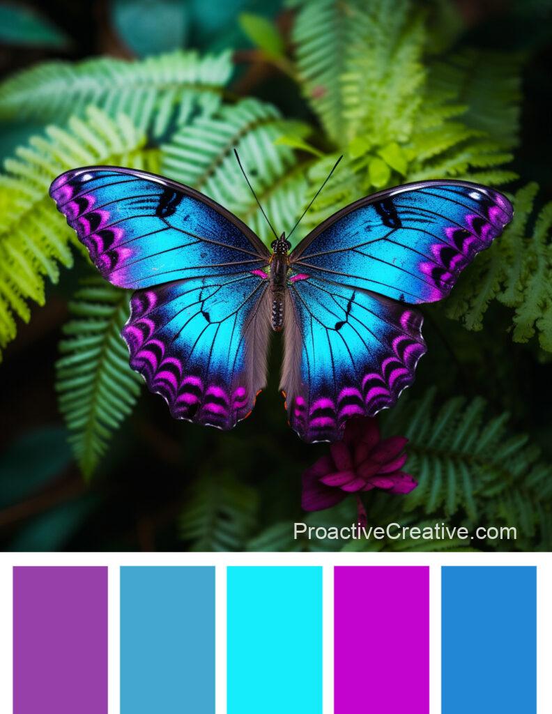
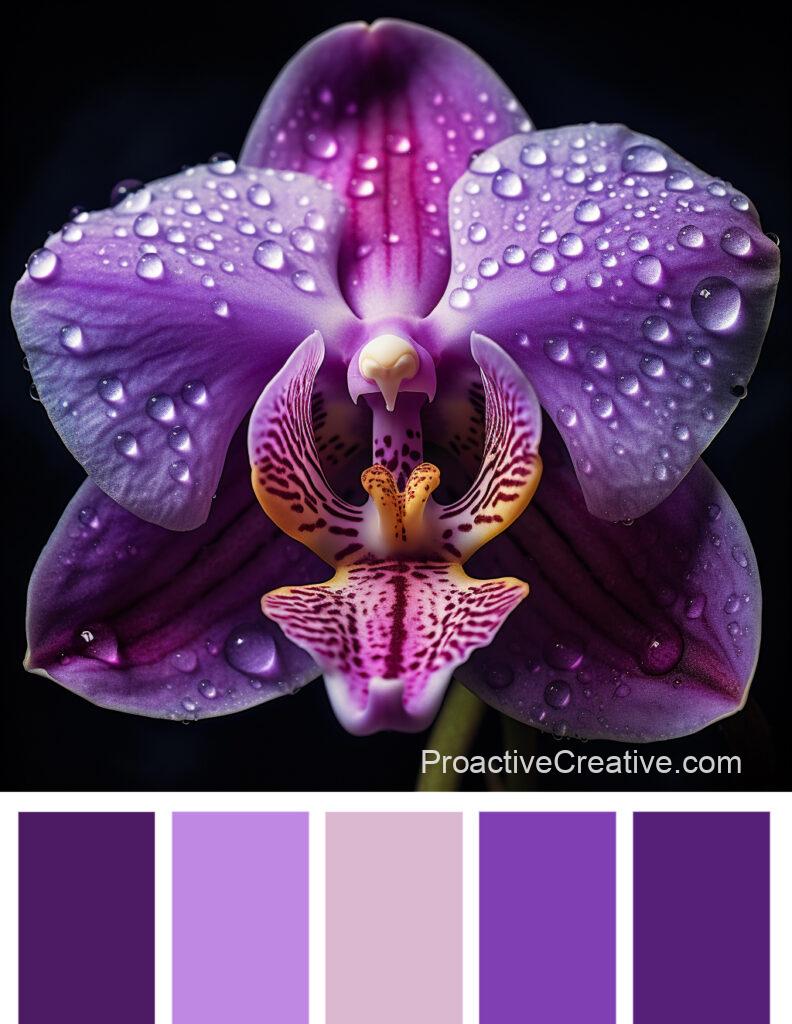
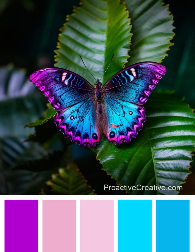
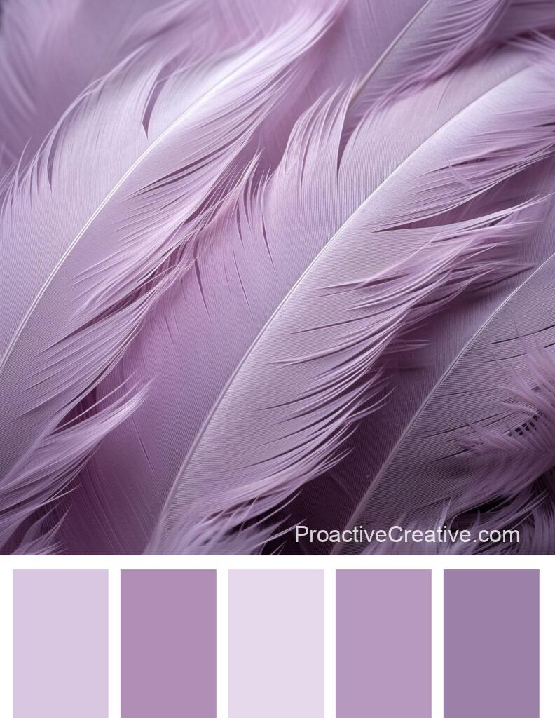
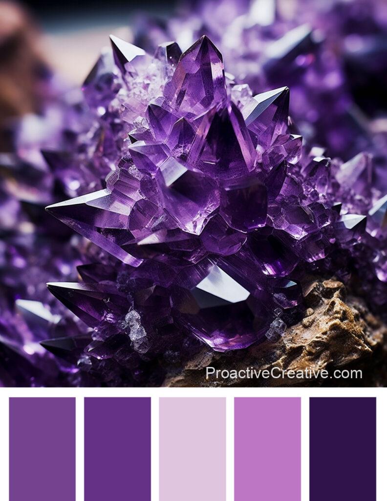
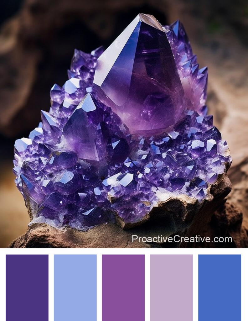
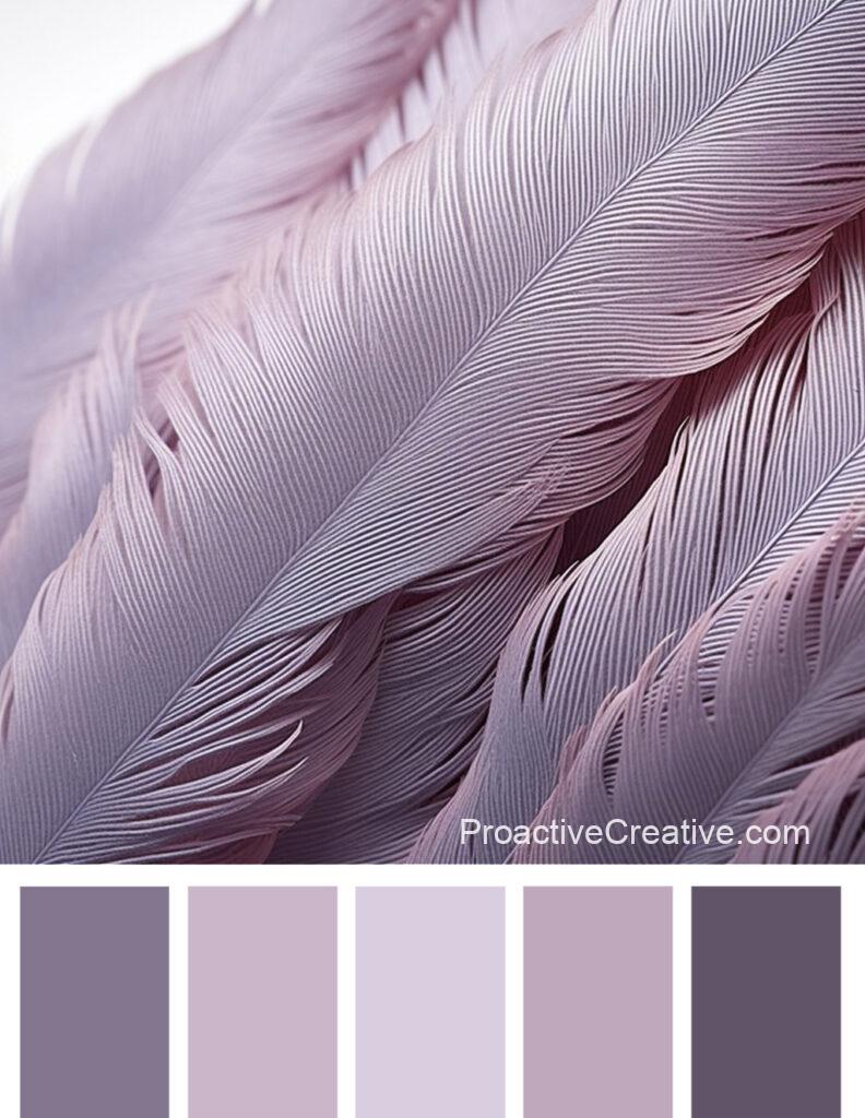
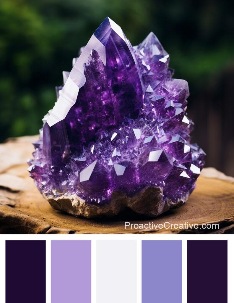
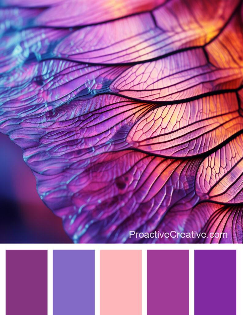
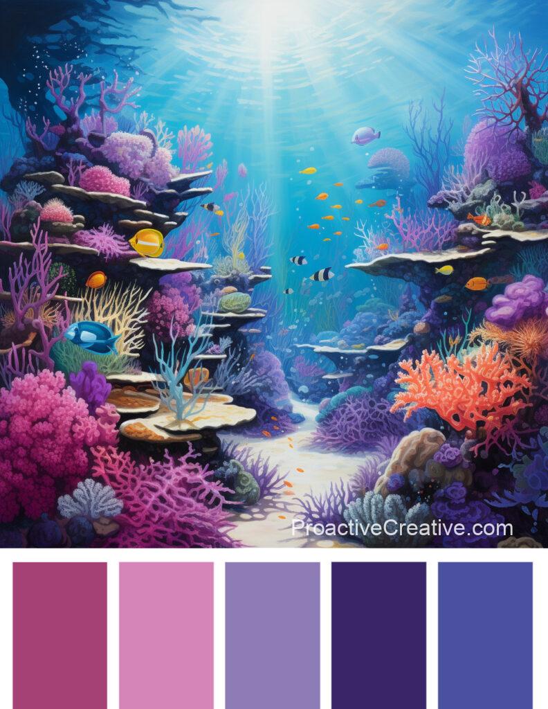
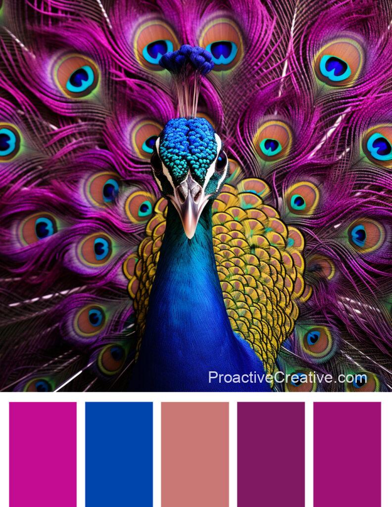
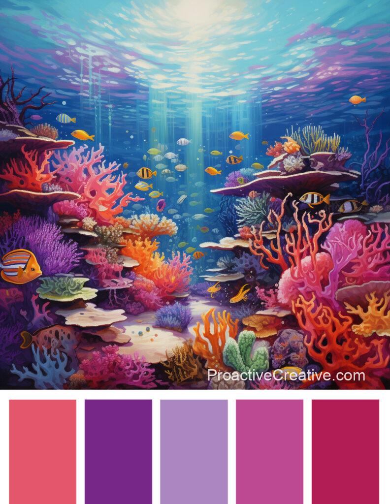
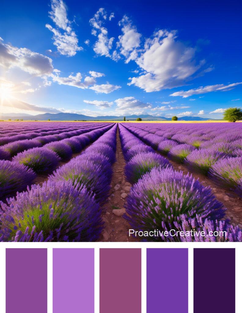
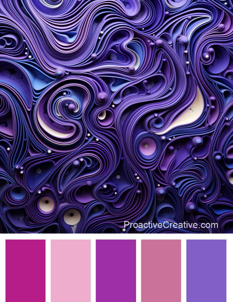
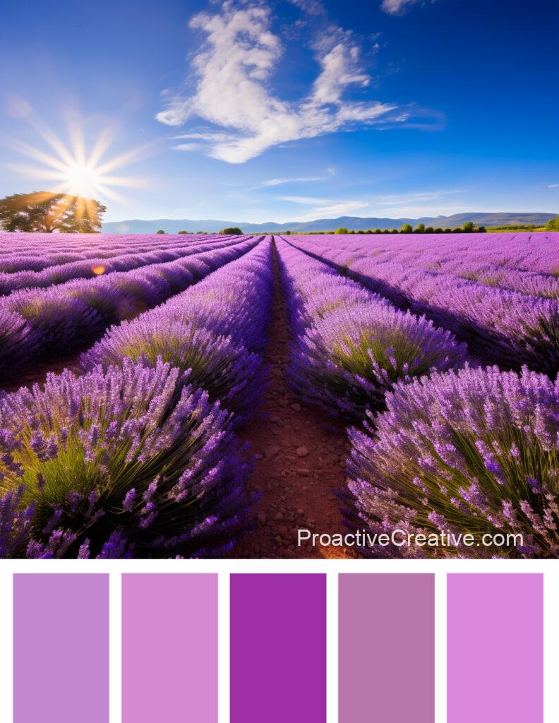
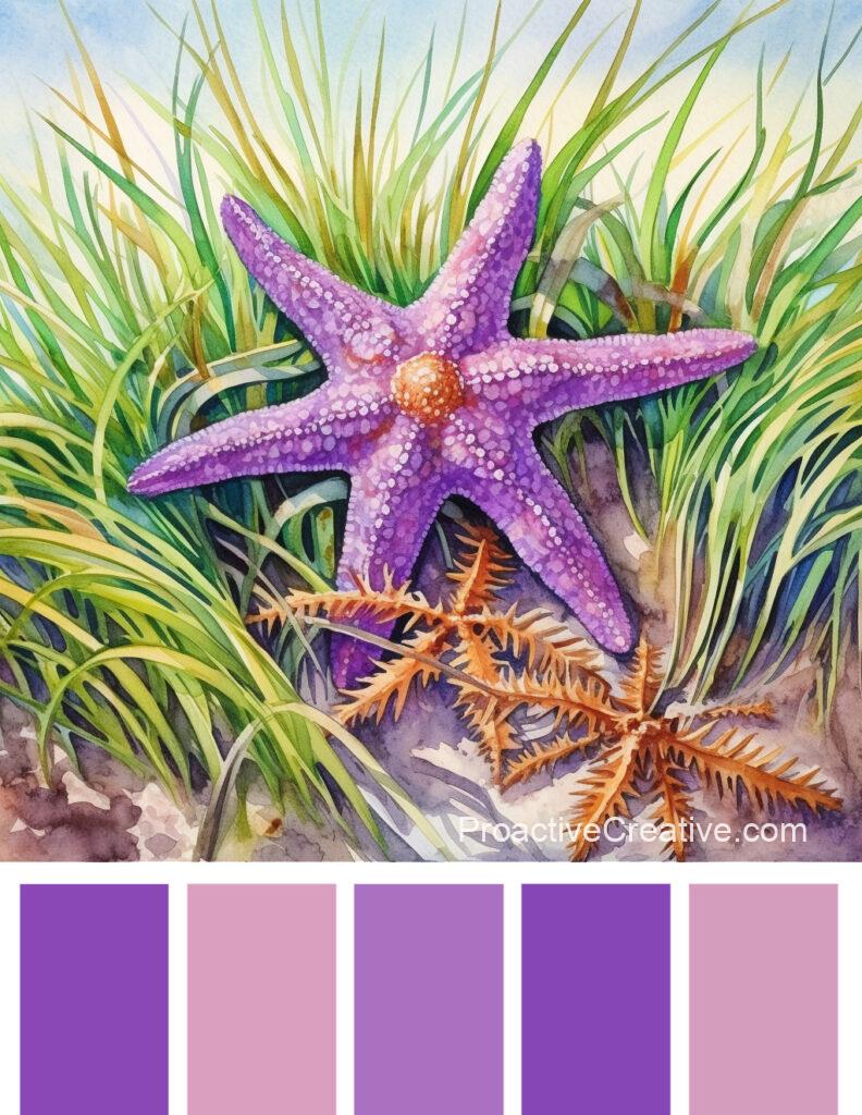
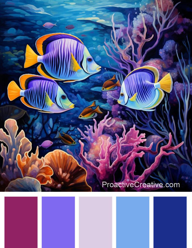
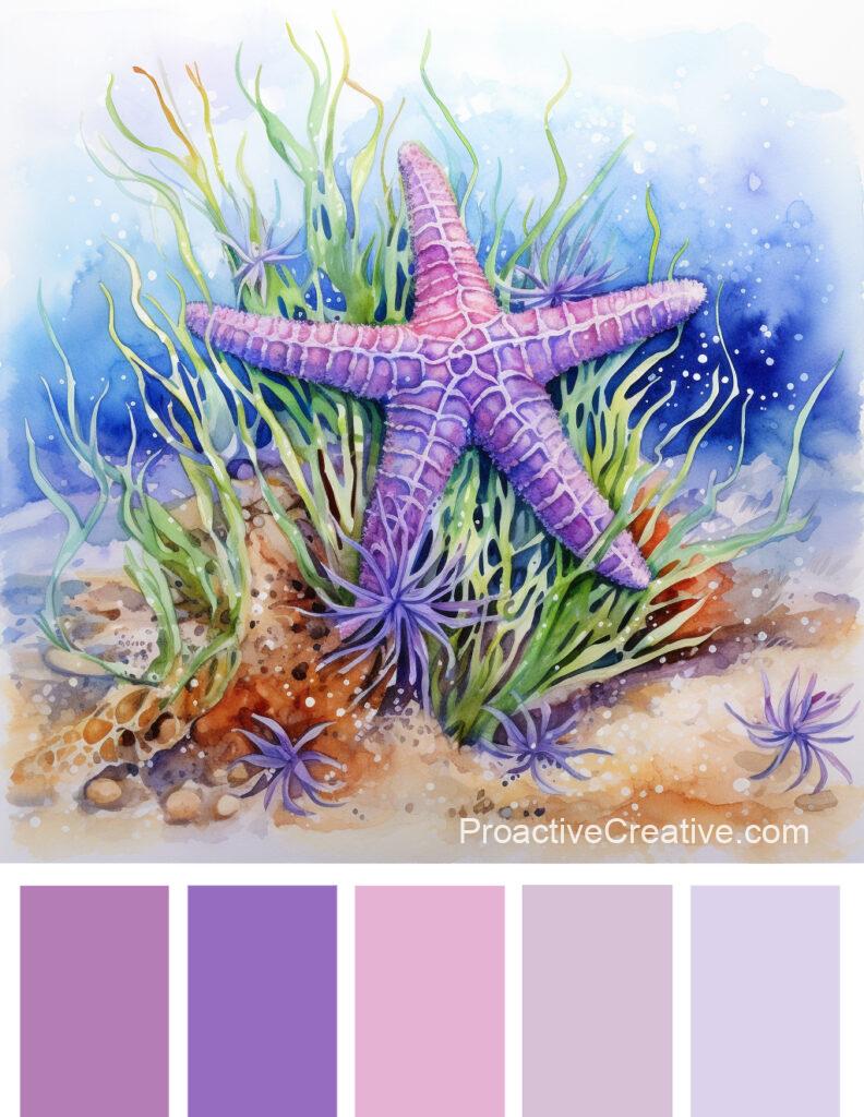
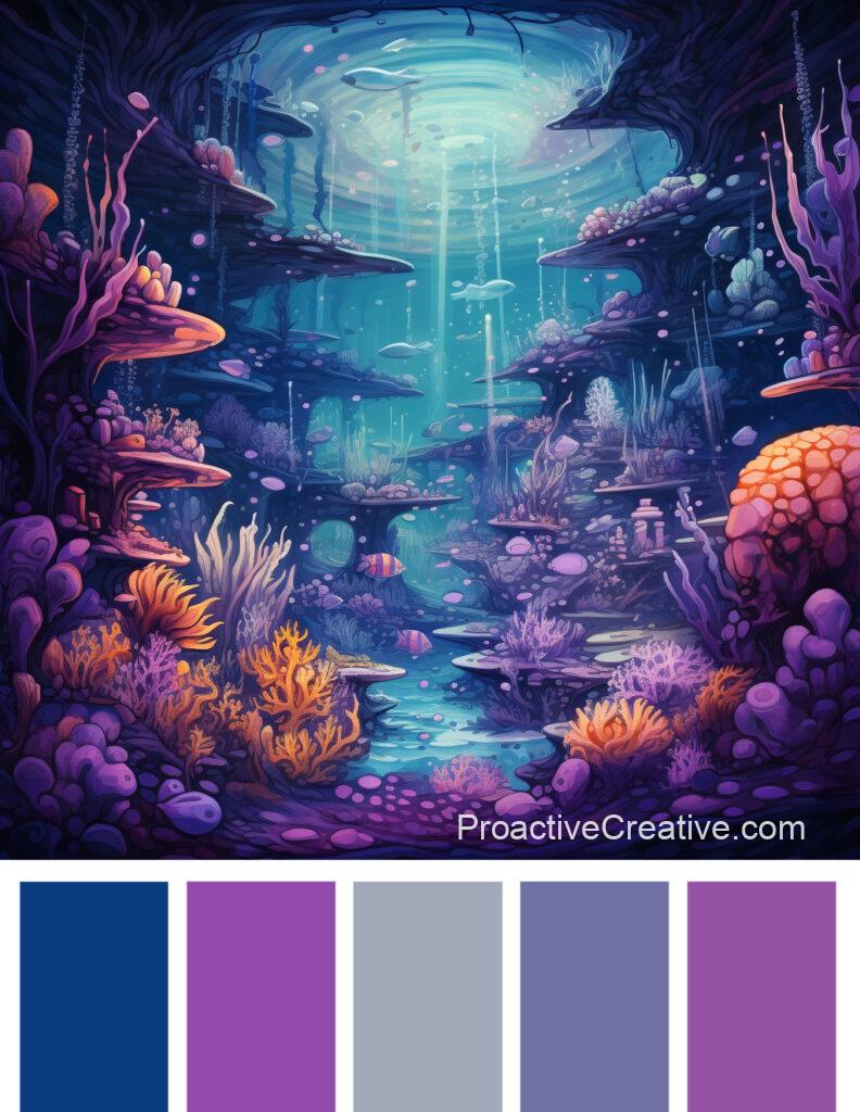
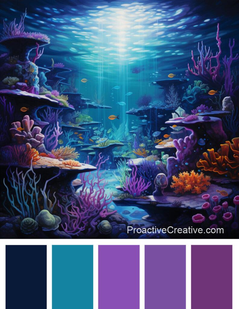
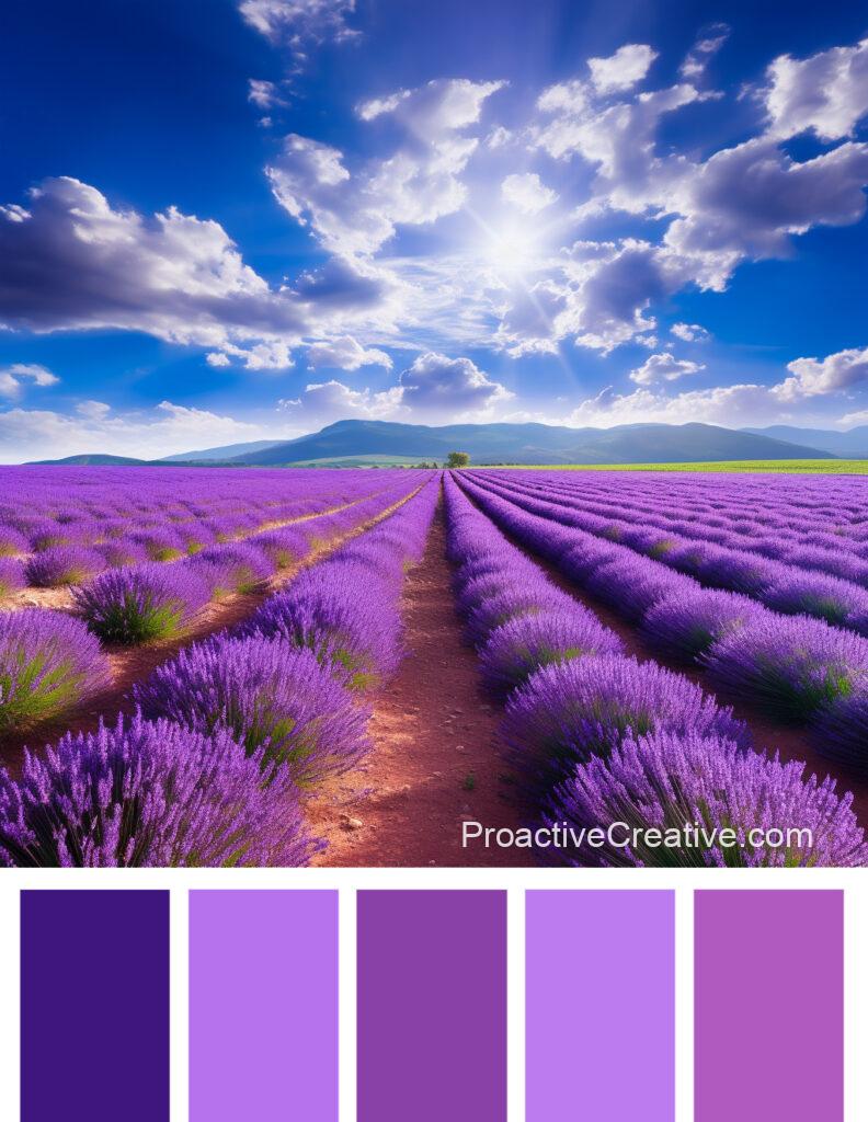
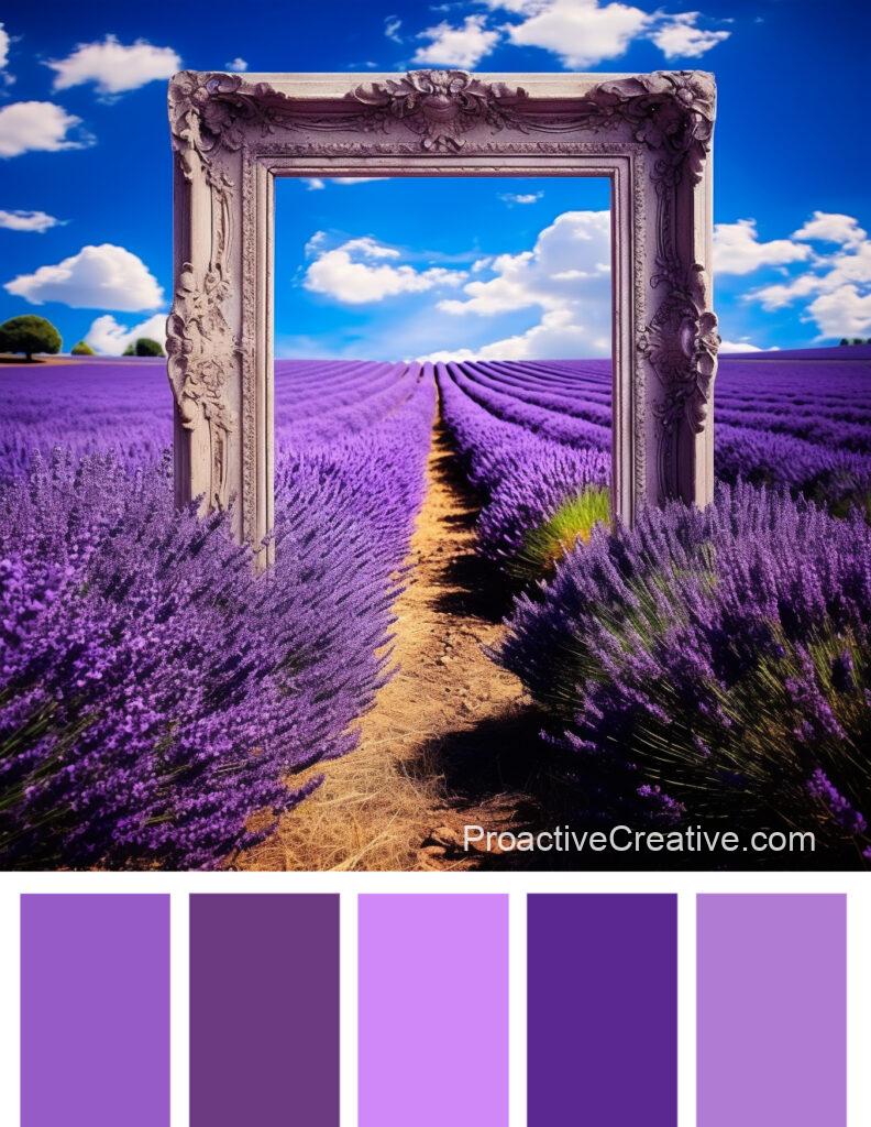
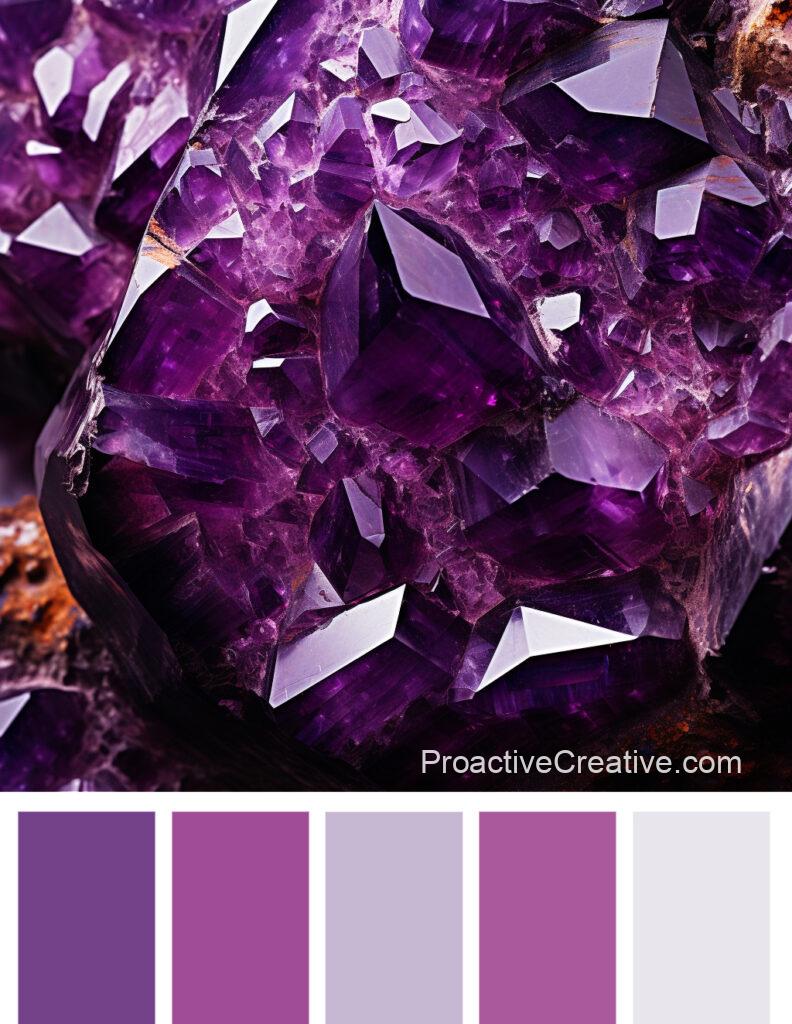
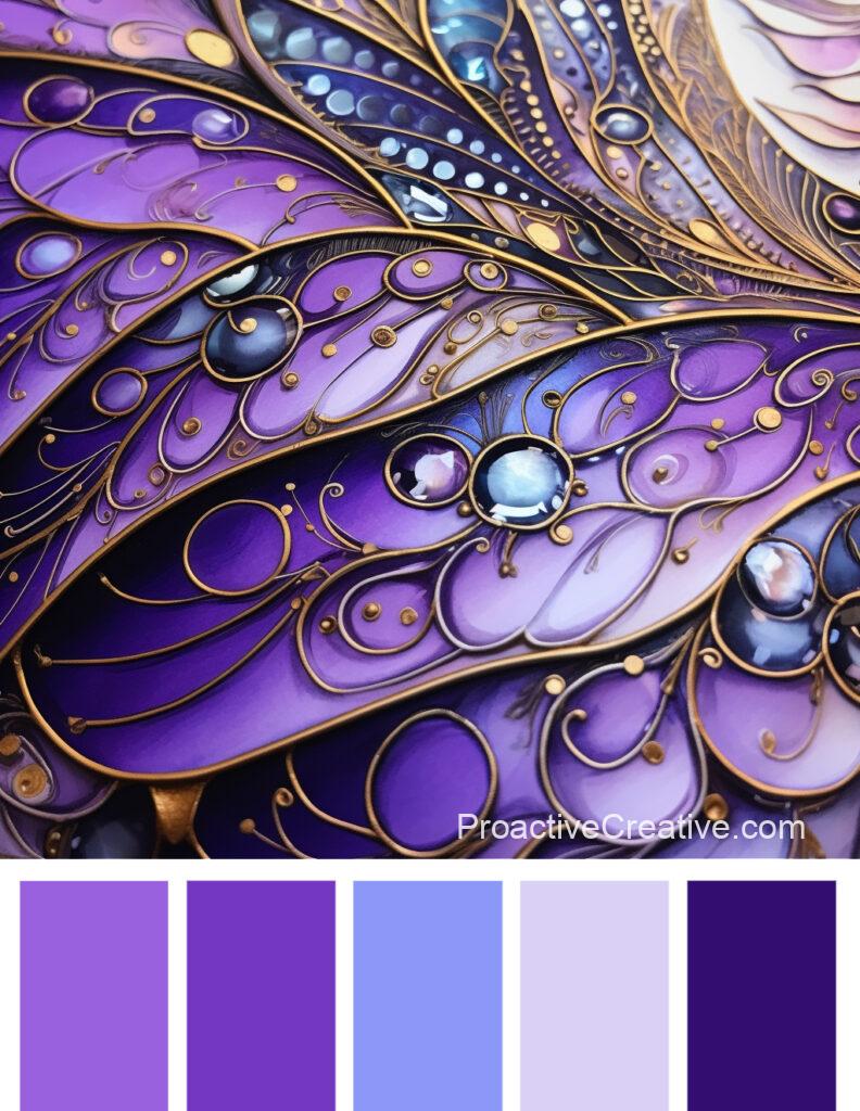
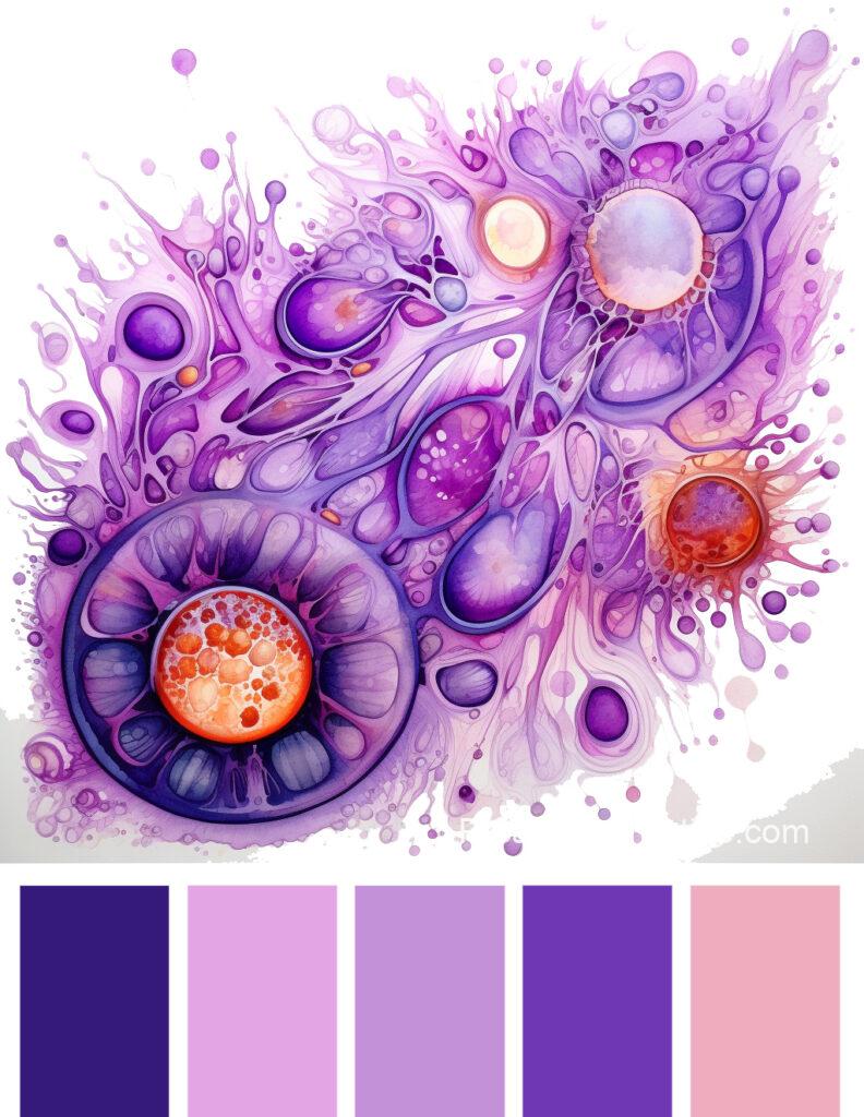
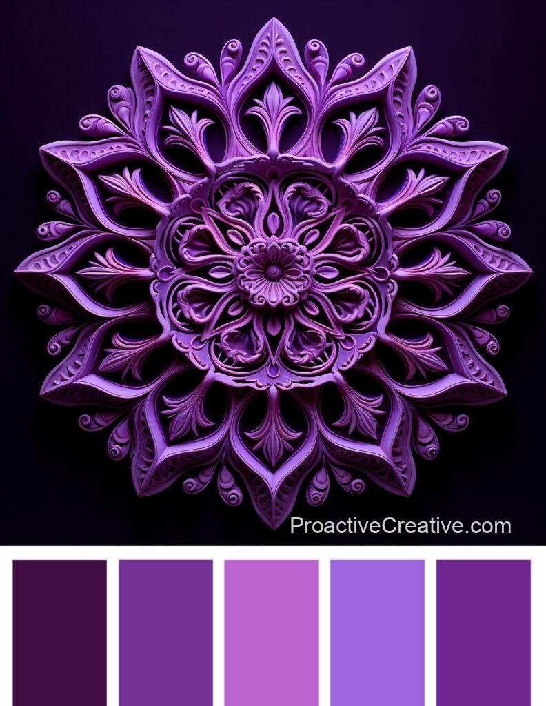
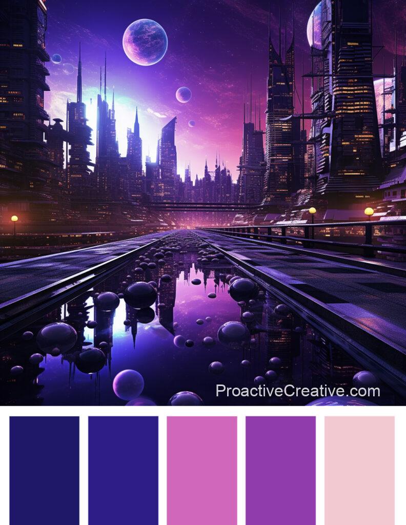
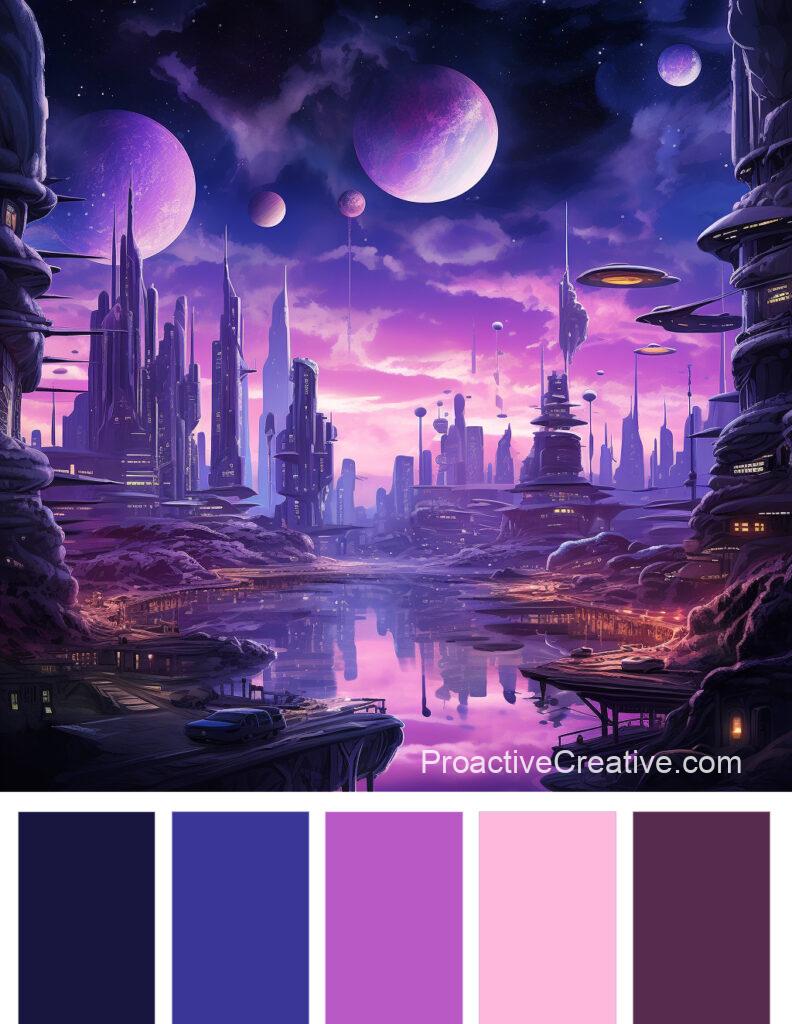
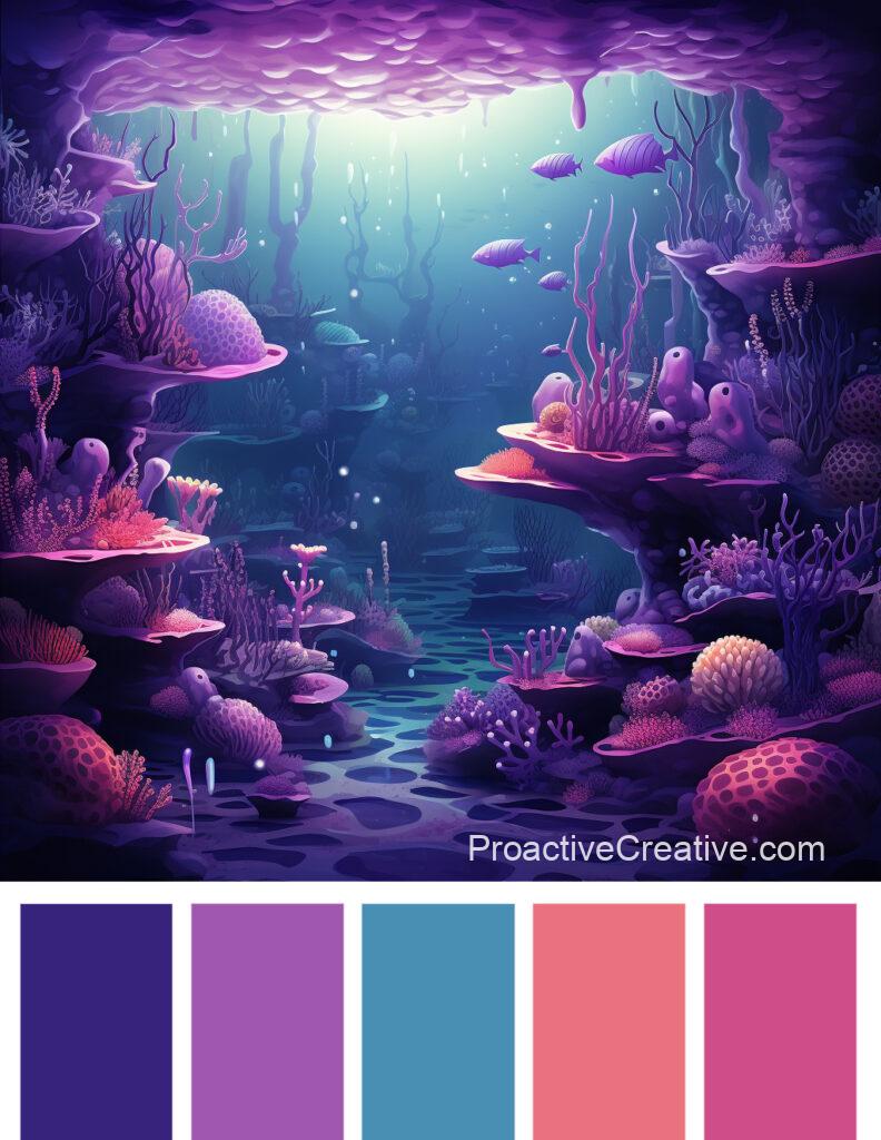
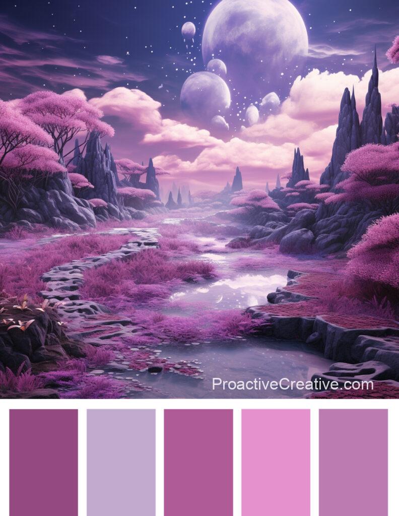
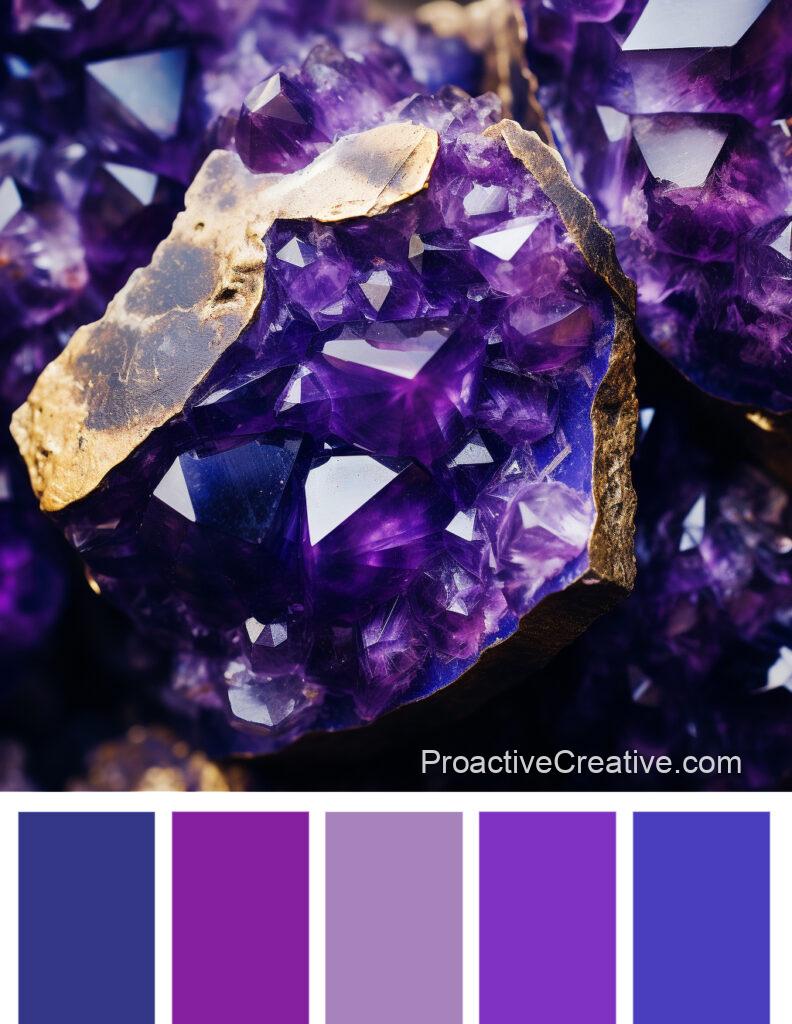
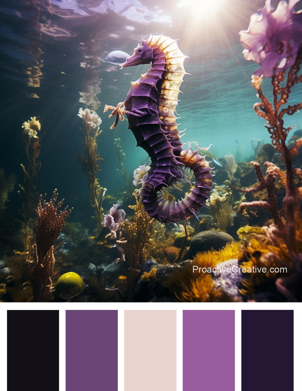
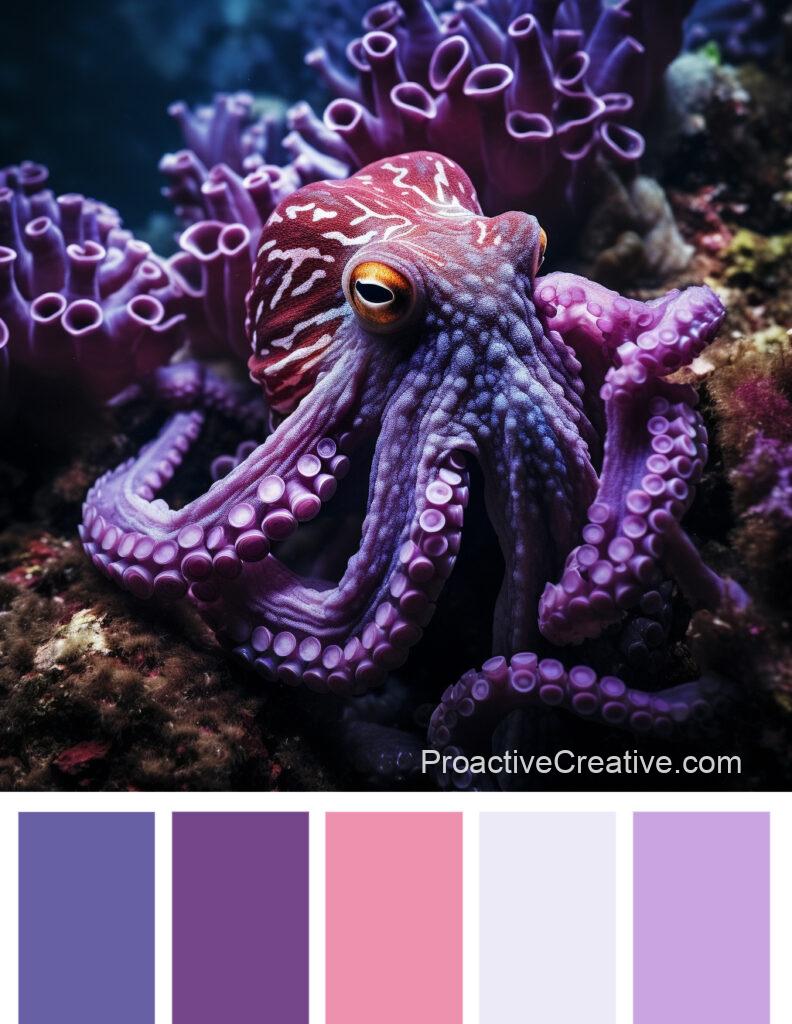
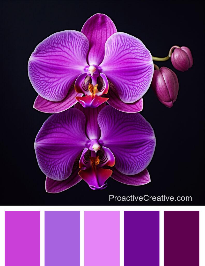
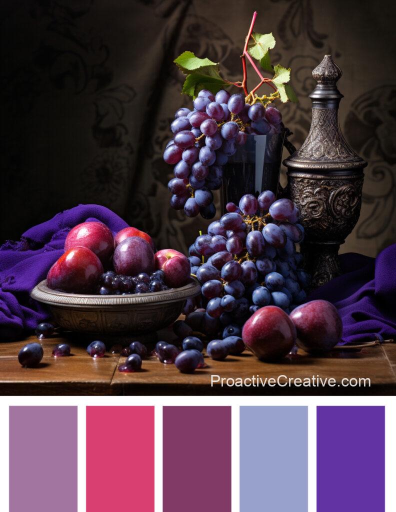
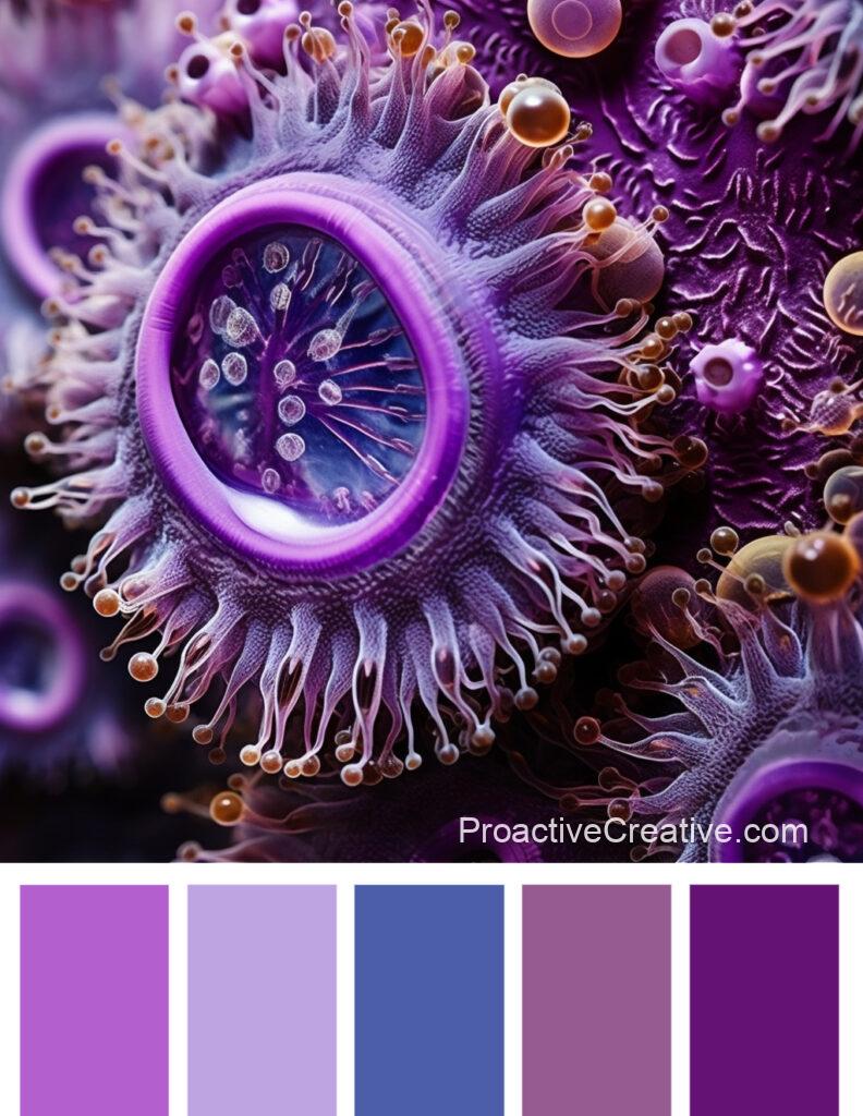
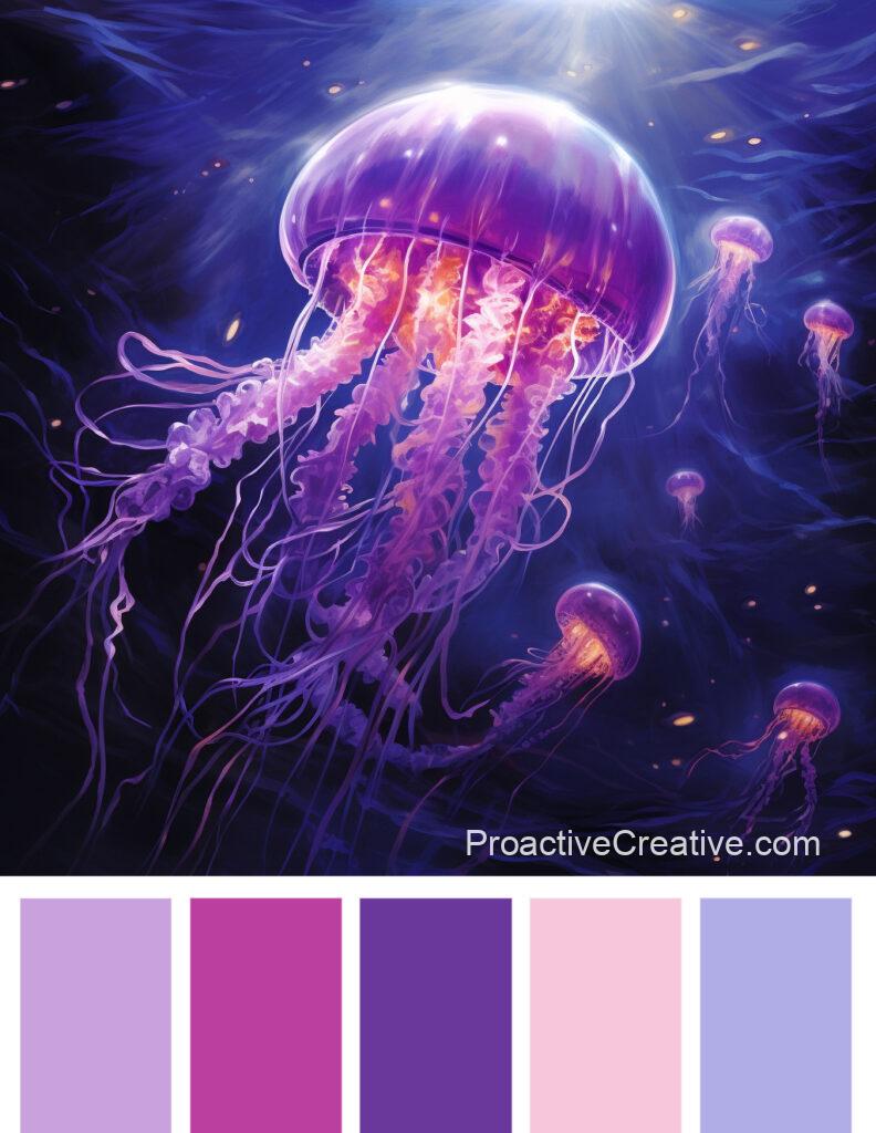
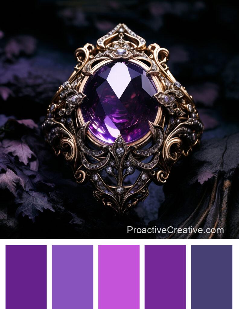
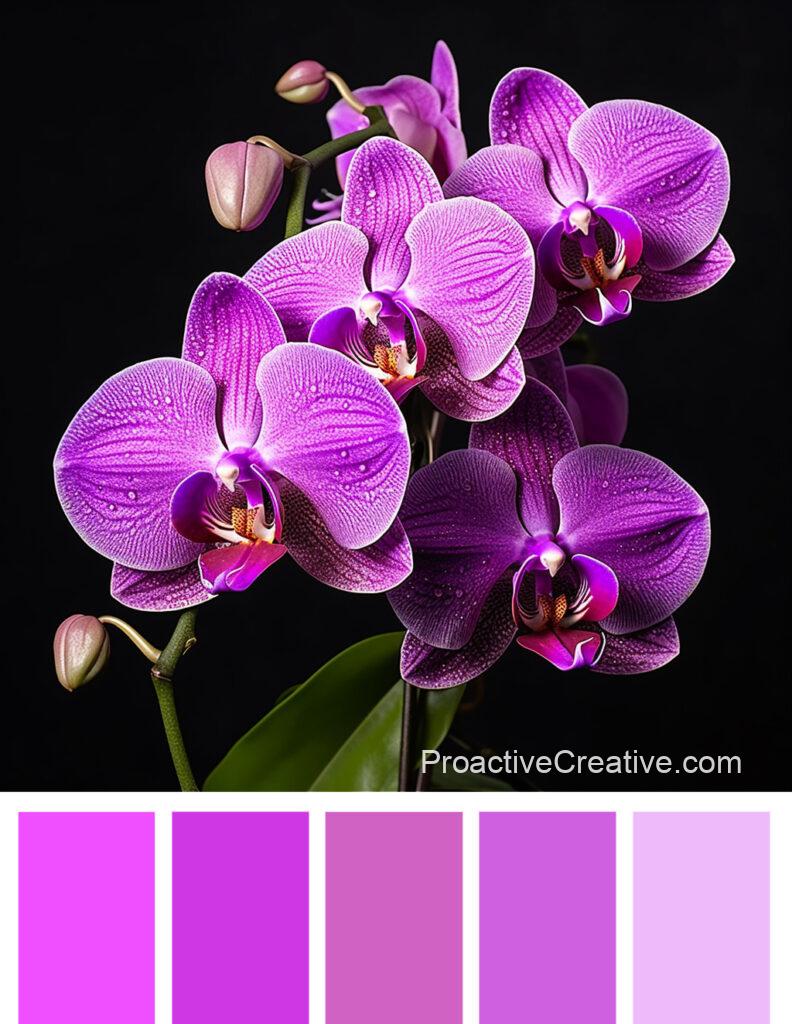
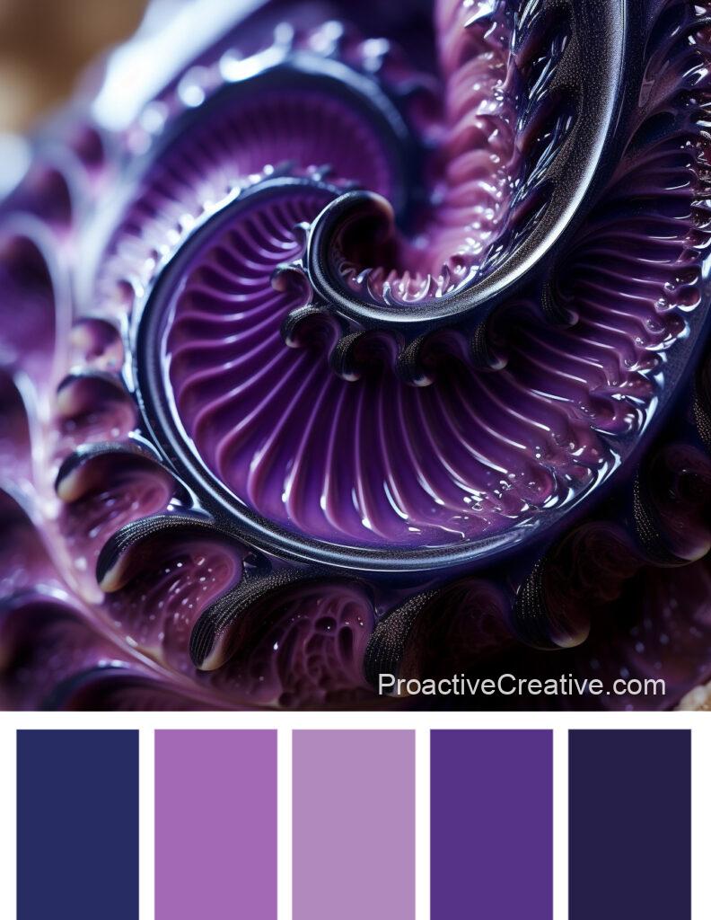
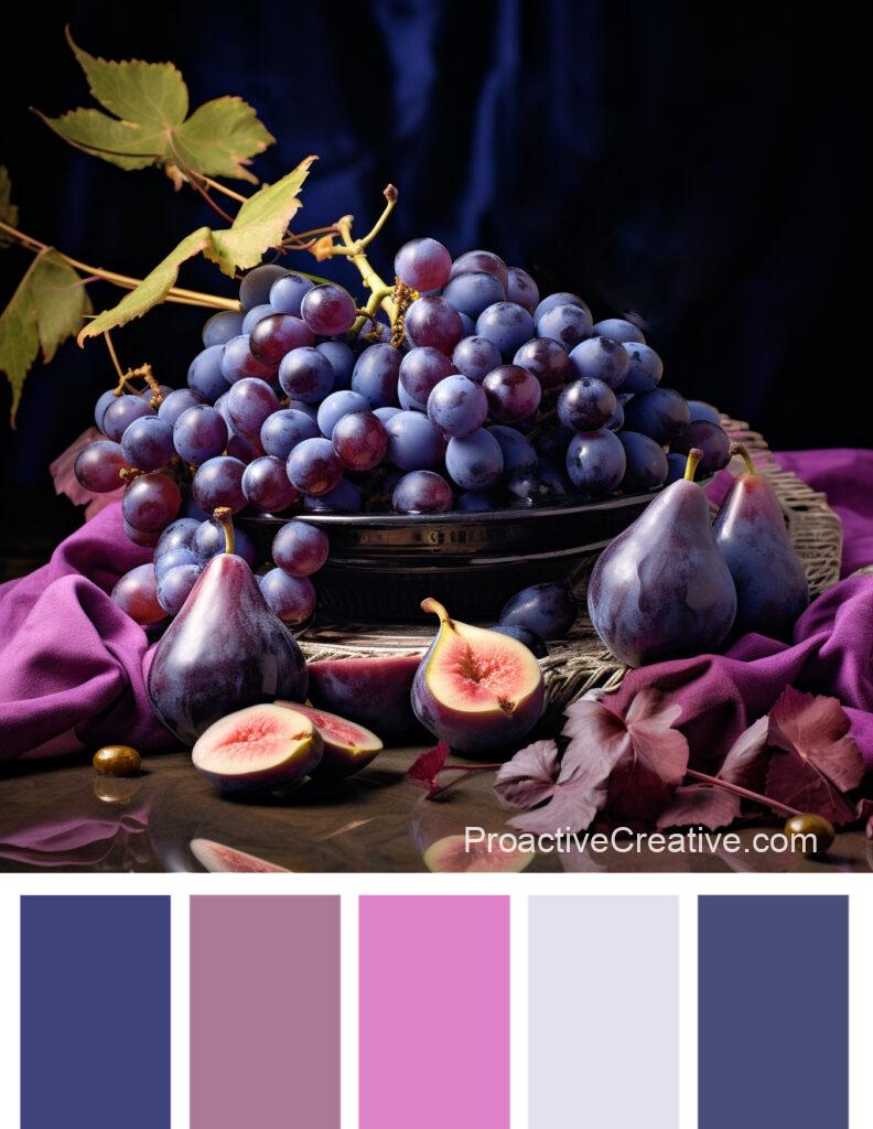
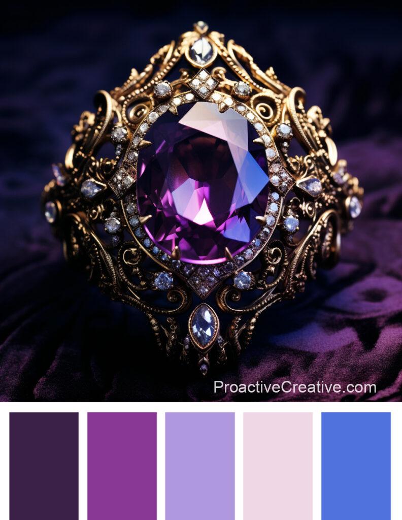
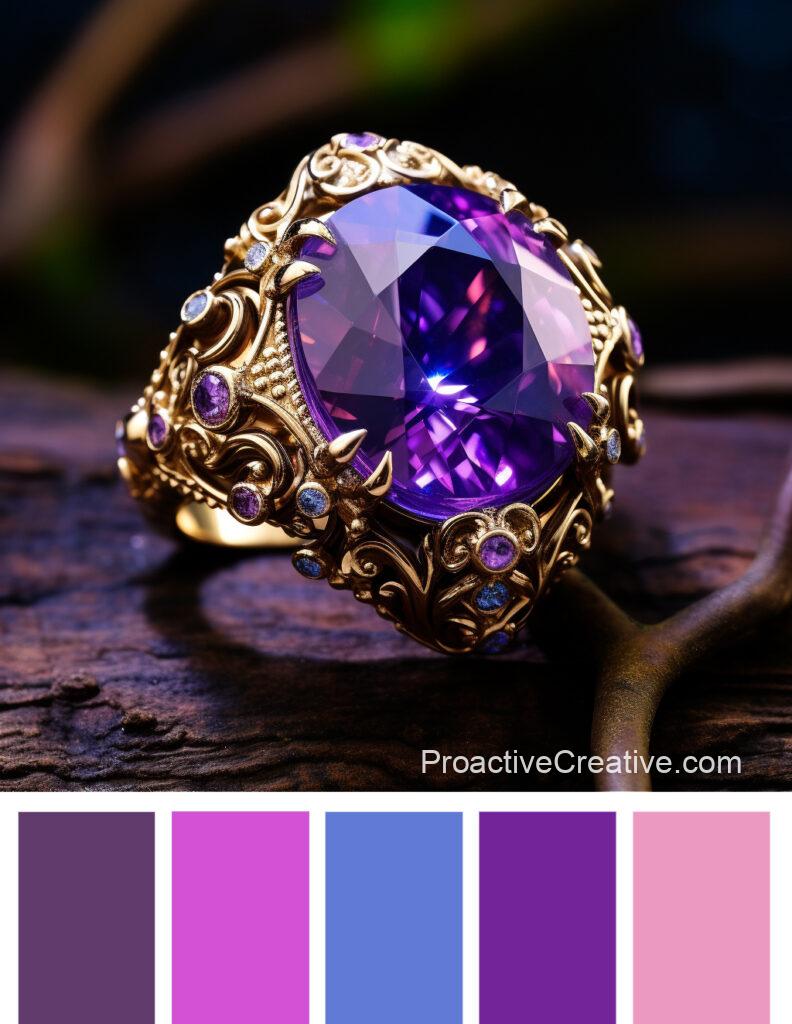
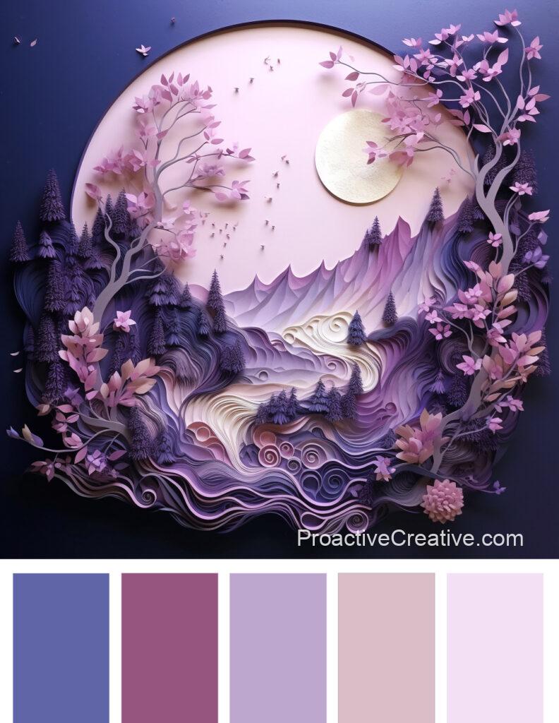
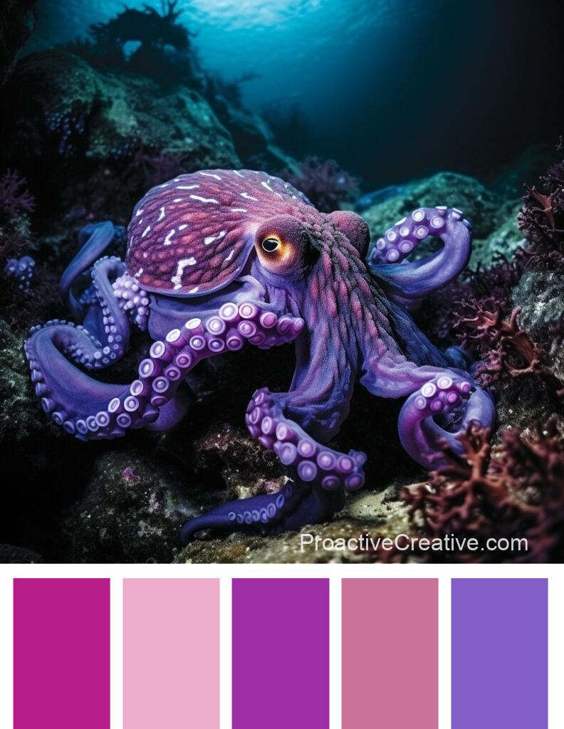
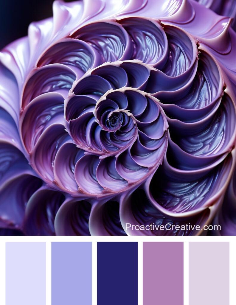
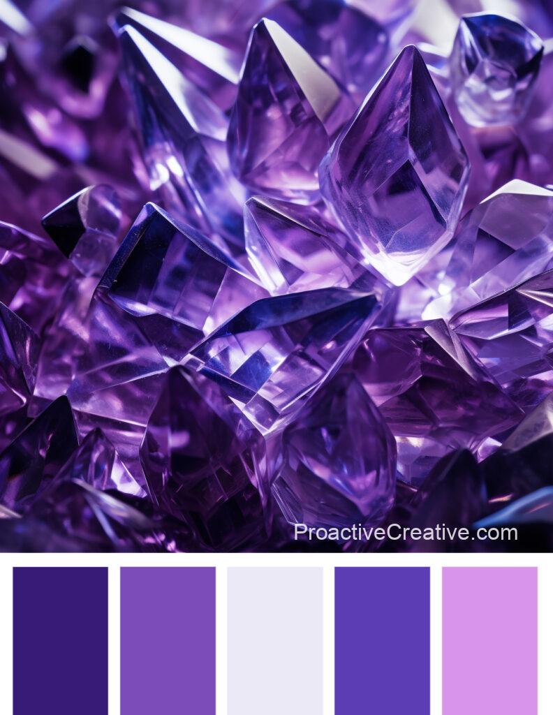
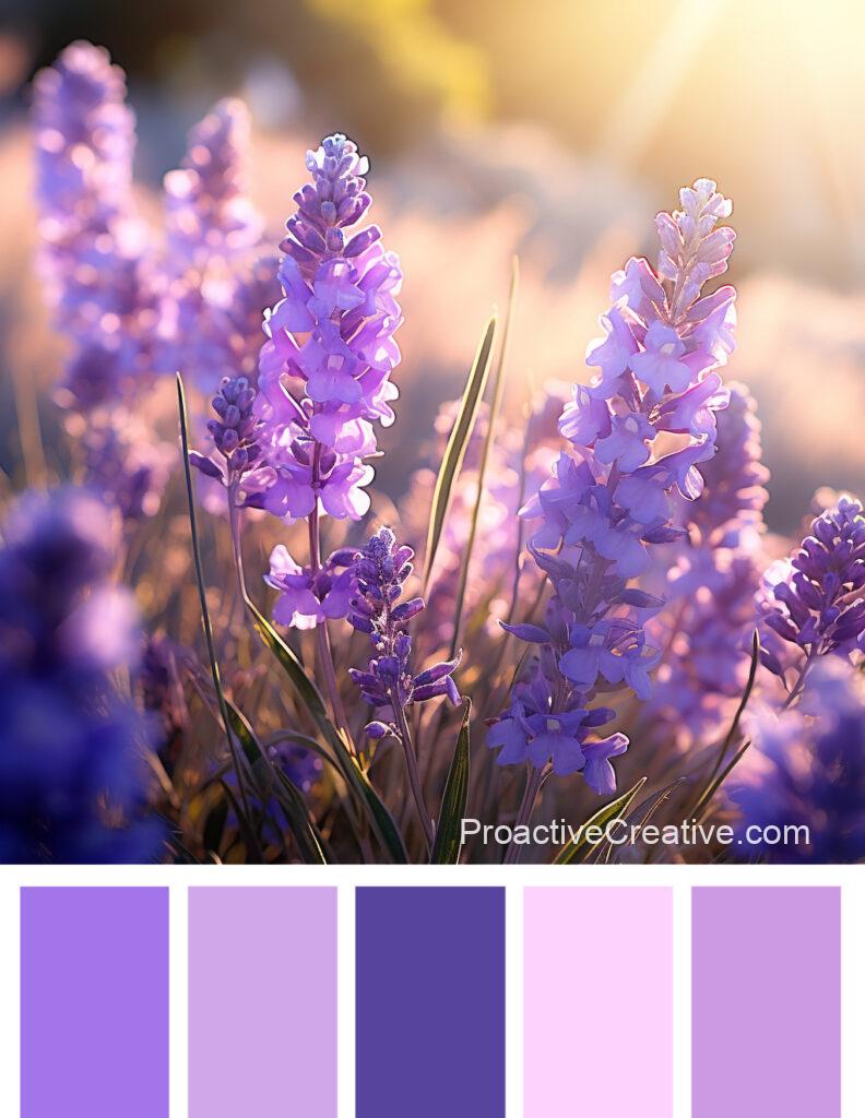
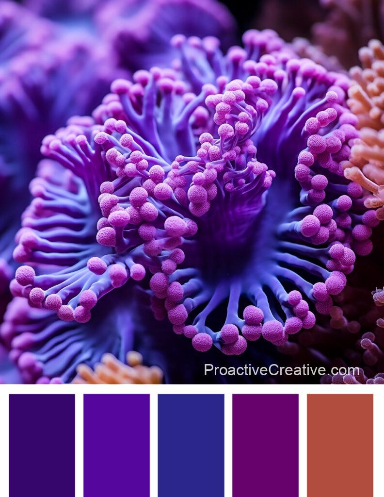
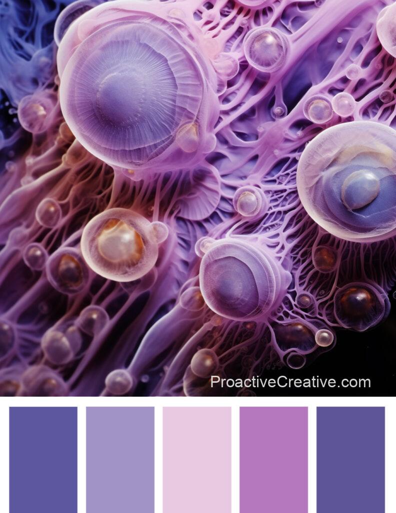
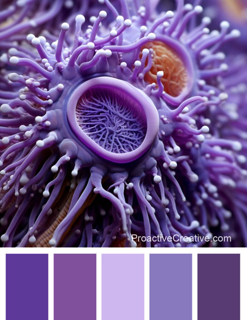
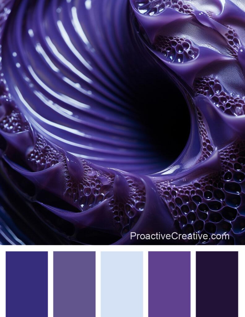
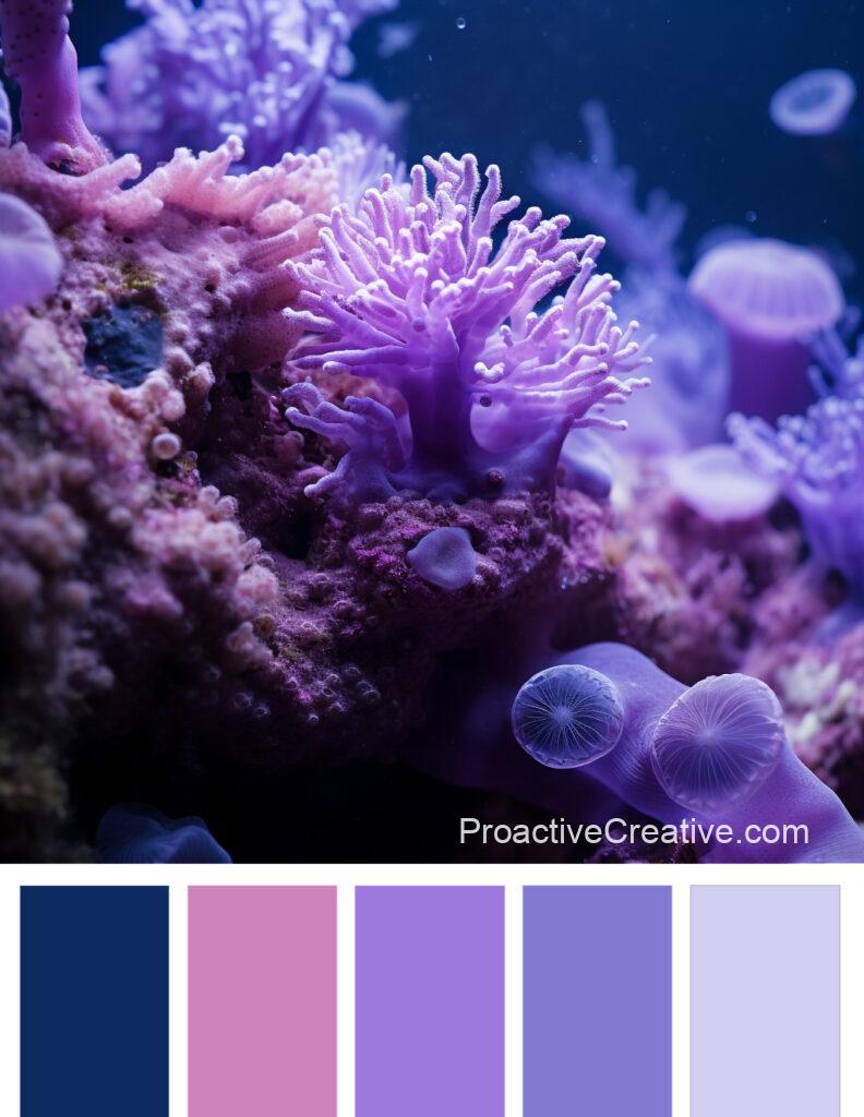
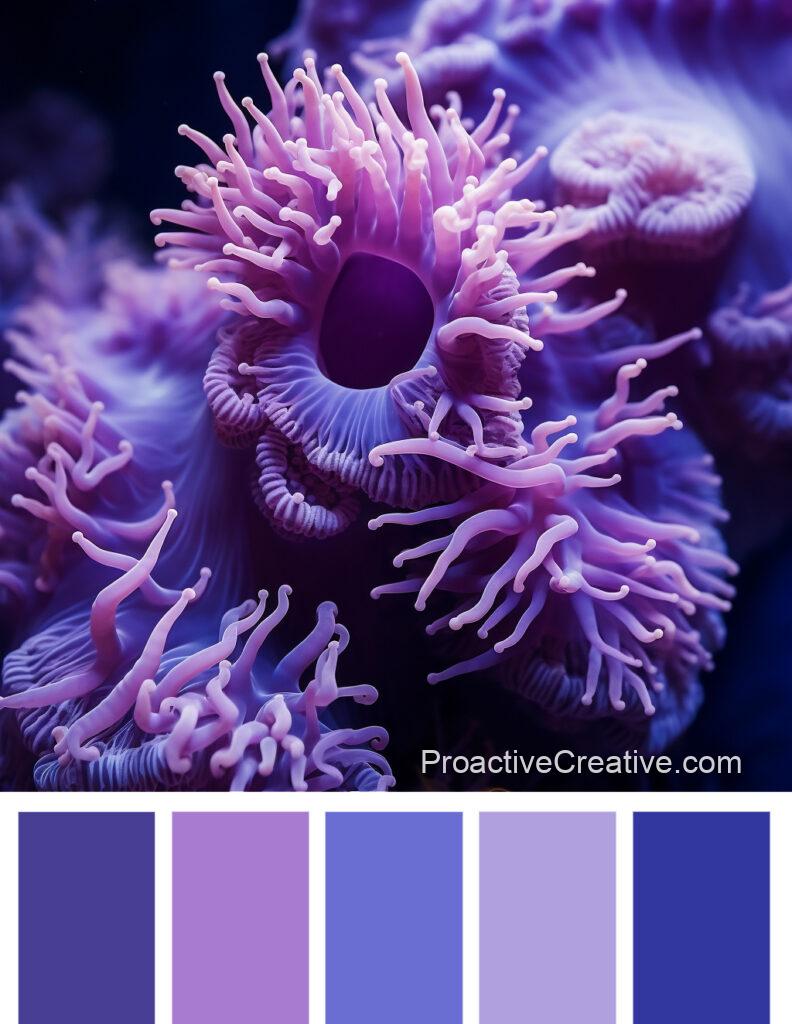
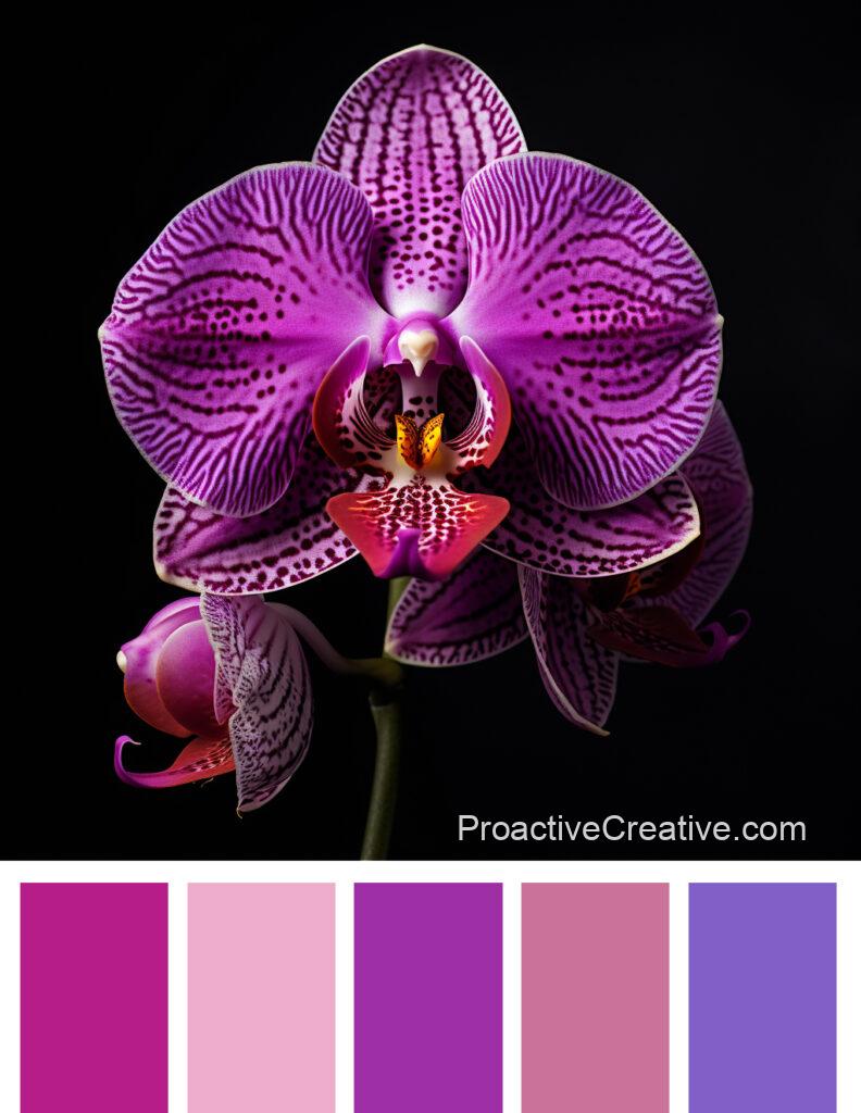
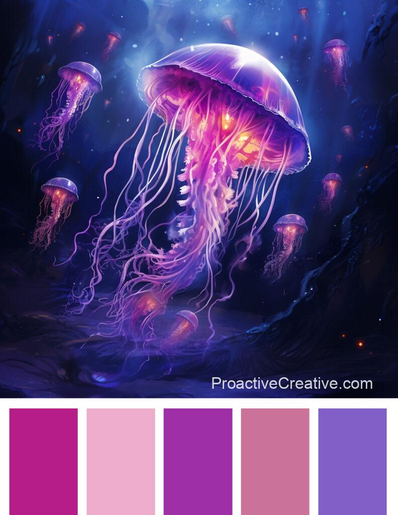
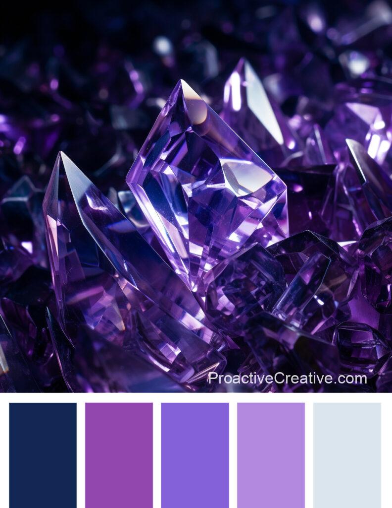
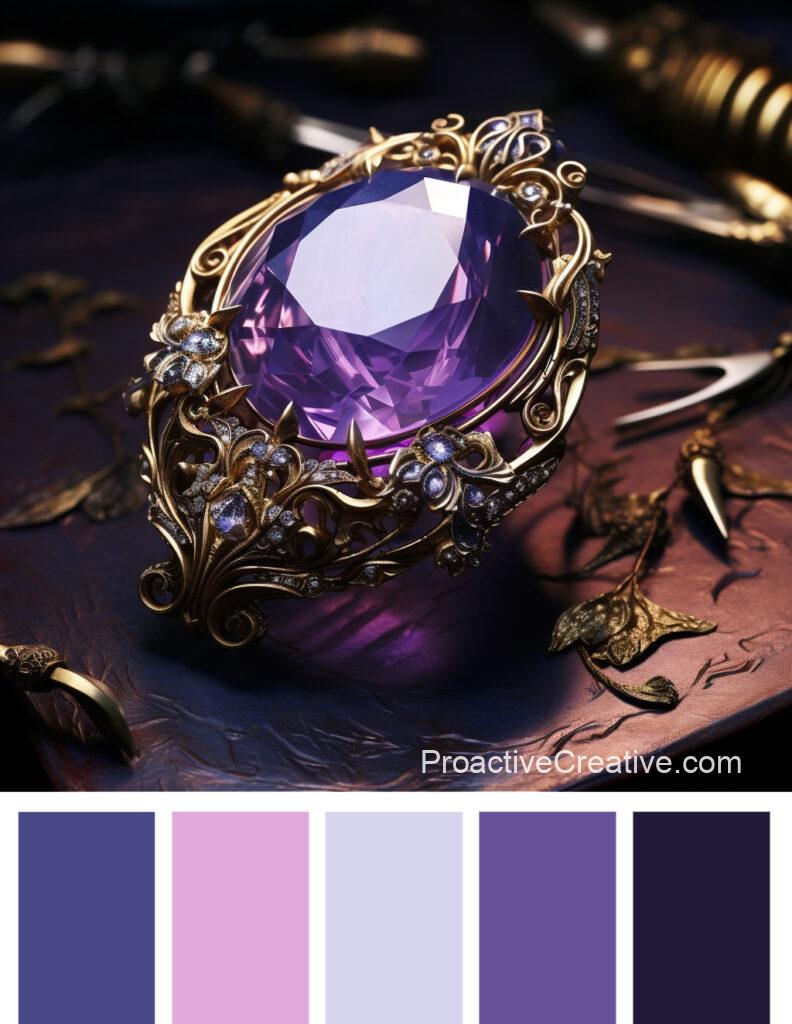
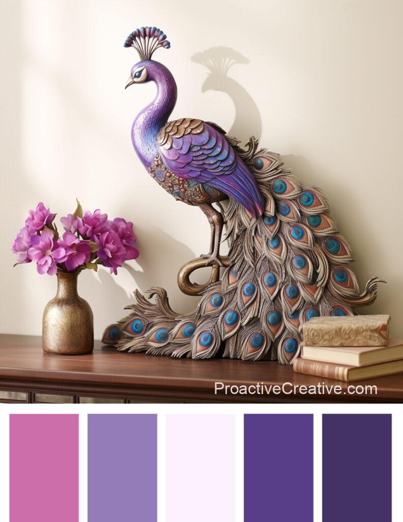
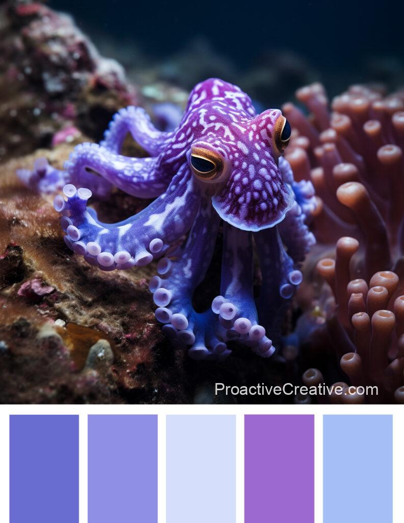
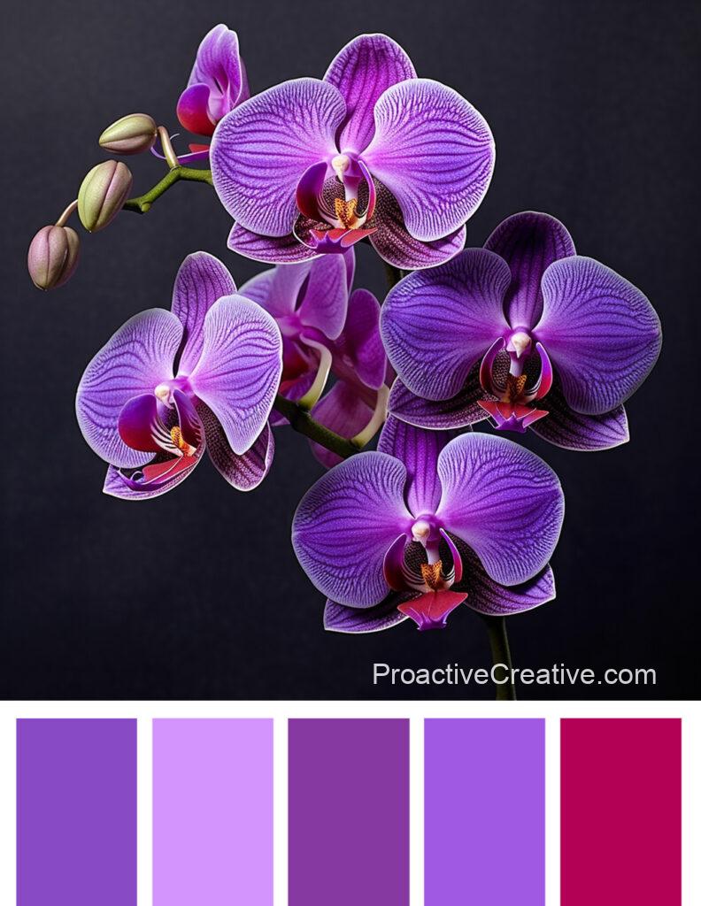
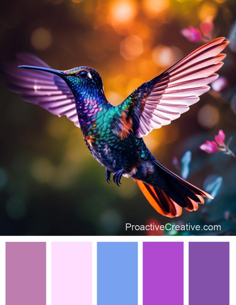
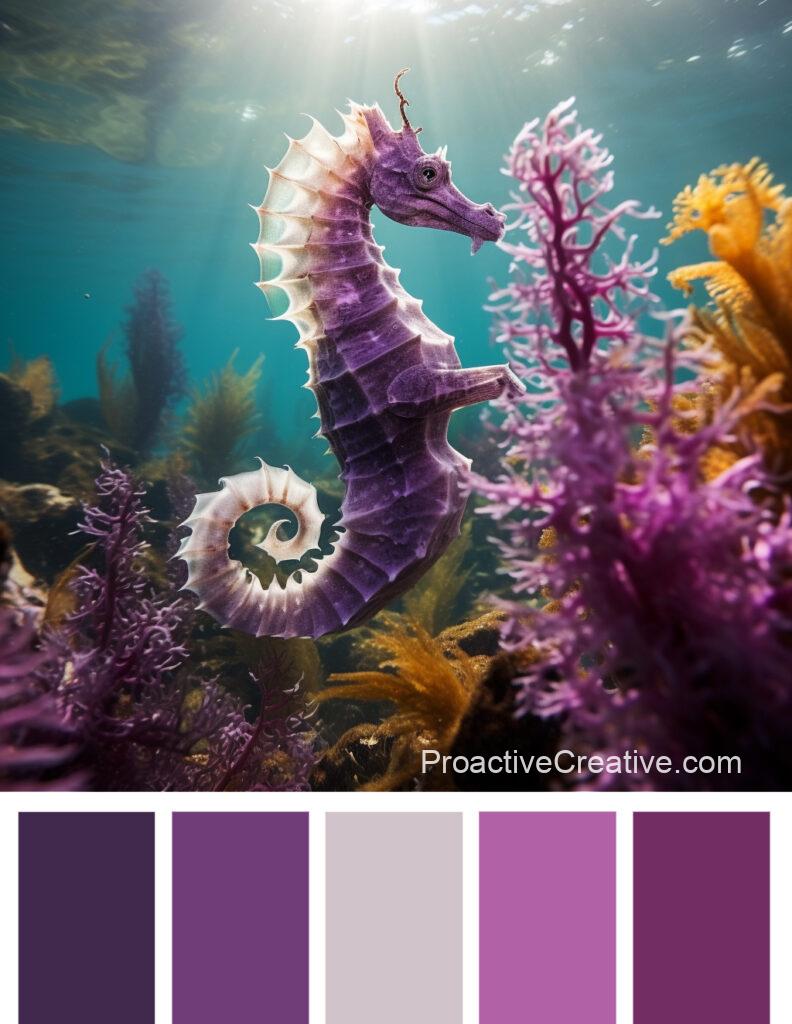
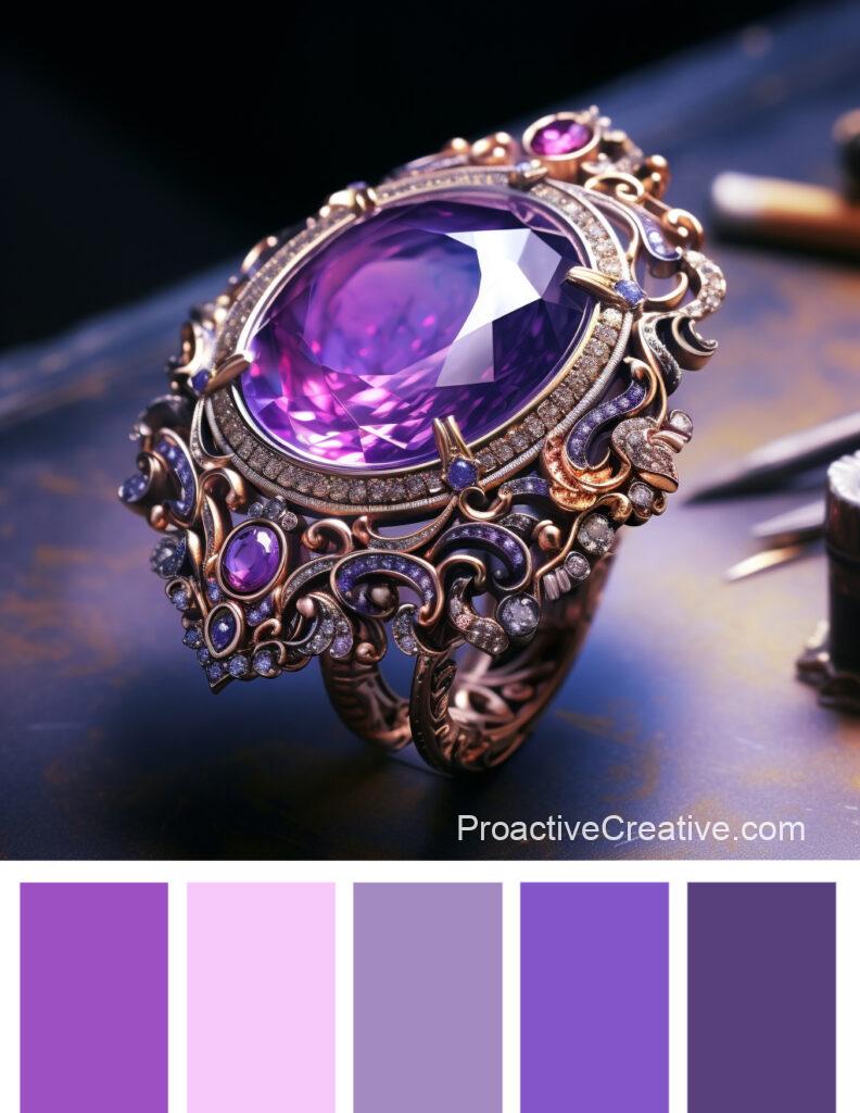
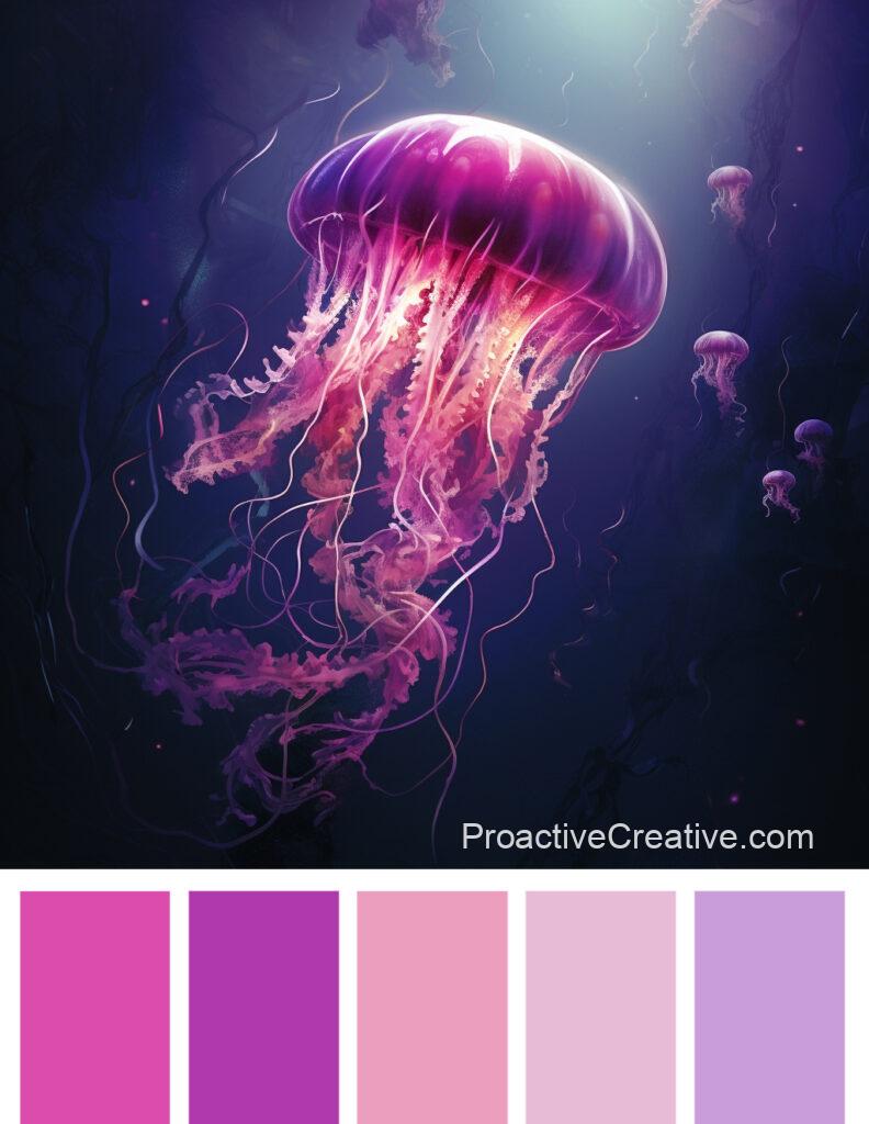
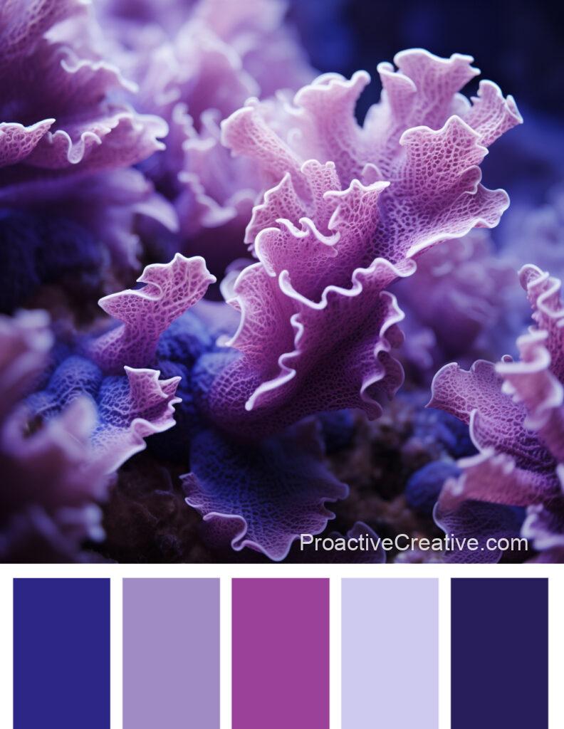
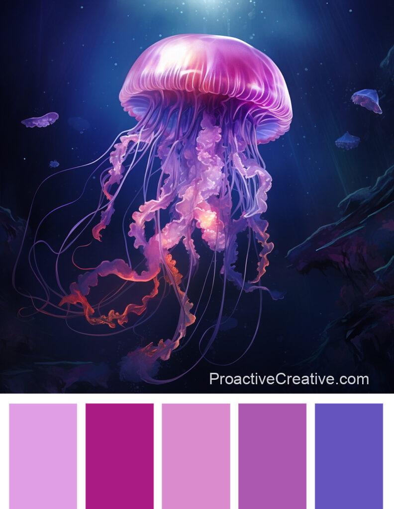
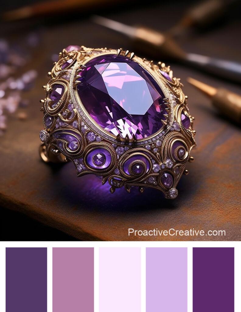
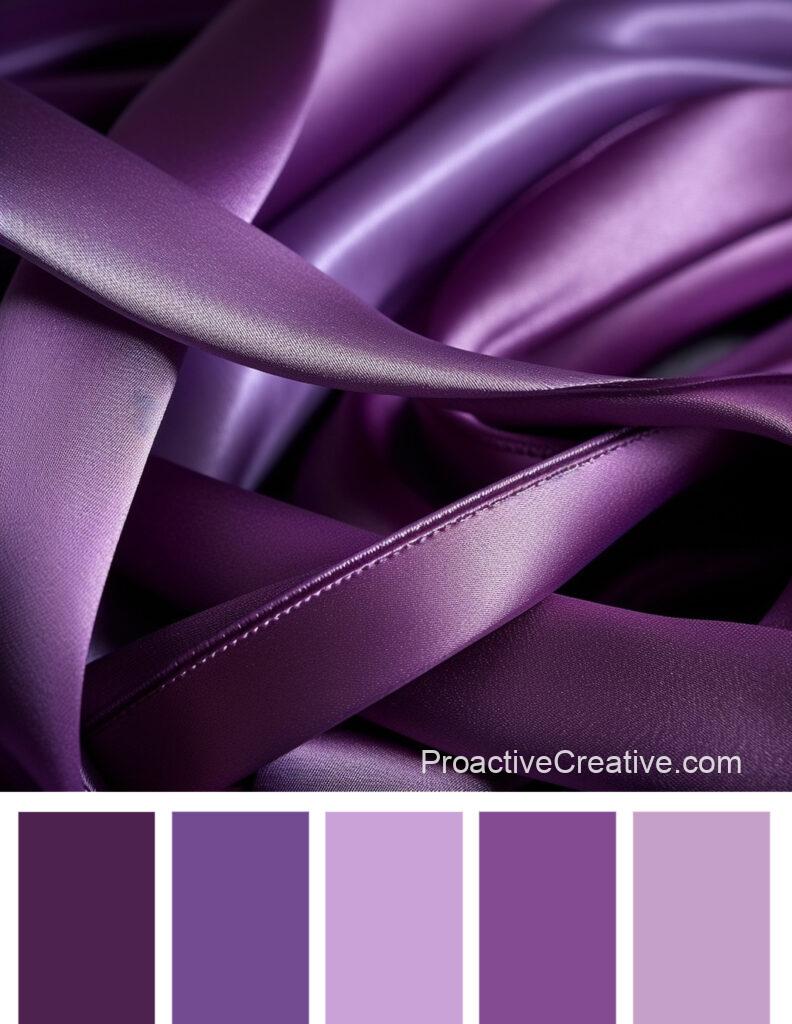
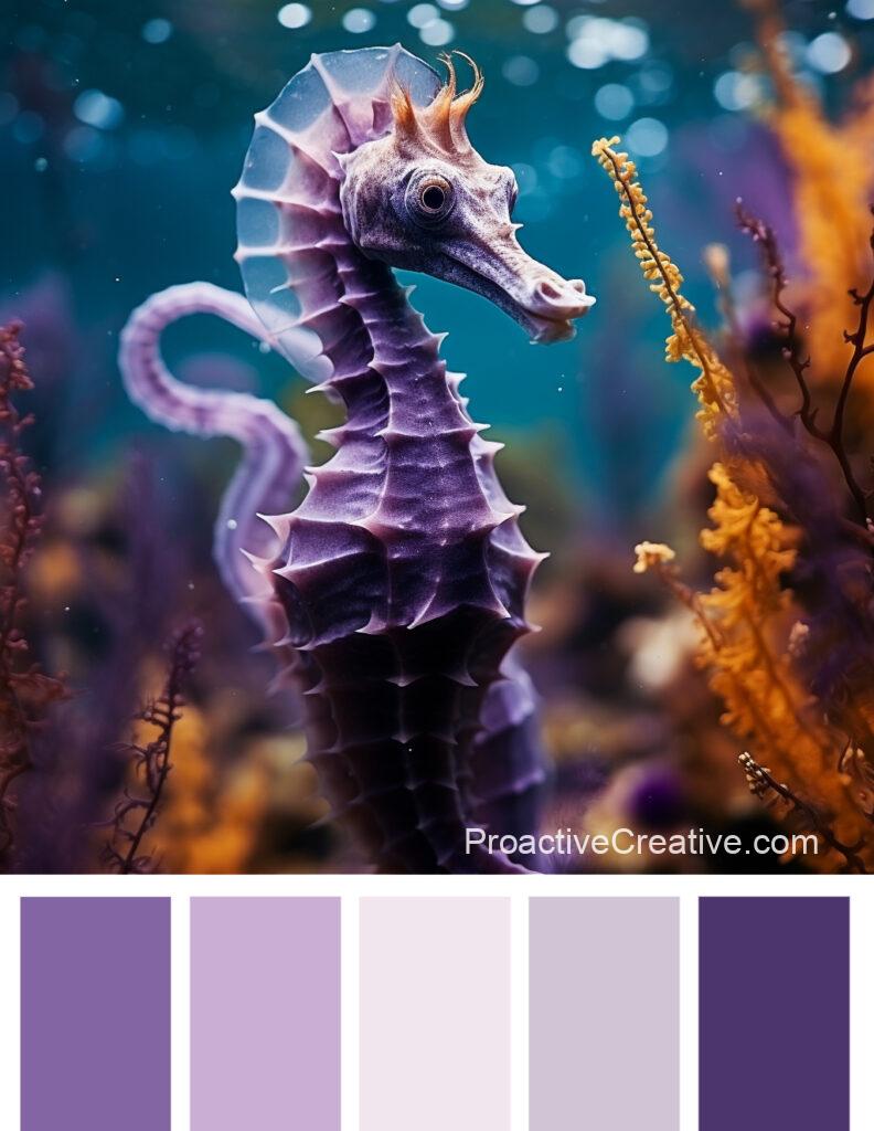
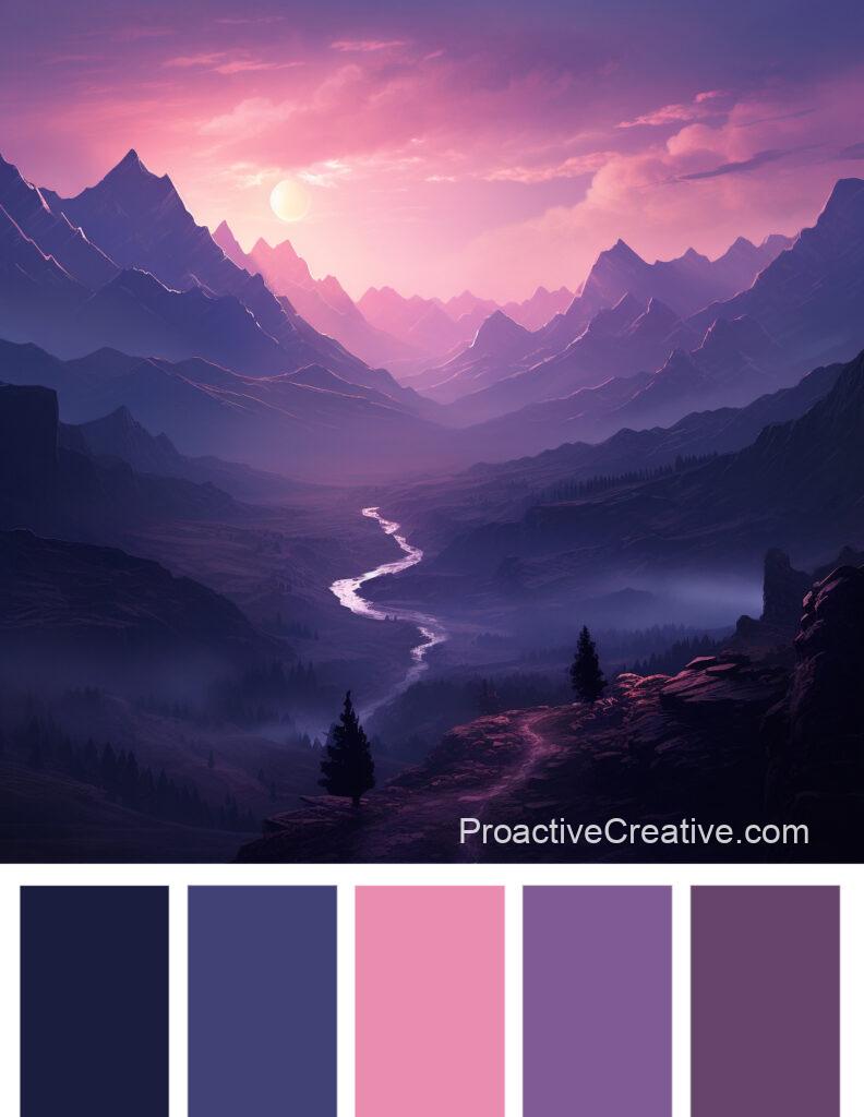
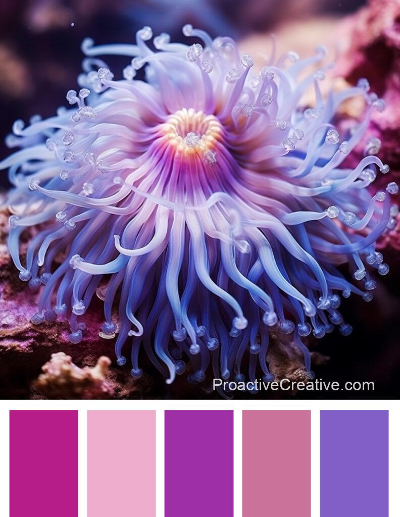
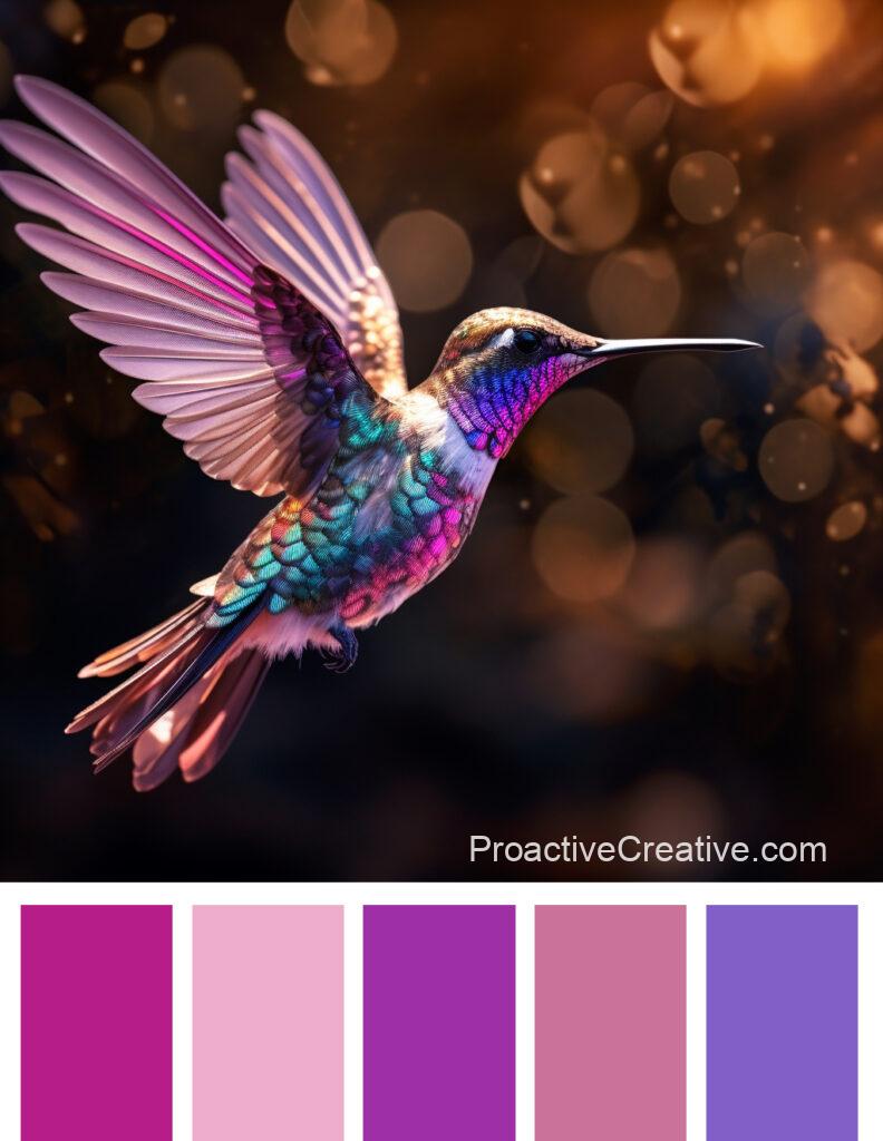
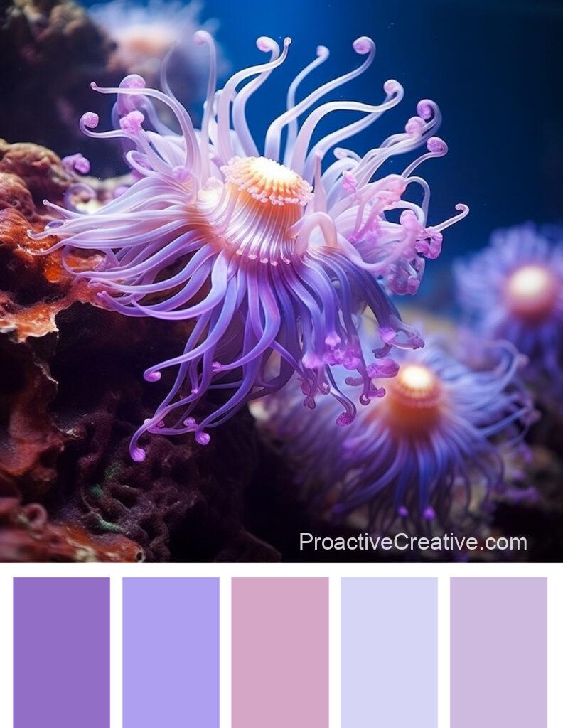
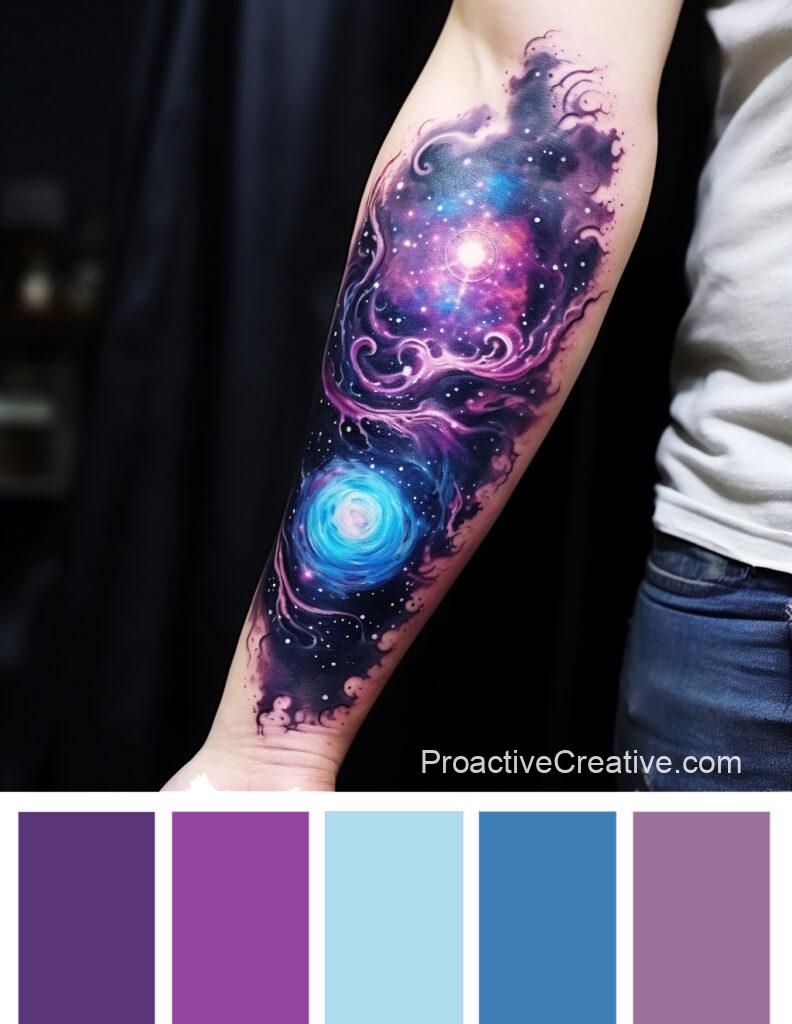
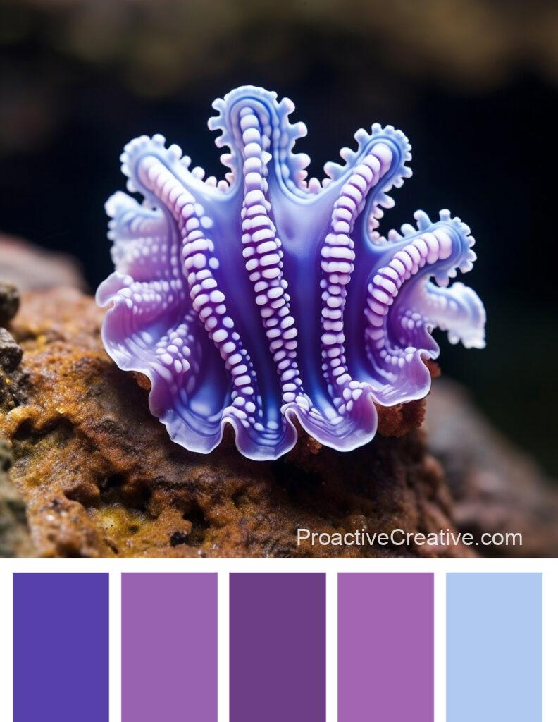
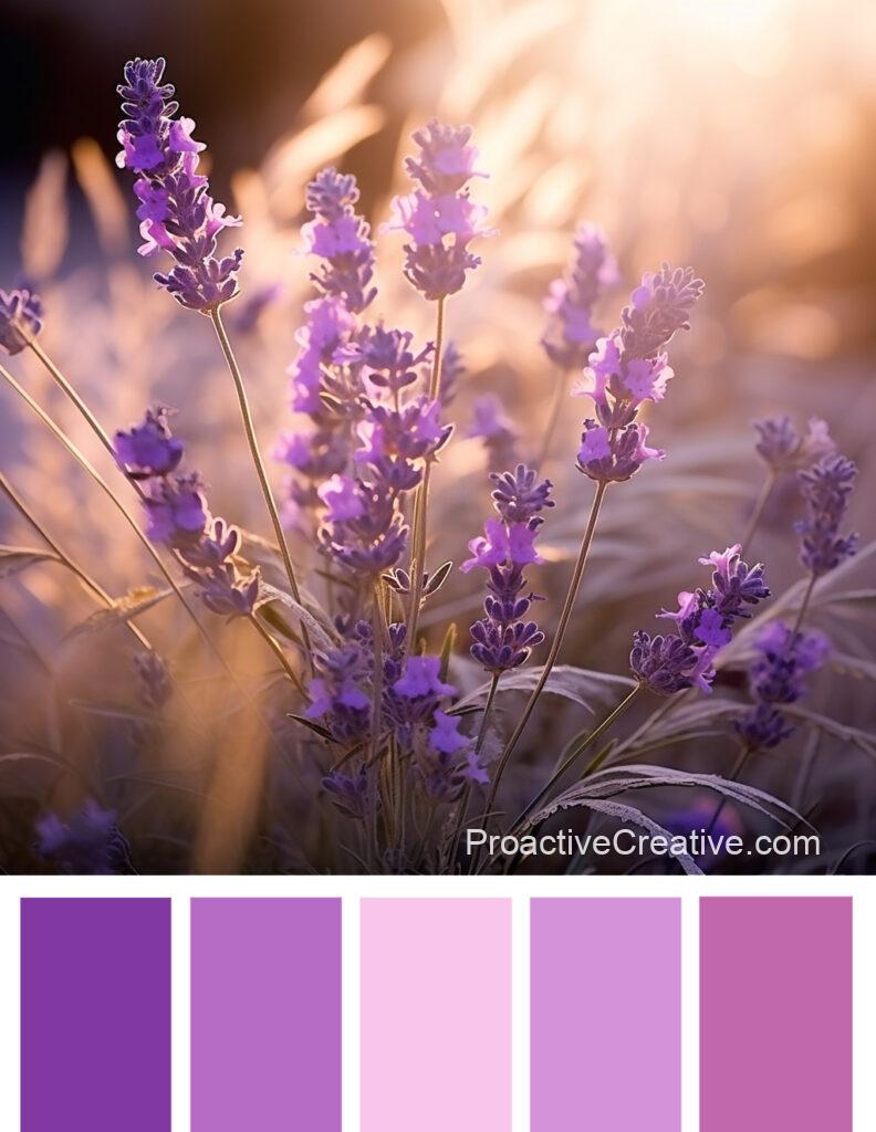
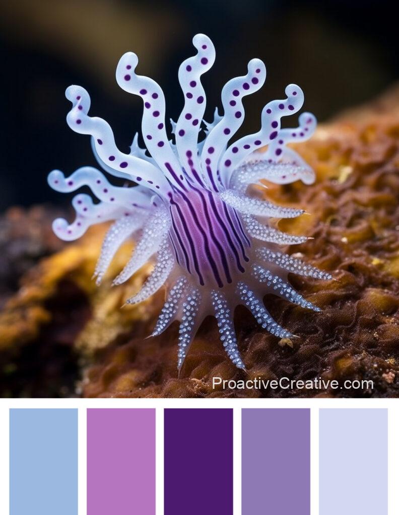
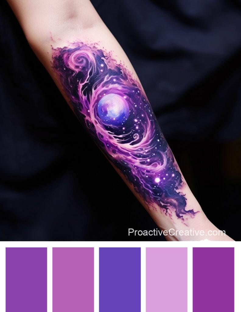
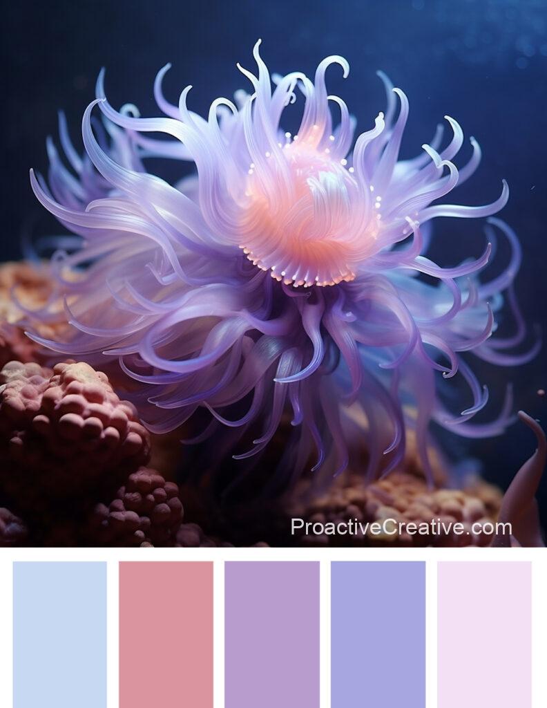
The color palettes mentioned above feature shades of purple, ranging from delicate lilac to deep eggplant. These shades add a touch of elegance and sophistication to any design or project.
Delicate lilac is a soft and gentle shade that brings a sense of calmness and tranquility. It pairs well with pastel colors like pale pink or light yellow, creating a harmonious and charming palette.
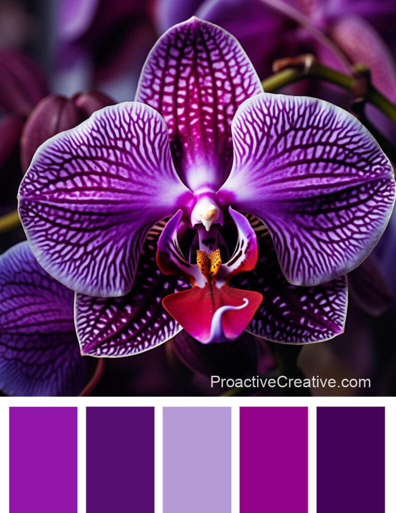
Moving on to deeper tones, we have shades like eggplant and dark plum. These rich purples bring depth and intensity to any composition. They create a dramatic contrast with lighter colors like beige or creamy.
Purple is often associated with creativity, spirituality, and luxury. The different shades in these palettes allow you to explore the versatility of this captivating color. Whether designing a wedding invitation or working on an art project, incorporating shades of purple can help evoke the desired mood or atmosphere.
So why not embrace the beauty of purple? Experiment with these stunning color palettes and let your creativity shine through!
Pink and Lilac Tones
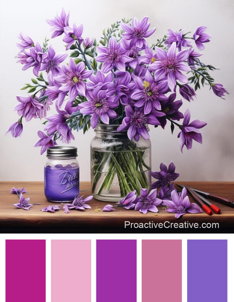
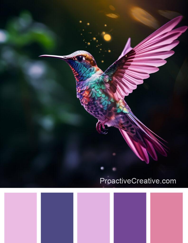
Explore the delightful range of pink and lilac tones in these palettes, perfect for adding a touch of softness and femininity to your designs.
In Color Palette #4504, you’ll find delicate pink that exudes elegance and sophistication. Its subtle hue is complemented by dull aquamarine, creating a calming and soothing combination. Lavender adds a touch of tranquility, while marine green brings an earthy element to the palette—shades of purple complete this harmonious collection.
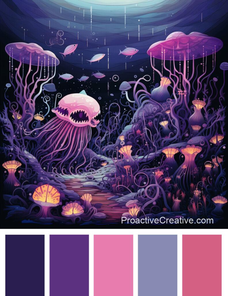
Color Palette #4498 offers delicate violet, which embodies gracefulness and charm. This enchanting shade is beautifully paired with eggplant, creating a rich and luxurious contrast. Lilac adds a dreamy quality to the palette, evoking a sense of nostalgia. The various shades of green and purple provide depth and dimension.
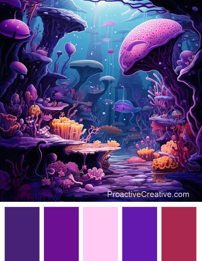
Lastly, let’s explore Color Palette #4481, which features dark pink as its standout tone. It injects vibrancy into any design with its bold and energetic presence. Delicate pink adds a softer touch, while pastel shades of purple create an ethereal atmosphere. With dark green, this palette strikes the perfect balance between femininity and strength.
Incorporating these pink and lilac tones into your designs will bring about an aura of elegance, gentleness, and romance that’ll captivate your audience’s attention.
Blue-Violet Hues
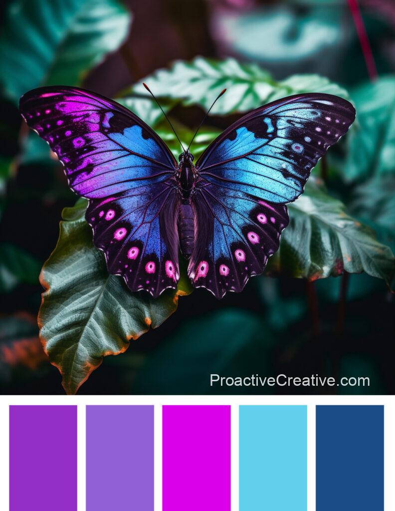
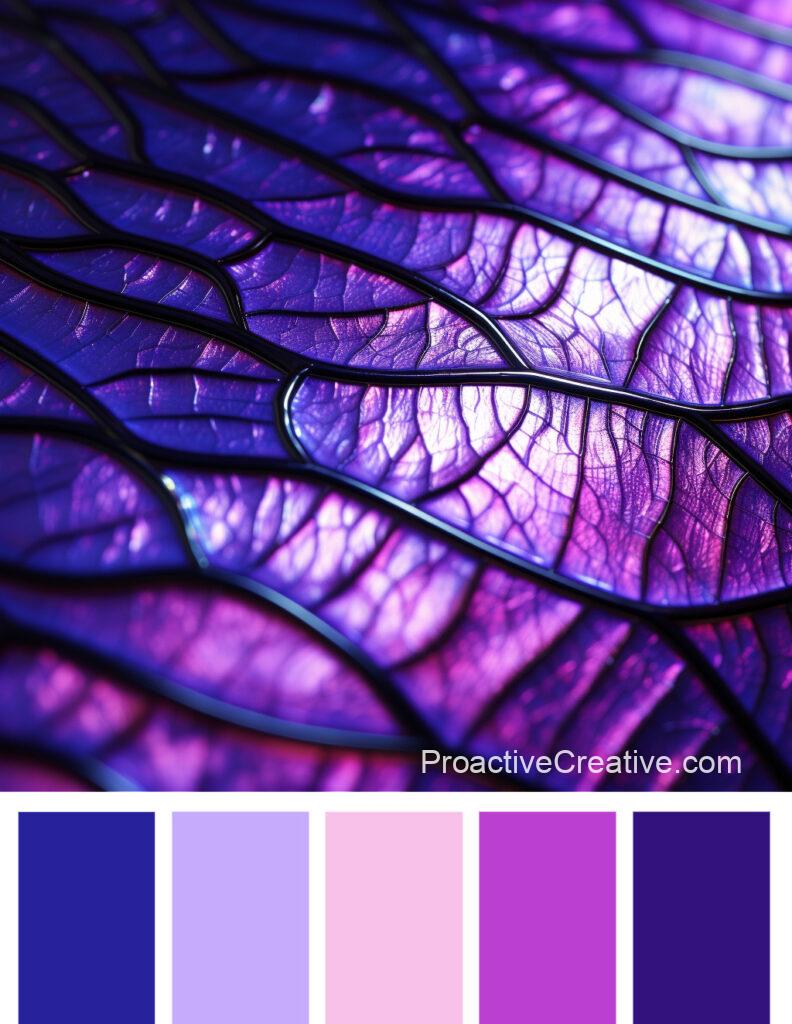
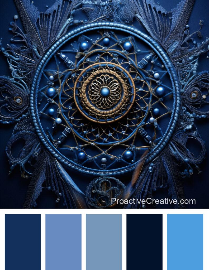
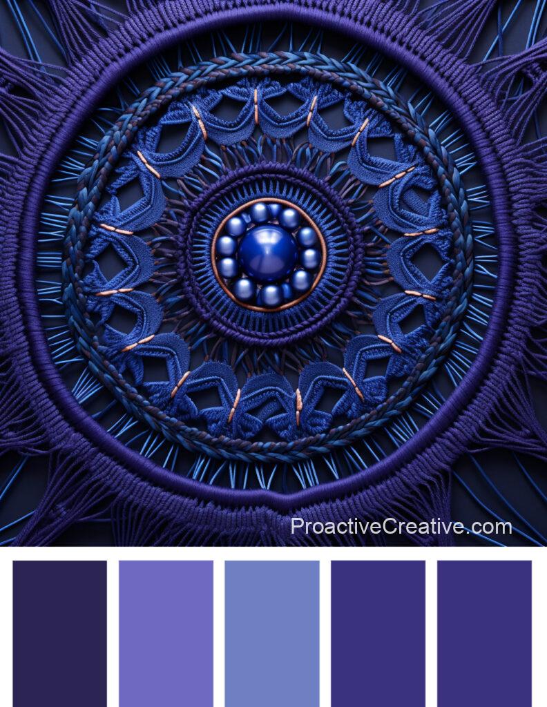
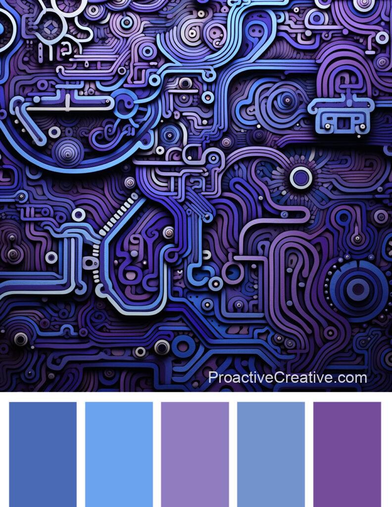
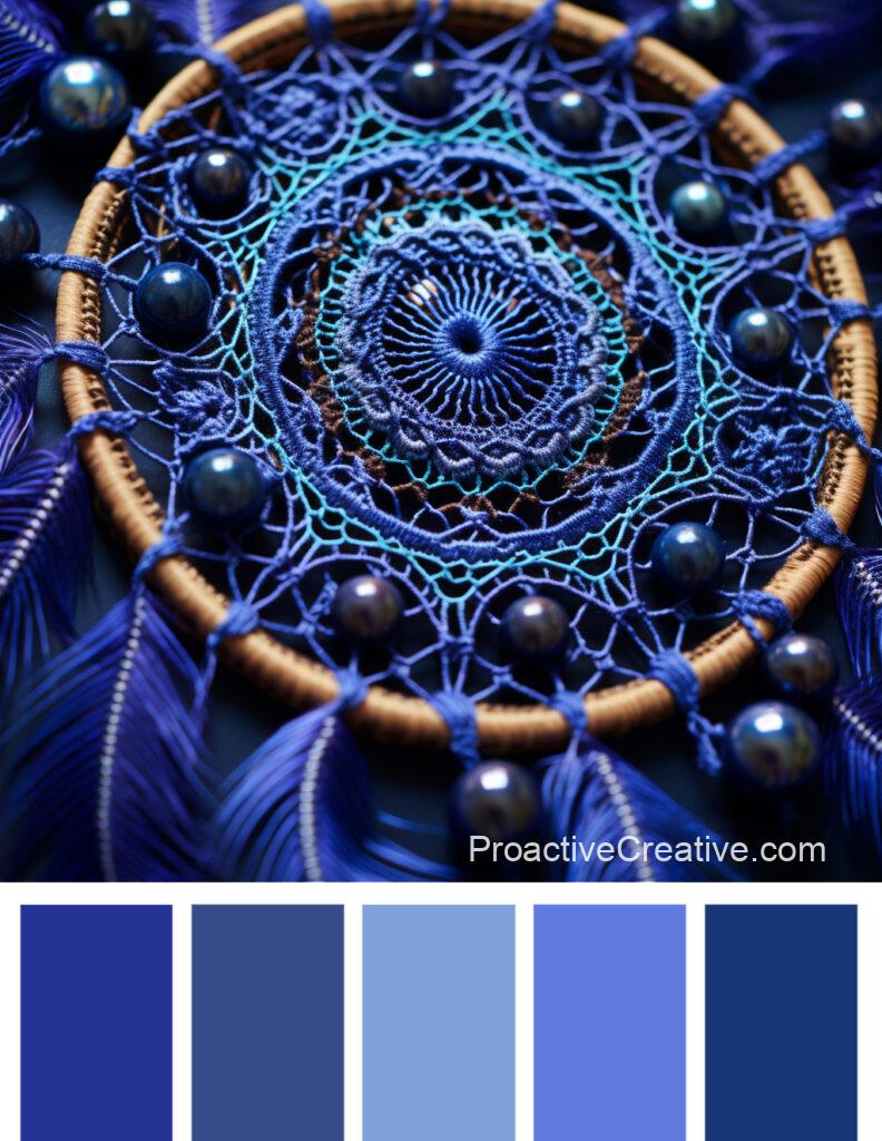
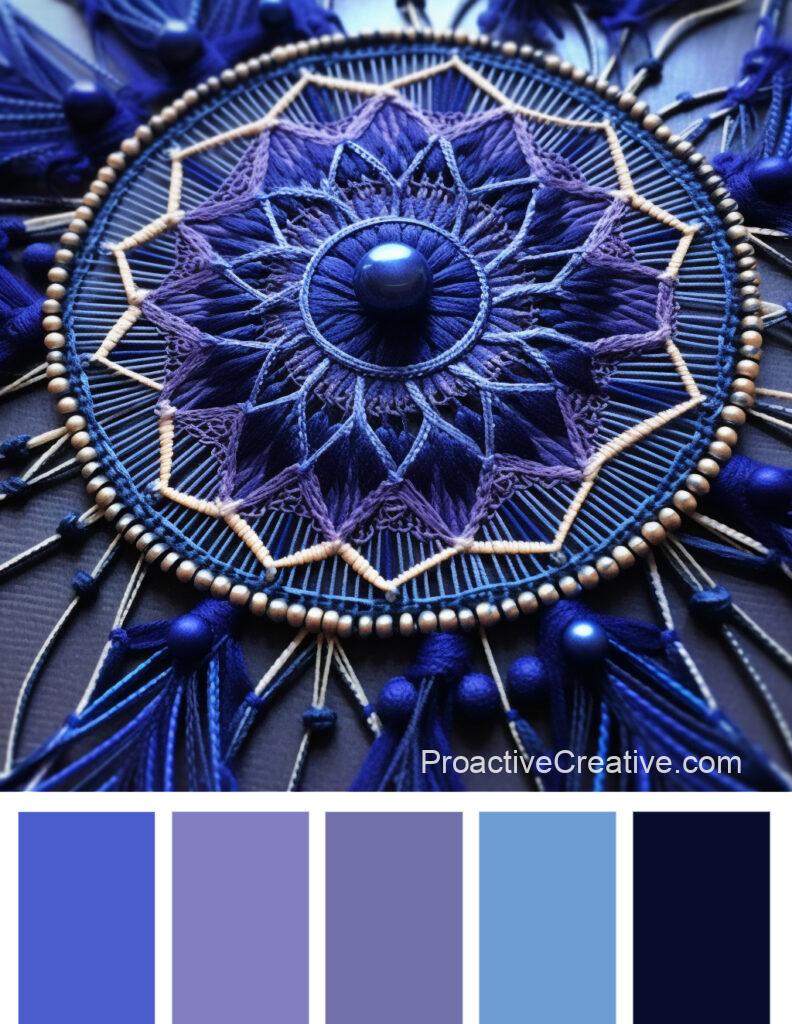
Immerse yourself in the captivating allure of blue-violet hues in these enchanting palettes. These color combinations effortlessly blend shades of blue and purple, creating a sense of tranquility and elegance. Their cool undertones evoke a feeling of serenity that’s perfect for any space or design project.
In Color Palette #4502, delicate lilac and blue-violet take center stage, complemented by light yellow and sunset colors. This combination creates a harmonious balance between warm and cool tones, creating a visually pleasing palette that exudes calmness.
Meanwhile, Color Palette #4485 showcases the beauty of blue-violet alongside gentle lilac and light yellow. The addition of orange adds a touch of vibrancy to this otherwise serene palette, making it ideal for designs that require a pop of energy.
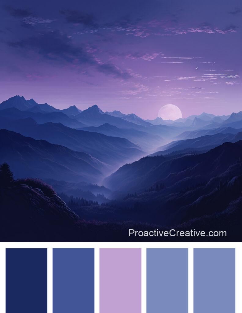
These blue-violet hues can be incorporated into various themes and styles. Whether aiming for a dreamy atmosphere reminiscent of twilight or seeking to create an elegant wedding aesthetic, these palettes offer endless possibilities.
So, embrace the allure of blue-violet hues in your next creative endeavor. Let them transport you to a world filled with tranquility, sophistication, and charm.
Delicate Pastels
Indulge in the enchanting world of delicate pastels, where soft hues and gentle shades combine to create a mesmerizing palette that exudes elegance and charm.
In this captivating realm of colors, you’ll immerse yourself in a dreamlike atmosphere, surrounded by the subtle beauty of pastel shades.
Within these delicate pastels, shades of purple take center stage. From delicate violet to lilac, these hues evoke a sense of tranquility and grace. They add a touch of sophistication to any design or space they adorn. Paired with other soft tones like pale pink or creamy beige, these purple pastels create an ethereal ambiance that’s both calming and uplifting.
But it’s not just purple that makes up this delightful palette. Shades of pink, ranging from delicate blush to dusty rose, blend effortlessly with the gentle purples. These feminine hues bring warmth and tenderness to the color scheme. Soft blues and greens add a refreshing element to the mix, reminiscent of springtime gardens and blooming flowers.
Sunset Inspired Colors
Step into the captivating realm of colors inspired by the mesmerizing beauty of a sunset, where vibrant hues and warm tones come together to create an enchanting palette that’ll ignite your imagination.
Picture yourself basking in the glow of deep oranges and fiery reds as the sun slowly dips below the horizon. These sunset-inspired colors bring warmth and tranquility to any space they adorn.
Imagine a room painted in burnt orange and golden yellow shades, reminiscent of the last rays of sunlight dancing across the sky. Accentuate this with dusky pink and soft lilac touches, evoking the delicate pastel hues that often accompany a breathtaking sunset. The result is a harmonious blend of rich earth tones and gentle pastels to soothe the senses.
To complete your sunset-inspired color palette, incorporate deep violet and indigo blue hints, mirroring the twilight sky. These fabulous shades add depth and contrast to your space, creating an atmosphere that captures serenity and awe-inspiring beauty.
Conclusion
In conclusion, purple color palettes offer designers and artists a versatile range of options. These palettes create delicate and soothing aesthetics with shades of purple, pink, lilac, and blue-violet. They can evoke various emotions and add depth to compositions when complemented by green, yellow, orange, and beige colors.
Purple Color Palettes
Are you a designer or artist looking to add a touch of elegance and tranquility to your creations? Look no further than purple color palettes. With their shades of purple, pink, lilac, and blue-violet, these palettes offer a wide range of options for evoking various emotions and creating visually appealing compositions.
Incorporating complementary colors like green, yellow, orange, and beige, these palettes go beyond just purple hues. Whether you’re aiming for a romantic ambiance or a calming atmosphere, the delicate pastel tones in these palettes will give your designs a soft and soothing aesthetic.
Some palettes even draw inspiration from sunsets or wedding pastels, adding depth and meaning to the color combinations. So why not explore the world of purple color palettes and let your creativity shine?
Shades of Purple
The color palettes mentioned above feature shades of purple, ranging from delicate lilac to deep eggplant. These shades add a touch of elegance and sophistication to any design or project.
Delicate lilac is a soft and gentle shade that brings a sense of calmness and tranquility. It pairs well with pastel colors like pale pink or light yellow, creating a harmonious and charming palette.
Moving on to deeper tones, we have shades like eggplant and dark plum. These rich purples bring depth and intensity to any composition. They create a dramatic contrast with lighter colors like beige or creamy.
Purple is often associated with creativity, spirituality, and luxury. The different shades in these palettes allow you to explore the versatility of this captivating color. Whether designing a wedding invitation or working on an art project, incorporating shades of purple can help evoke the desired mood or atmosphere.
So why not embrace the beauty of purple? Experiment with these stunning color palettes and let your creativity shine through!
Pink and Lilac Tones
Explore the delightful range of pink and lilac tones in these palettes, perfect for adding a touch of softness and femininity to your designs.
In Color Palette #4504, you’ll find delicate pink that exudes elegance and sophistication. Its subtle hue is complemented by dull aquamarine, creating a calming and soothing combination. Lavender adds a touch of tranquility, while marine green brings an earthy element to the palette—shades of purple complete this harmonious collection.
Color Palette #4498 offers delicate violet, which embodies gracefulness and charm. This enchanting shade is beautifully paired with eggplant, creating a rich and luxurious contrast. Lilac adds a dreamy quality to the palette, evoking a sense of nostalgia. The various shades of green and purple provide depth and dimension.
Lastly, let’s explore Color Palette #4481, which features dark pink as its standout tone. It injects vibrancy into any design with its bold and energetic presence. Delicate pink adds a softer touch, while pastel shades of purple create an ethereal atmosphere. With dark green, this palette strikes the perfect balance between femininity and strength.
Incorporating these pink and lilac tones into your designs will bring about an aura of elegance, gentleness, and romance that’ll captivate your audience’s attention.
Blue-Violet Hues
Immerse yourself in the captivating allure of blue-violet hues in these enchanting palettes. These color combinations effortlessly blend shades of blue and purple, creating a sense of tranquility and elegance. Their cool undertones evoke a feeling of serenity that’s perfect for any space or design project.
In Color Palette #4502, delicate lilac and blue-violet take center stage, complemented by light yellow and sunset colors. This combination creates a harmonious balance between warm and cool tones, creating a visually pleasing palette that exudes calmness.
Meanwhile, Color Palette #4485 showcases the beauty of blue-violet alongside gentle lilac and light yellow. The addition of orange adds a touch of vibrancy to this otherwise serene palette, making it ideal for designs that require a pop of energy.
These blue-violet hues can be incorporated into various themes and styles. Whether aiming for a dreamy atmosphere reminiscent of twilight or seeking to create an elegant wedding aesthetic, these palettes offer endless possibilities.
So, embrace the allure of blue-violet hues in your next creative endeavor. Let them transport you to a world filled with tranquility, sophistication, and charm.
Delicate Pastels
Indulge in the enchanting world of delicate pastels, where soft hues and gentle shades combine to create a mesmerizing palette that exudes elegance and charm.
In this captivating realm of colors, you’ll immerse yourself in a dreamlike atmosphere, surrounded by the subtle beauty of pastel shades.
Within these delicate pastels, shades of purple take center stage. From delicate violet to lilac, these hues evoke a sense of tranquility and grace. They add a touch of sophistication to any design or space they adorn. Paired with other soft tones like pale pink or creamy beige, these purple pastels create an ethereal ambiance that’s both calming and uplifting.
But it’s not just purple that makes up this delightful palette. Shades of pink, ranging from delicate blush to dusty rose, blend effortlessly with the gentle purples. These feminine hues bring warmth and tenderness to the color scheme. Soft blues and greens add a refreshing element to the mix, reminiscent of springtime gardens and blooming flowers.
Sunset Inspired Colors
Step into the captivating realm of colors inspired by the mesmerizing beauty of a sunset, where vibrant hues and warm tones come together to create an enchanting palette that’ll ignite your imagination.
Picture yourself basking in the glow of deep oranges and fiery reds as the sun slowly dips below the horizon. These sunset-inspired colors bring warmth and tranquility to any space they adorn.
Imagine a room painted in burnt orange and golden yellow shades, reminiscent of the last rays of sunlight dancing across the sky. Accentuate this with dusky pink and soft lilac touches, evoking the delicate pastel hues that often accompany a breathtaking sunset. The result is a harmonious blend of rich earth tones and gentle pastels to soothe the senses.
To complete your sunset-inspired color palette, incorporate deep violet and indigo blue hints, mirroring the twilight sky. These fabulous shades add depth and contrast to your space, creating an atmosphere that captures serenity and awe-inspiring beauty.
Conclusion
In conclusion, purple color palettes offer designers and artists a versatile range of options. These palettes create delicate and soothing aesthetics with shades of purple, pink, lilac, and blue-violet. They can evoke various emotions and add depth to compositions when complemented by green, yellow, orange, and beige colors.


