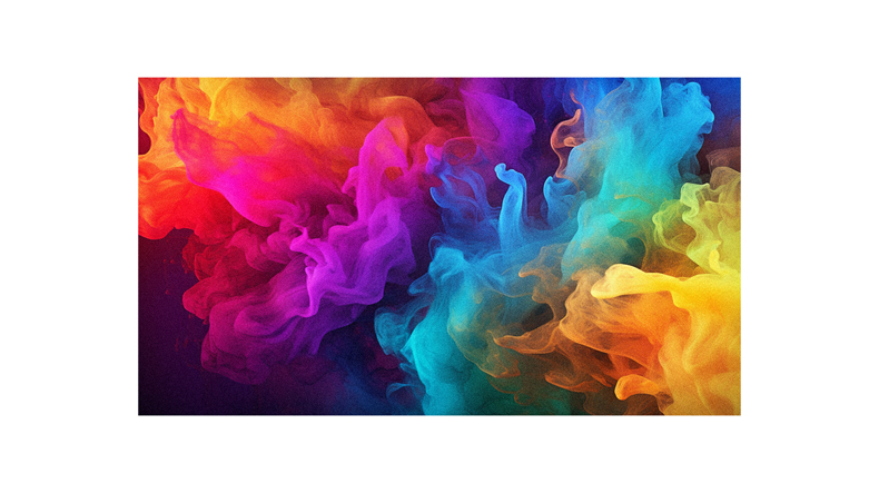
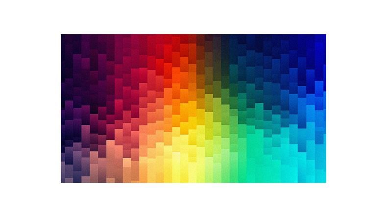
Imagine waking up to a fiery red sunrise, feeling invigorated and ready to tackle the day. Or sinking into a calming blue ocean, instantly relaxed. You’re not just reacting to the beauty of these scenes; it’s the colors that are evoking these emotions in you. Colors have a profound influence on our feelings and moods, according to color theory and psychology.
Warm hues like reds and yellows can spark joy and energy, while cool tones such as greens and blues soothe us. Certain shades even carry unique meanings – think about how black symbolizes power or sorrow.
But did you know this relationship between colors and feelings may vary depending on factors like your age, gender or culture? In this article, we’ll dive deep into the intriguing world of color-emotion associations, looking at both universal patterns and cultural variations, all to help us understand why we react so emotionally to different shades around us.
What are colors?
So, what exactly are colors and how do they tie into our emotions? Let’s dive in!
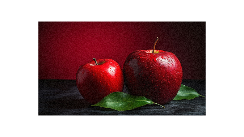
Colors are light waves absorbed or reflected by objects. When you look at a red apple, it appears red because the apple absorbs all other color wavelengths and reflects only the red wavelength back to your eyes.
Now here’s where it gets interesting – these colors aren’t just visually pleasing or useful for differentiation, they also have a profound impact on our feelings and moods. This connection between colors and emotions is so strong that certain hues can evoke specific emotional responses from us.
For instance, warm colors like red might stir up passion while cool blues might bring about calmness. Fascinating, isn’t it?
Psychology of color
Imagine you’re painting a mental picture, with each color having the power to stir up different emotions within you; it’s like an artist’s palette where every hue is a unique blend of psychology and symbolism.
Warm colors like red and orange can ignite feelings of passion or urgency, while cooler tones like blue and green bring calmness.
Yellow radiates happiness, but also caution.
Colors aren’t just shades; they hold power in their ability to influence mood and behavior.
Brands use this knowledge to sway your thoughts toward their products, too!
So remember, whether you’re painting that mental image or deciding on a product, consider color’s impact on your psyche – it’s more influential than you might think.
Color associations
While it’s clear that hues can significantly impact our emotions, it’s worth noting the specific associations each color can carry.
Warm colors like red and orange are often linked with energy and optimism, while cool tones like blue and green evoke calmness and security.
Interestingly, yellow is associated with happiness in warmer countries but tends to be more joyful in colder climates.
Color-emotion connections aren’t just one-to-one; they’re many-to-many! For instance, red can signify both love and danger, depending on the context.
Keep these associations in mind when choosing colors for your designs or even your wardrobe – you might find that a splash of aquamarine brings peace to your day!
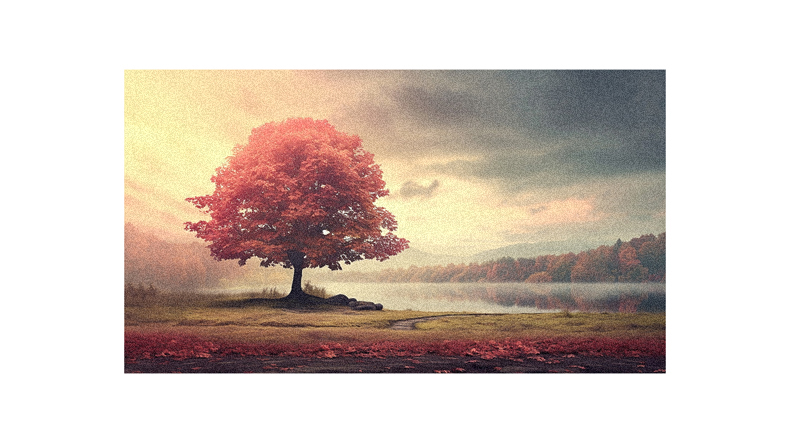
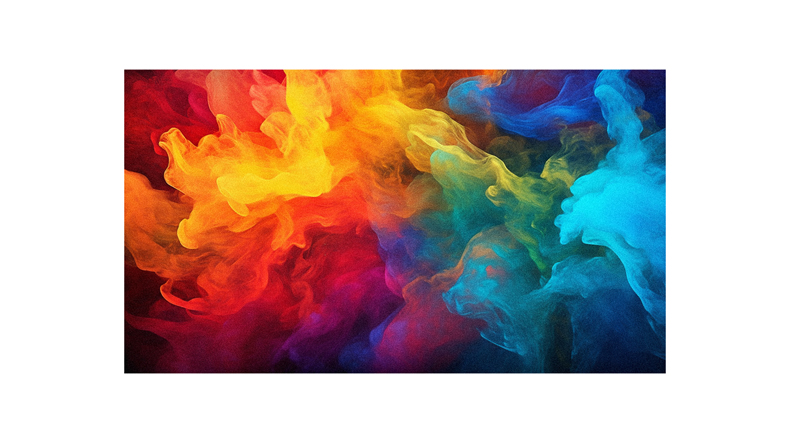
Warm colors and emotions
Drenched in the fiery hues of red, orange, and yellow, your surroundings can ignite a flame of positivity within you, sparking joy and enthusiasm like a sunrise at dawn. These warm colors aren’t just visually enticing; they directly impact your feelings.
Imagine sitting in a room bathed in vibrant reds or bright oranges. You’d likely sense an energy surge, wouldn’t you? This is because warm colors have been linked to happiness and optimism.
Now, picture a sunny day with radiant yellows filling the sky. Wouldn’t it make you feel energized and cheerful? It’s no wonder that many fast food chains utilize these lively hues to stimulate appetite and prompt quick decision-making. But be cautious; these same stimulating colors can signal danger or urgency when excessively used. So, balance is key!
Cool colors and emotions
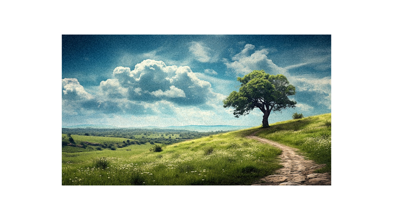
Have you ever noticed how a calm blue sky or a serene green forest can instantly soothe your mind? This isn’t accidental. Cool colors like green and blue have calming effects on our emotions. They’re often used in settings where peace, security, and relaxation are desired – think spas, hospitals, and yoga studios.
Green brings balance and freshness; it’s associated with growth and tranquility. Blue is synonymous with trustworthiness and dependability – that’s why you’ll see it frequently used by big corporations. Purple combines the calmness of blue with the fierceness of red to create an aura of creativity, wealth, and mystery.
So, next time you feel stressed, try surrounding yourself with cool colors for much-needed soothing vibes.
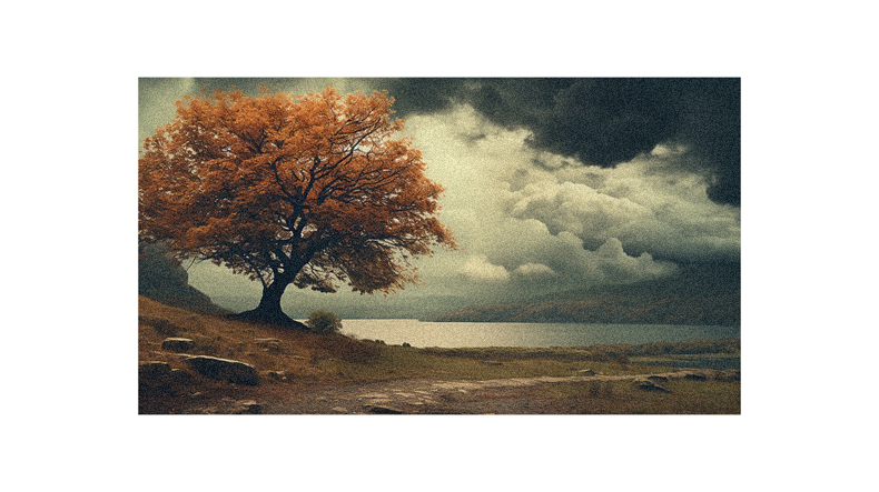
Happy and sad colors
So, you’ve learned about cool colors and how they can evoke calmness and tranquility. Now, let’s delve into the world of happy and sad colors.
Happy colors are usually bright and warm, like red, orange, or yellow, making you feel energetic, optimistic, and cheerful. On the other hand, sad colors tend to be dark and muted, such as deep blues or grays; these hues often elicit feelings of melancholy or desolation. Yet, remember that perception of color is personal – what may seem joyful to one could appear gloomy to another.
It’s essential to consider this when deciding on color schemes for your designs or even your living space! After all, color is more than just aesthetics; it’s an emotional language we all understand.
Energizing colors
Are you looking for a burst of energy? Vibrant, highly pigmented colors can give you just the jolt you’re after. Think fiery reds, bright oranges, or sunny yellows. These energizing colors are bold and attention-grabbing, often evoking excitement and enthusiasm. They’re great to use to stand out or stimulate action.
However, remember that context is critical in color psychology. While these energetic hues might be perfect for a fitness logo or an advertising campaign to grab attention quickly, they could be overwhelming in a calm spa setting or on a website dedicated to relaxation techniques. Ultimately, understanding how colors influence our mood and behavior can help us make more informed choices in our professional and personal lives.
Specific color meanings
Let’s dive into what different colors symbolize, helping you understand their powerful psychological impacts. Red can stir passion or anger, while orange radiates energy and cheerfulness. Yellow is usually associated with happiness and extraversion.
On the other hand, green conveys freshness and security, making it a common choice for brands promoting health and balance. Blue tends to have a calming effect and signifies trustworthiness – no wonder many corporations use it! Purple often sparks creativity and is linked to wealth and royalty.
Pink can be playful or romantic, depending on its shade. Brown gives off a feeling of warmth and stability, whereas black denotes power but also mourning. White suggests simplicity and peace, while gray is seen as mature and neutral.
Cultural influences on color
Diving into the vibrant tapestry of cultural influences, it’s fascinating to see how hues can hold different meanings across the globe.
For instance, while white symbolizes purity and innocence in Western cultures, it represents mourning and death in many Eastern societies.
Similarly, red might mean love and passion to you, but it signifies luck and prosperity in China.
Even within a single color like blue, there are variations; sky blue is calming for some people, while navy blue might evoke feelings of authority or stability.
It’s not just about individual colors, though – color combinations also matter. Red and green together could remind you of Christmas cheer but might be seen as unlucky in other cultures!
Remember this when choosing colors for global communication or design.
Age differences in color perception
As we journey through the stages of life, our eyes encounter a kaleidoscope of colors that could shift in appeal and perception, suggesting an intriguing interplay between age and color sensibilities.
Young ones often gravitate towards bright, vibrant hues like reds and yellows. As you mature, your preference might lean toward cooler tones, such as blues or greens, due to their calming effect.
In older age, muted shades may seem more appealing for their subtlety and ease on the eyes. However, remember these are general assumptions; individual preferences can vary greatly.
It’s fascinating how our relationship with colors evolves as we age, reflecting changing tastes and mirroring our emotional state at different points in life.
Geographic influences on color
It’s truly captivating how our location can dramatically sway our color preferences and associations.
For instance, the International Color-Emotion Association Survey found that people living closer together geographically had more similar color-emotion associations.
The influence of geography on colors extends even to climate; yellow, a color often associated with joy, was found to be most joyful in colder and rainier countries.
Interestingly, people’s feelings about yellow also varied based on proximity to the equator.
So next time you’re pondering why certain colors resonate with you, consider your surroundings.
Geography plays an unexpected role in shaping our emotional response to colors, reminding us how interconnected we are with the world around us.
Universal color-emotion associations
Peering through the kaleidoscope of human emotions, we find a few universal truths – like how certain hues tend to paint our moods with broad strokes across all cultures.
A global survey involving nearly 90 countries and 12,000 participants reveals that most colors are linked to positive emotions, while darker ones connect to negative feelings.
Surprisingly, red stirs up both positive and negative reactions universally.
You’ll also discover that yellow invokes joy more in warmer climates than colder ones. So, whether you’re in Saudi Arabia or Colombia, a sunny shade might just lift your spirits!
Remember this gem of wisdom the next time you’re deciding on a color for something significant – it’s not just about aesthetics but how it makes you feel too.
Unanswered questions in color psychology
Building on our understanding of universal color-emotion associations, there are still many unanswered questions in the field of color psychology.
How are these associations influenced by personal experiences or cultural backgrounds?
Does age play a role in how we perceive colors and associate them with feelings?
Are there gender differences in color perceptions and emotional responses?
What about the impact of physical environments on our relationship with colors?
These queries call for more detailed research to delve into this fascinating subject. So, keep your eyes peeled and stay curious!
As scientists continue to unravel the mysteries of color psychology, you’ll gain new insights into how colors can influence your emotions, shape your perceptions, and even guide your actions.
Future research in color psychology
Looking ahead, there’s a wealth of potential in the field of color psychology for further research. As we continue to explore how colors impact our feelings and behaviors, your understanding of this relationship might change.
There are so many unanswered questions. For instance, how do physical environments influence people’s reactions to colors like yellow? How do age and gender play into these associations? Are there cultural variations that haven’t been fully explored yet?
These are just a few areas where future studies could shed light on. So stay tuned! The findings from these investigations could revolutionize not only the fields of design and marketing but also our everyday understanding of how color influences our lives.
Follow us on Pinterest for more tips, tutorials, and artist reviews!