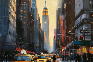
Imagine stepping into a space and feeling energized and inspired.
How is it that colors can have such a profound impact on our emotions and well-being?
It’s all about color psychology in interior design.
As an interior designer, I understand the power of color to influence the mood and atmosphere of a space.
Each color has its unique meaning and can evoke different emotions within us.
Each hue holds the key to creating a balanced and cohesive home, from the passionate reds to the calming blues.
This article will explore how colors affect our emotions, delve into their meanings, and discuss how to use them effectively in interior design.
We will discover why red is perfect for creative spaces like home offices, why green promotes balance in bedrooms, why blue creates tranquility in communal areas, why purple sparks inspiration in artistic spaces, and much more.
So join me as we unlock the secrets of color psychology in interior design and create spaces that optimize our well-being.
What colors mean
So, you’re curious about what colors mean? Let’s dive into the fascinating world of color psychology and discover the emotions and moods each color can evoke in your home.
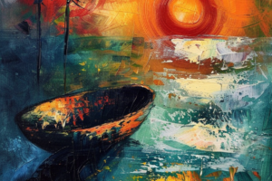
Colors have a powerful impact on our emotions and can significantly influence the atmosphere of a space. For example, warm colors like red, orange, and yellow evoke happiness and energy. Red is associated with passion and power, while orange stimulates creativity and enthusiasm.
On the other hand, more fabulous shades like green, blue, and purple create a calming effect and are ideal for bedrooms or spaces where relaxation is desired. Purple is also known to improve creativity.
So, when choosing colors for your home, consider how they will make you feel and what atmosphere you want to create in each room.
Colors and emotions
Immerse yourself in a world of emotions as colors come alive in your home, painting the canvas of your feelings and creating an atmosphere that resonates with your soul.
Colors profoundly impact our emotions, and understanding their psychological effects can help us design spaces that evoke the desired mood.
Warm colors like red, orange, and yellow are vibrant and energetic, perfect for areas where you want to feel lively and invigorated.
More fabulous shades like green, blue, and purple bring a sense of calmness and tranquility, making them ideal for bedrooms or relaxation spaces.
Pink walls can make people and furnishings look brighter while calming the mind.
Blue is associated with stability and better sleep, while green has a soothing impact on anxiety levels.
By choosing colors wisely in interior design, we can create spaces that look beautiful and nurture our emotional well-being.
Using red in design
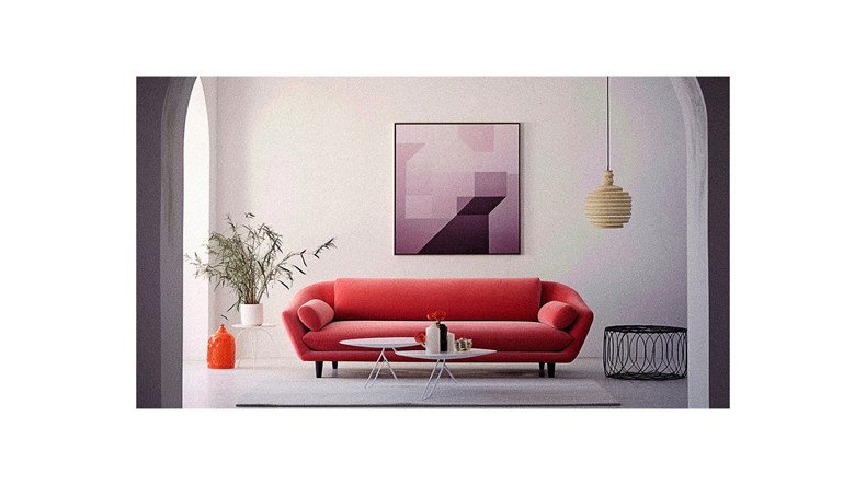
Red brings a fiery and passionate energy to any space, igniting creativity and ambition. It’s a bold color that demands attention and can create a powerful impact.
When using red in design, it’s essential to consider the emotions it evokes. Red is perfect for creative spaces like home offices or studios, as it stimulates passion and excitement. It also increases appetite, making it an excellent choice for kitchen and dining areas. However, it’s best to avoid using red in relaxing areas like bedrooms, bathrooms, or living rooms where you want to create a calm atmosphere.
Red is all about intensity and power, so use it strategically to make a statement in your interior design.
Using orange in design
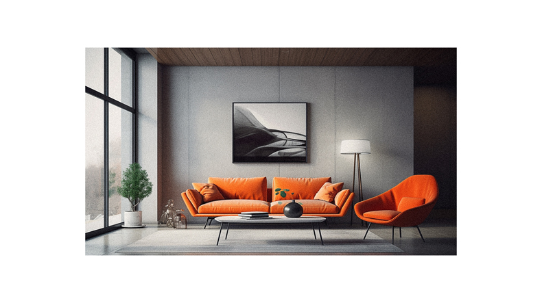
Consider incorporating orange into your design to add fun and energetic enthusiasm to your space. It boosts creativity and increases energy levels. Orange is a vibrant color that stimulates physical effects such as increased activity, socialization, oxygen supply to the brain, and joy.
It is perfect for areas in the home that need a boost of energy and confidence, like home gyms or creative spaces. Soft shades of orange, like peach or apricot, are more manageable if you prefer a subtler touch. You can use orange in small doses and accent pieces throughout your space to add pops of color.
With its ability to uplift and invigorate, orange is an excellent choice for creating a lively atmosphere in any room.
Using yellow in design
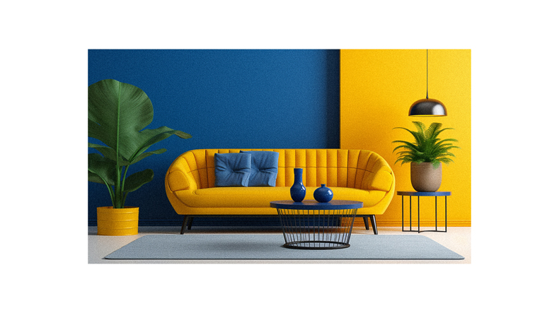
Incorporating yellow into your space can bring a touch of happiness and optimism. It creates an energetic and vibrant atmosphere throughout the room. Yellow is related to feelings of positivity and can instantly brighten up any space. However, it is not considered a relaxing color due to its brightness. Yellow does increase energy levels, making it ideal for high-traffic areas like the kitchen and living room.
When using yellow in your design, it’s important to use it in small doses or as accent pieces. This is to avoid overwhelming the space. Shades like golden and mustard can add chicness and playfulness to a room while maintaining balance.
So infuse your space with cheerful yellow hues for a lively and uplifting ambiance!
Using green in design
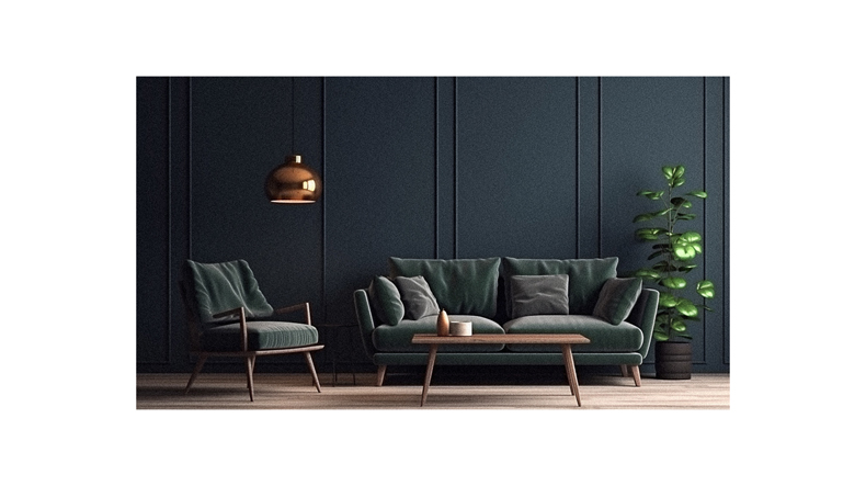
When you bring the refreshing and rejuvenating power of green into your space, you’ll create an atmosphere of balance and growth that invigorates your senses. Green is known for its ability to stimulate feelings of serenity and restoration.
Whether you choose deep shades like emerald or lighter hues like sage, green can be used throughout your home to enhance focus and promote a sense of calmness. Deeper greens add intensity and elegance to the space in bedrooms, dens, and home offices. On the other hand, lighter shades such as mint or jade can boost concentration levels and are suitable for any room in the house.
By layering different shades of green, you can create dimension and depth while incorporating color psychology into your interior design.
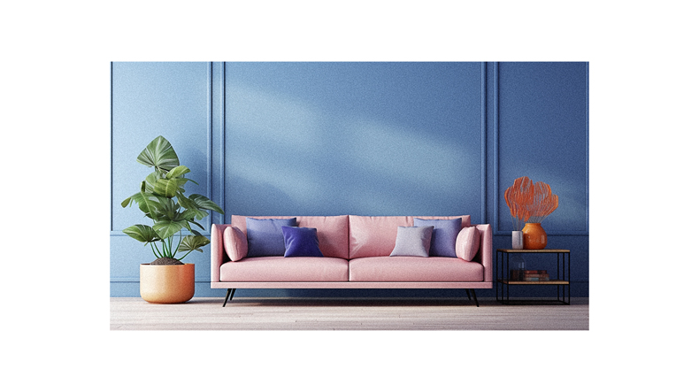
Using blue in design
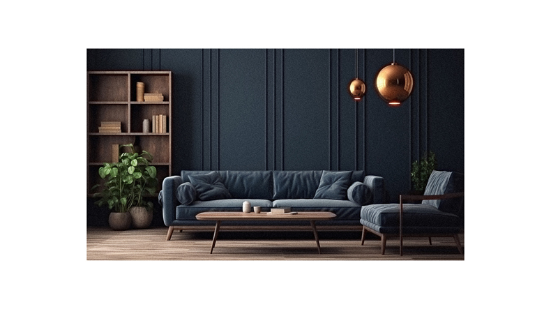
Immerse yourself in the calming and tranquil ambiance created by incorporating various shades of blue throughout your space.
Blue is a versatile color that evokes feelings of calmness stability, and promotes better sleep. It’s an ideal choice for bedrooms and areas where relaxation is desired. Whether you choose a deep navy blue for a masculine touch or a soft baby blue for a feminine feel, blue can effortlessly transform any room into a serene oasis.
Not only does blue create a sense of peace, but it also fosters feelings of community and connectedness. By incorporating different shades of blue, you can create depth and dimension in your design while maintaining an overall soothing atmosphere.
So embrace the tranquility of blue and let it wash over your space with its serene beauty.
Using purple in design
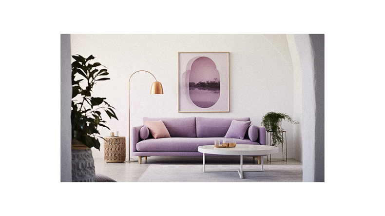
Now, let’s explore how we can use purple in interior design. Purple is a color that evokes creativity, depth, and inspiration. It’s a fantastic choice for studios, home offices, craft rooms, and any area where you want to foster artistic expression.
Darker hues of purple can make a space feel luxurious and sophisticated. On the other hand, lighter shades of purple create a sense of softness and playfulness in a room. You can create dimension and depth by incorporating different shades of purple into your design scheme.
Whether you choose to use it as an accent color or as the main focus of a room, purple adds an element of intrigue and imagination to your space.
Using pink in design
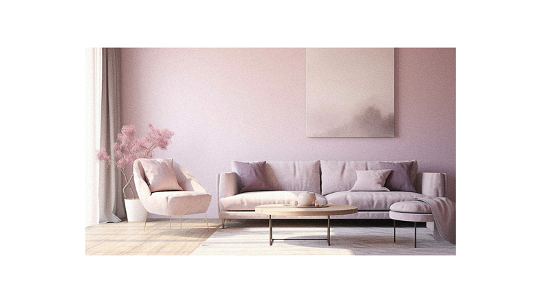
Embrace the soft embrace of pink, and let its love-infused hue bring brightness and femininity to your space.
Pink represents love, nurturing, and softness, making it a perfect choice for creating a warm and inviting atmosphere in any room.
Whether you opt for blush, rose, or flamingo tones, pink can add a touch of playfulness and elegance to your design.
Deeper shades like magenta and fuchsia can enhance maximalist designs, while coral and salmon offer gender-neutral options.
Pink walls can make both people and furnishings look brighter and more flattering.
Not only does pink add visual appeal to a space, but it also has calming effects on the mind, reducing aggression and promoting relaxation.
So incorporate pink into your interior design to create a soothing oasis that radiates love and tranquility.
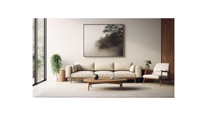
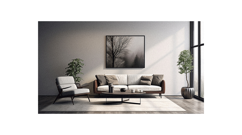
Using white and black in design
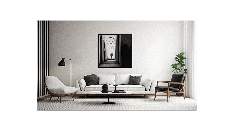
Transform your space with the timeless elegance of white and black, creating a sophisticated and powerful atmosphere that captivates the senses.
White is a versatile color that symbolizes purity and cleanliness, making it popular in minimalist design. It creates an open, airy feel, perfect for smaller spaces or rooms with limited natural light. Pops of color can be used with white to create dimension and warmth.
On the other hand, black signifies power, mystery, depth, and drama. It adds a touch of sophistication to any space and works well as an accent color or as a base for a monochromatic design. However, using black sparingly is important to avoid overpowering the room.
By incorporating white and black into your interior design, you can achieve a classic and timeless look that will never go out of style.
Follow us on Pinterest for more tips, tutorials, and artist reviews!