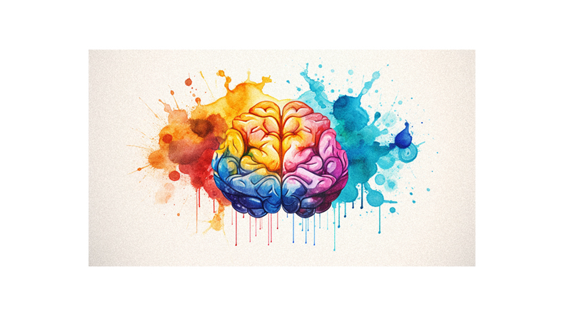
Imagine walking into a serene blue room and immediately feeling calm or seeing a vibrant red advertisement and suddenly craving that fast food burger. This isn’t magic, but the power of color psychology at play.
You’ve probably never realized how much colors influence your mood, decisions, and perceptions daily. That’s why understanding the basics of color psychology is so important. It can enhance your personal life by helping you create spaces that inspire certain feelings; it’s also essential for businesses looking to connect with customers on a deeper level.
Whether you’re an aspiring designer or just curious about how colors affect us, this guide is for you! We’ll delve into the fascinating world of color perception, cultural symbolism, branding implications, and more – all in an accessible way for beginners!
So let’s dive right in – prepare to have your mind colored!
What is it?
Did you know that color psychology, the study of how colors affect our emotions and behaviors, plays a crucial role in everything from branding to user experience design? Within mere seconds of viewing something, your brain makes subconscious judgments. 62% to 90% of these snap decisions are based on color alone!
It’s a fascinating field that combines art, science, and human perception. And it goes beyond just personal preference – cultural influences and context play huge roles, too. Whether picking brand colors or designing an app interface, understanding color psychology can elevate your work.
So, as a beginner diving into this area, remember every shade has different meanings and effects. Your choice of color could be more powerful than you think!
Importance of Color Psychology
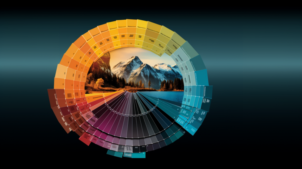
Understanding the impact of hues on human emotion and behavior is crucial, as it plays a significant role in decision-making processes, especially in areas such as marketing and branding.
Your chosen colors can evoke different emotions in your audience, influencing their perceptions about your brand. For instance, warm colors like red and orange stimulate excitement or urgency, while cool colors like blue and green convey tranquility and trust.
So, color psychology should be at the forefront of your mind when creating a logo or designing a website for your business. Not only will this help to strengthen your brand’s identity, but it’ll also enhance customer engagement by appealing directly to their emotions.
Knowing your target demographic’s color preferences can also improve communication effectiveness.
Color Perception
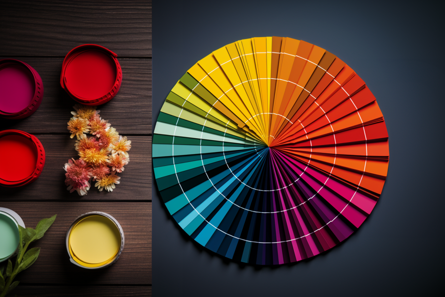
Perception of color is a fascinating topic, as it’s profoundly subjective and can be influenced by numerous factors such as personal experiences, cultural backgrounds, or even one’s mood.
Imagine you’re looking at a vibrant red apple. To you, red might signify energy and passion because of its association with fiery elements. But someone else could associate red with danger or warning signs based on their experiences.
Cultural impact on color perception can’t be overstated either. For instance, while white may represent purity in Western cultures, it symbolizes mourning in some Eastern societies.
So next time you pick colors for any design project, remember – there’s more to color than what meets the eye!
Influence of Color
You might not realize it, but colors play a significant role in influencing your decisions and behaviors. For instance, studies have shown that certain hues can increase your heart rate or even make you feel hungry – that’s why fast food chains often use red and yellow in their branding!
Imagine walking into a shop with calming blue walls versus one painted bright orange. Your feelings and reactions would likely be different for each setting. That’s color psychology at work!
It doesn’t stop there, though. Even your clothes can influence how others perceive you based on color alone.
So, next time you pick out an outfit or decorate a room, consider the impact of colors. You’ll be surprised by how much they can sway emotions and actions!
Color in Branding


In the world of branding, it’s crucial to choose appropriate colors that effectively convey your brand’s personality and values, as they can significantly impact consumer perceptions and interactions with your brand.
You’ve got to remember different colors evoke distinct emotions. For example, red symbolizes power and passion, whereas blue conveys trustworthiness. Your color choices should align with what you want people to feel when interacting with your brand.
But be mindful – cultural differences can alter how colors are perceived! So do some research, especially if you’re targeting a global audience.
Remember consistency is key in branding; use your chosen palette across all platforms for a unified look to boost recognition. After all, color psychology isn’t just about aesthetics – it’s strategic!
Personal Experiences and Culture
Let’s delve into how personal experiences and culture can shape our emotional responses to different hues! You see, personal experiences can significantly influence your perception of colors.
For example, if you’ve had a negative experience associated with yellow, you might not find it as cheerful or pleasant as others. On the other hand, culture plays a critical role in color interpretation.
What’s considered joyful in one culture may signify sadness in another. For instance, blue is seen as masculine in Western cultures but feminine in Chinese society. Similarly, while white symbolizes purity and innocence here, it signifies death and bad luck in China.
So, always remember that context is key when interpreting the psychological effects of color.
Brand Personality and Values
Have you ever considered what your brand’s colors say about its personality and values?
The colors you choose are a direct reflection of your brand’s identity. They communicate non-verbal messages that are crucial to how your audience perceives you.
For instance, red signifies power and passion; it may suggest that your brand is energetic and bold.
Blue, conversely, conveys trustworthiness and stability, making it suitable for brands that want to project reliability.
Green is often associated with balance and environmental consciousness – perfect for eco-friendly businesses or wellness brands.
Remember, color psychology isn’t a one-size-fits-all science. Understanding your target market’s preferences is essential when choosing colors to represent your brand’s personality and values accurately.
Listening to the Audience
Understanding your audience’s color preferences can truly make or break your brand’s success. It’s crucial to consider what colors resonate with them when choosing your brand colors.
You might prefer pink, but if you’re targeting a male audience, it may not be the best choice, given that studies show men tend to prefer blue.
Similarly, cultural differences need consideration; while white symbolizes purity in Western cultures, it can represent death in some Eastern ones. Therefore, conduct thorough research on your target demographic and their reactions to different colors before making any decisions.
Color psychology is not one-size-fits-all – it varies based on individual experiences and cultural backgrounds.
Consistency in Brand Colors
Imagine if Nike, known for its iconic swoosh in a bold black and white palette, suddenly switched to pastel colors. You’d likely be thrown off, right? That’s because consistency in brand colors is critical to building and maintaining brand recognition.
Just as you wouldn’t change your friend’s name halfway through a conversation, constantly changing your brand’s color scheme can confuse and alienate customers. So once you’ve chosen the best colors that resonate with your audience and align with your company values, stick with them across all platforms – from logos to websites to packaging – to ensure a unified brand identity.
This consistent use of color enhances memorability and strengthens your brand’s image in the consumer’s mind.
Meanings and Effects of Colors
After understanding the importance of consistency in brand colors, let’s dive into the fascinating world of color meanings and effects.
Each color sparks certain emotions and reactions within us. For instance, red often stirs feelings of power and energy. Meanwhile, green can bring balance and harmony, while blue evokes trust and stability. On the other hand, purple is linked with luxury and creativity; black resonates with mystery and tradition.
It’s crucial to remember that these associations aren’t universal – personal experiences, cultural backgrounds, and context all play a role in how we perceive colors. So, when choosing colors for your design or branding efforts, consider what you want to convey and how your audience might interpret those colors.
Color Psychology in UX Design
In UX design, color psychology can significantly amplify visual hierarchy and draw attention to specific elements. By understanding how colors influence emotions and behaviors, you can create a more compelling user experience.
For instance, warm colors like red or orange can stimulate users and evoke excitement or urgency. On the other hand, cool colors like blue or green tend to be calming and may improve focus.
Be mindful that too much color can overwhelm the user, so balance is key. Also, remember that different cultures may have varying interpretations of specific colors.
Ultimately, your color choices should align with your brand’s personality and resonate with your target audience for the best results in UX design.
Black in the Fashion Industry
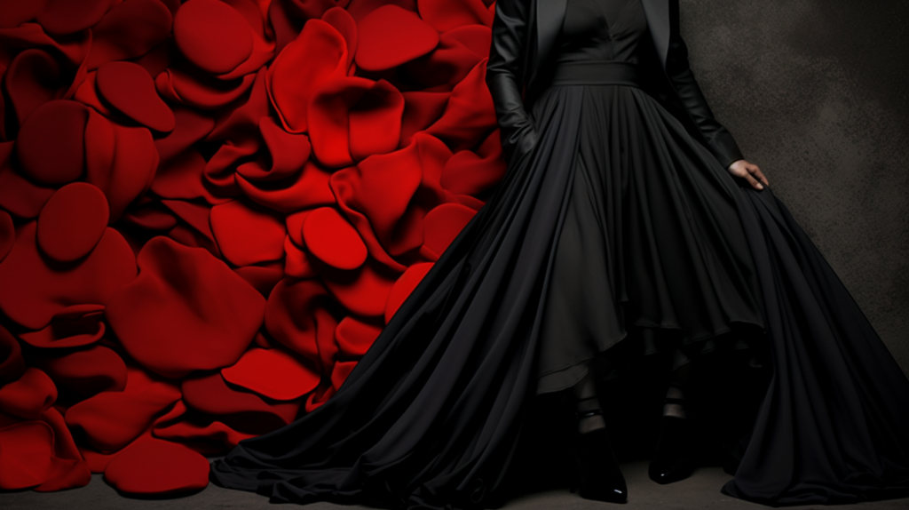
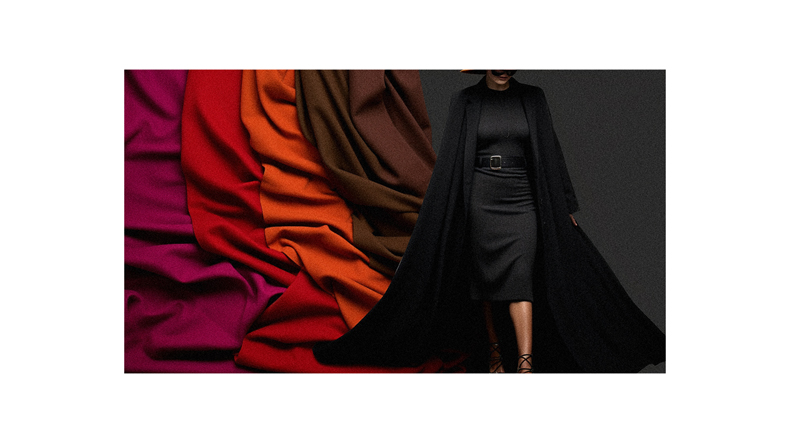
After diving into the fascinating implications of color psychology in UX design, you might wonder how these principles apply to other industries. Take a look at fashion, for instance.
Black plays a pivotal role here, and its psychological influence is tremendous. Wearing black often signifies elegance, luxury, and refinement – it’s no surprise that the classic little black dress never goes out of style. Furthermore, black exudes an aura of authority and power, making it a go-to choice for formal attire and business wear.
Yet, it’s worth remembering that this bold hue can also evoke negative feelings such as mourning or depression. As you explore color psychology further, consider these nuanced interpretations based on context and industry-specific usage.
White and its Associations


Think about the purity and clarity associated with white – it’s a color that traditionally signifies innocence. You’ve probably noticed its prevalence in weddings, where the bride wears white to represent purity and new beginnings.
But did you know that too much white can evoke emptiness or loneliness? This could be because it lacks color, making spaces seem stark or devoid of warmth and personality. It’s also often used in medical settings due to its association with cleanliness and sterility.
So, while white may carry positive connotations like safety and perfection, remember that context matters. Its various meanings can greatly influence how we perceive this seemingly simple color in different situations.
Grey in Design
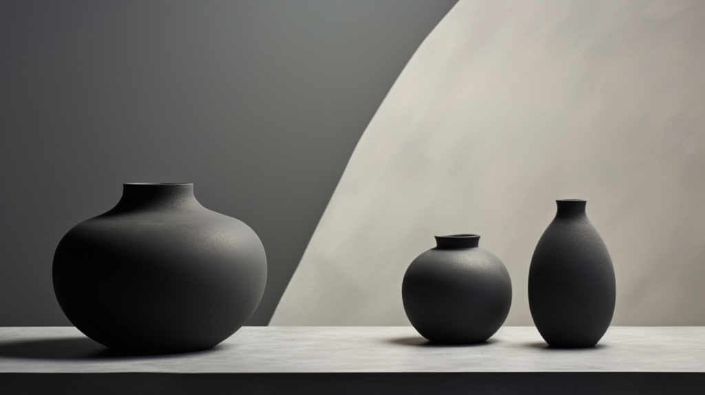
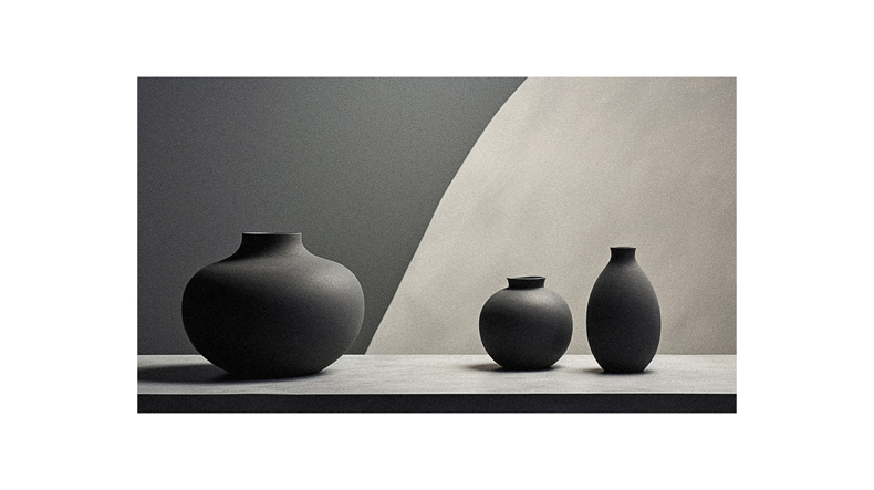
As you delve deeper into color psychology, you’ll come across grey – a hue often used in design to evoke sophistication and elegance. Grey can serve as a neutral backdrop that allows other colors to shine. It’s versatile, effectively conveying professionalism and modernity.
However, it’s not all positive with grey. Too much can lead to feelings of depression, lack of energy, or even create a sense of muddiness. Balance is key when working with this color.
So remember, while grey has its place in design for creating an elegant and sophisticated vibe, it’s crucial to use this color thoughtfully. You wouldn’t want your plans to seem dull or depressing due to overuse or misuse of this complex hue.
Brown and its Implications

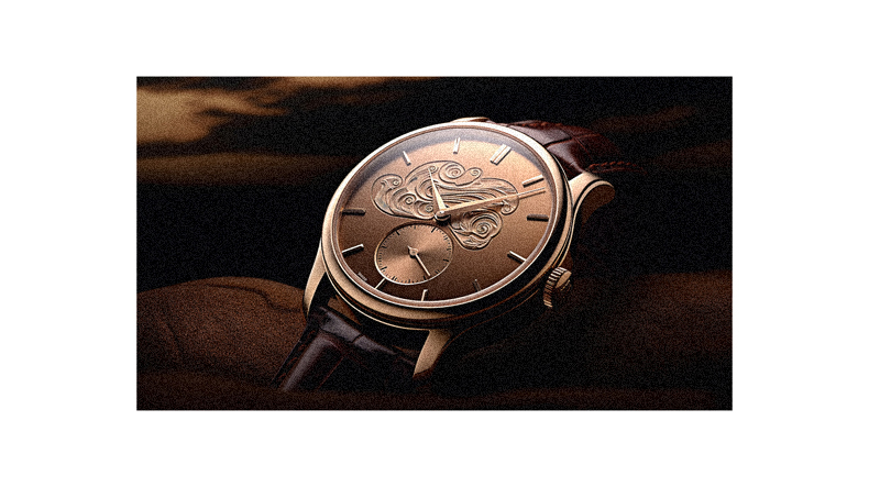
Moving on from the sophisticated and elegant implications of grey in design, let’s delve into the world of brown. Brown is a color often associated with feelings of security, protection, comfort, and stability. It evokes an earthy tone that can make a brand appear serious, reliable, and mature.
This is why you’ll often see it used by companies wanting to project an image of dependability or longevity. However, like other colors, overuse can be detrimental – too much brown might give off a dull or old-fashioned vibe. So, while incorporating brown into your design or branding strategy, remember to balance it with other colors that complement its nature.
Understanding these nuances will help you effectively leverage this color in your designs.
Yellow and its Emotions
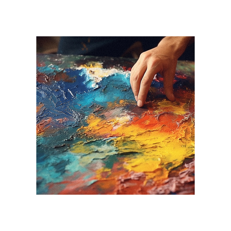
Imagine walking into a room bathed in the radiant glow of yellow; instantly, it brightens your mood and fills you with an infectious sense of joy and positivity.
Yellow, in color psychology, is closely tied to happiness and friendliness; it’s a color that stimulates mental activity and generates muscle energy. However, too much yellow may cause discomfort or even evoke feelings of fear.
Did you know that taxicabs are painted yellow because it’s an attention-getter? But be aware – overuse can lead to agitation; have you ever wondered why babies cry more in yellow rooms?
The symbolism varies: while yellow indicates honor and loyalty, it was later associated with cowardice. It’s all about balance when using this vibrant hue!
Orange and its Energy


Next up, let’s dive into the world of orange. This color is about energy and positivity, often associated with motivation, cheerfulness, and enthusiasm. It screams warmth and happiness like a vibrant sunset or juicy citrus fruit.
Orange is also linked to creativity – it stimulates your mind and encourages you to think outside the box.
In design and branding, using orange can give off a sense of fun and adventure. Think of brands that use orange in their logos; they usually want to appear friendly and approachable. But remember, don’t overdo it! Too much orange can feel overwhelming.
So, next time you’re looking for some optimism or a burst of creative energy in your designs or outfits, consider choosing shades of orange!
Pink and its Associations
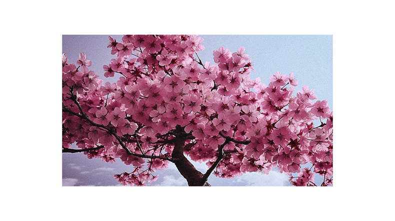
Let’s delve into the realm of pink, shall we? This color is strongly associated with romance, sincerity, and sensitivity. Research has shown that 76% of American women aged 16-24 associate pink with sophistication and femininity.
But there’s more to it than just its pretty face! Pink can evoke feelings of calmness and hope. It’s linked to innocence and optimism, too. However, be cautious, as overuse might give off a vibe of naivety or silliness.
Remember that color perception varies among individuals based on personal experiences and cultural backgrounds. So, while some view pink as youthful and romantic, others might perceive it as immature or overly sweet. Always consider your audience when using colors in design!
Demographics and Color Preferences
Did you know that your age, gender, and cultural background can significantly influence your color preferences?
For instance, blue is typically the most preferred color for men and women. However, brown tends to be less popular among men, while orange doesn’t appeal much to women.
Our tastes also change as we age – children prefer warm colors like red and yellow, while adults lean towards cooler tones like blue or green.
Culture plays a massive role, too! Western societies view blue as masculine, whereas Chinese culture sees it as feminine. These differences highlight the importance of considering demographics when applying color psychology in design or marketing strategies.
Always remember: understanding your audience’s color preferences can significantly enhance their experience with your brand.
Culture and Color Symbolism
Now that we’ve explored how individual factors like age and gender influence color preferences, it’s time to broaden our view.
Our cultural upbringing also profoundly impacts our color associations. Different cultures attach unique meanings and emotions to colors beyond personal or demographic influences.
For instance, while blue is often seen as masculine in Western culture, it’s considered feminine in Chinese society. Similarly, white symbolizes purity and innocence in the West but represents death and bad luck in China. Even within religions, colors hold different connotations – yellow signifies sanctity and commerce in Hinduism, whereas red, combined with black, indicates war and military in Latin America.
Understanding these cultural nuances is vital when applying color psychology globally.
Follow us on Pinterest for more tips, tutorials, and artist reviews!

