Pastel pink and white go perfectly together for a soft, feminine color palette. These colors are gentle and refreshing without being too bold or bright. So, they’re ideal if you want to avoid strong, intense colors.
Look through these pastel pink and white color palettes to see which one appeals most to you. I’ve included the hex codes for easy reference. So, you can grab the exact shades and use them in your digital art and design work. Or you can take inspiration for interior design and other creative projects.
Pastel Pink & White Color Palettes (With Hex Codes)
Here are loads of pink and white color palettes to browse. You can scroll through and find the right color palette for your needs. Each color palette has its own aesthetic and feel, so there’s something for everyone.
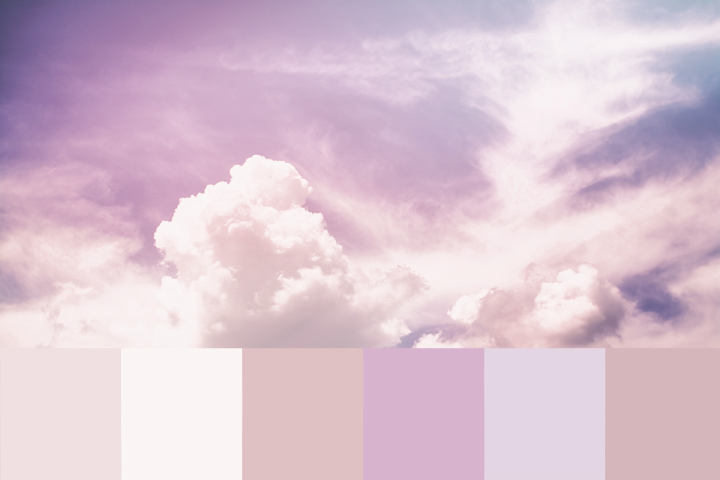
Pastel Pink & White Color Palette
Hex Codes:
#D2D2DC
#EEEAF2
#FAF2F8
#FAFAFA
#FFD0D4
If you’re looking for a pale color palette, this one is just what you need. It has pastel pinks, grays, and whites for a soft and gentle look. This neutral color palette is a popular option for interior design. It makes a perfect, soothing backdrop for any space.
Soft Pink Color Palette
Hex Codes:
#FFB0B0
#FFC3C3
#FFD8D8
#FFE1E1
#FFEAEA
This color palette contains soft, gentle shades of pastel pink. They range from warm candy pink to the faintest pink shades, close to white. It’s ideal if you want a color scheme using a range of pastel pink colors. You can use this color palette whenever you need a warm, feminine color scheme that’s neither bold nor bright.
Pastel Pink, White & Gray Color Palette
Hex Codes:
#81737C
#AAB2C0
#FFFFFF
#F8D5D7
This color palette is soft and minimalist – the perfect neutral backdrop. It combines a pastel pink with pure white and gray shades for a clean, pretty look. This color scheme ticks the box if you want to avoid bold, dark, or bright tones. It’s calm and soothing, making it a popular choice for anyone who prefers the minimalist style.
White to Pink to Red Color Palette
Hex Codes:
#FFFFFF
#FFCCCC
#FF8484
#FE4A49
#E53935
This color palette is interesting because it contains every shade from white to pink to red. And as pink is basically just a desaturated shade of red, these colors work well together. They go from more vibrant, getting softly paler through to white. So, you could mix all these shades using only red and white paint. You need to adjust the ratio to create the different shades.
Earthy Pastel Pink & White Color Palette
Hex Codes:
#D3998F
#F0CAC4
#FEECEC
#FFFFFF
#9B9B8E
Pink doesn’t have to be sweet and saccharine. Instead, you can take inspiration from the earthy tones found in nature. This color palette uses warm, earthy tones that are slightly muted. The pink shades have an orange undertone, while the olive green provides a nice contrast. Use this color scheme to channel natural vibes.
Pink, Purple & White Pastel Color Palette
Hex Codes:
#F677C0
#FBBEE0
#F6F7FC
#B7ACD8
This color palette is sweet and fun! It contrasts a brighter pink with a lighter pink. Throw in a pastel purple and white, and you have a winning color palette. It’s uplifting and whimsical, perfect for a young girl’s bedroom.
All The Shades of Pink
Hex Codes:
#FFFFFF
#FBBFD0
#F7AABC
#F39699
#F17287
If you’ve been looking for a color palette full of beautiful pink shades, this one is for you. It contains every shade of pink, from rich, bright pink to soft, pastel tones. So, it’s ideal for anyone who loves the color pink.
Pink, White & Teal Color Palette
Hex Codes:
#FE79B4
#FEB2CD
#F6DADA
#FCFBF7
#6E9EAE
You can use pink and white with contrasting colors for an eye-catching aesthetic. This color palette pairs pastel pinks with a rich teal shade. The warm pink and cool teal balance each other for a harmonious and unusual color palette. While these colors aren’t often used together, they look gorgeous together.
Berry Red to Pastel Pink
Hex Codes:
#D983A6
#FBFBFB
#D85577
#B4121D
The deep berry red contrasts with the lighter pink tones in this color palette. While the clean white brings some light and freshness to the color scheme. As a result, the colors balance each other for a perfect harmony.
Pastel Pink to Pastel Blue Color Palette
Hex Codes:
#EE9CB5
#E7B0CC
#EAC5E4
#EDDDF6
#E6F0FB
Blue and pink are opposite each other on the color wheel. That means they’re as different as can be – one is warm, and the other is cool. But it also means that blue and pink are complementary colors. And so, they look great when used together! I’ve taken soft pinks and blues and combined them in a gorgeous pastel color palette.
Dusty Pink Color Palette
Hex Codes:
#E06A82
#D4A1AD
#E3E3E2
#F7F7F5
#A6C8CF
This dusty pink color palette is atmospheric, a little romantic, and passionate! The rich pink tones contrast with the pastel gray, white, and fresh blue shades. It’s perfect for brightening any space, and these colors look gorgeous on canvas!
Spring Pink & Green Pastel Color Palette
Hex Codes:
#FE3B6D
#FF738E
#FFC5D1
#F6FFFA
#C3EDD7
This color palette is bursting with springtime energy and vivacity. Despite using pastel colors, it’s uplifting and full of life. You can use this anywhere you want to add a splash of color. The palest green shade replaces white in this color palette. While the bright pastel pinks contrast beautifully with the cool mint green tone.
Deep Purple to Pastel Pink & White Color Palette
Hex Codes:
#F9FAFC
#D3A1C4
#68485D
#341E2B
Light pinks stand out even more when used against darker shades. And that’s exactly what happens with this bold color palette. Deep purple shades contrast with the pastel pink color to create a vivid look. The pink shines through against the much darker purple tones, which are almost black. You could use this color scheme in artwork, design, or interiors for an impactful look.
White to Pink to Brown
Hex Codes:
#FFEEDB
#FFFFFF
#FFCAC7
#BA9E86
#8F745F
Pink is an excellent complement to the color brown, as it softens and brightens it. Both colors have warm tones that work well together. And as it’s a neutral color, brown looks great with muted pinks just as well as brighter shades.
FAQ: What Color Does Pink and White Make?
Are you wondering what will happen if you mix the colors pink and white? You might want to have a go at mixing paints for your artwork – but you’re not sure what you’ll make. Then, here’s the answer!
When you mix pink and white paint, you’ll end up while a paler shade of pink. The white paint will make your pink color more muted. The technical term is desaturation – it removes (or washes out) some of the color. So, you’ll end up with a lighter, pastel shade of pink. The exact result will depend on the pink color you started with and how much white paint you add.
The Wrap Up
As you can see, you can make so many different color palettes with pastel pinks and whites. You can create gorgeous looks with these colors, either alone or with other shades.
Pastel pinks range from muted to bright shades to create very distinctive looks. Adding white helps to balance the color palettes and allows the colors to stand out more. While pink contrasts nicely with blue, green, and teal for eye-catching color palettes.
Which of these pastel pink and white color palettes is your favorite? Let me know in the comments!
And follow Proactive Creative for more inspiration and tips!
If you’re looking for more pastel color palettes, check out this guide!
Follow Proactive Creative on Pinterest for more color & art tips and inspiration.