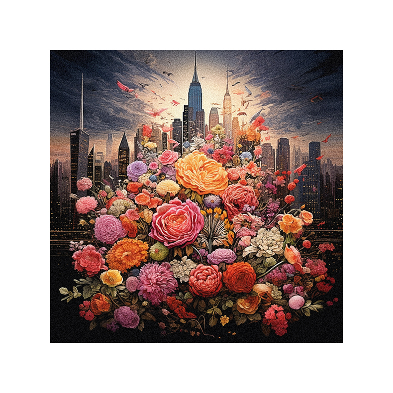
Imagine you’re a painter, and your brain is the canvas. The colors you choose can shape your masterpiece, affecting your mood, memory, and decisions. Dive into the world of color’s impact on your brain and uncover why certain hues might be survival essentials. You’ll even understand the sneaky strategies marketers use with color. Ready to discover the neuroscience of color? Let’s peel back the layers of this vibrant mystery together.
The Evolutionary Perspective: How Colors Influence Attention and Marketing
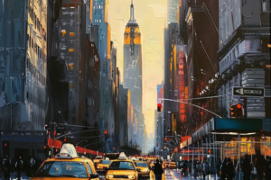
You’re exploring how the evolutionary perspective on color influences attention and shapes effective marketing strategies. Considering how our ancestors’ survival needs have shaped our modern responses to color is fascinating. Bright hues, once crucial for identifying ripe fruit or evil creatures, now command our attention in a storefront or website.
You’re beginning to see that color isn’t just an aesthetic choice—it’s a tool. It’s a way to tap into deeply ingrained instincts and perceptions. You’re learning that effective marketing isn’t just about what you’re selling but how you present it. You can evoke emotions, stir memories, or create associations through color. You’re realizing that mastering color in marketing is like learning a new language—the language of the human mind.
Unleashing the Power of Emotions: The Emotional Impact of Colors

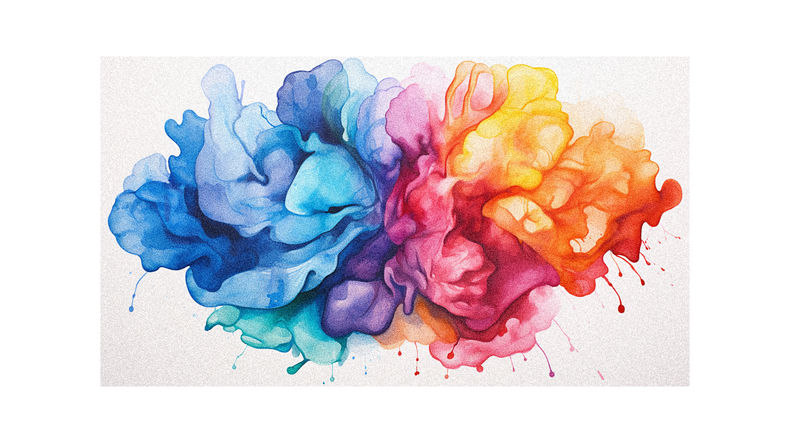
While understanding the evolutionary perspective of colors is crucial, diving into the emotional impact of colors is equally fascinating, as it allows you to manipulate emotions and responses effectively. You’ve seen it in action in movies where colors set the mood, in traffic signs demanding immediate attention, and in the way a brand’s color choice can stir emotions.
Your cultural upbringing emotionally impacts how you react to colors, making color perception subjective and exciting. Delving deeper into the psychology of colors, you can uncover how color tone influences the perception of temperature and even how the color of a pill can affect its perceived effectiveness. So, as you navigate life, remember it’s not just a world of colors; it’s a world of emotions, too.
Seeing Is Believing: Perception and Decision-Making in Color
Even though you might not be aware of it, the colors surrounding you greatly influence your perception and decision-making processes. You’re constantly interacting with colors, and they subtly steer your choices. For instance, marketers use colors to sway your purchasing decisions. A product’s color can make it stand out, creating a visual contrast that grabs your attention.
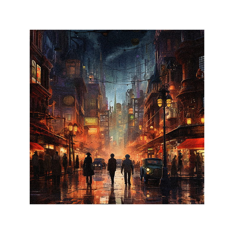
Likewise, the hue of a room can impact your mood, thus guiding your actions within that space. Bright colors might energize you, sparking creativity and productivity. On the other hand, cool tones might soothe you, promoting relaxation and introspection. So, whether shopping, working, or just chilling out, remember that colors silently shape your decisions.
The Science Behind the Hues: Physiological Effects of Colors

Let’s dive into the fascinating science behind how colors can stir up physiological changes in your body. It’s not just about aesthetics or personal preference; there’s a science behind it, too. Specific colors, like red, can raise your heart rate and adrenaline levels. This is why you’ll often see red used when quick reactions are needed.
On the other hand, cool colors like blue and green can have a calming effect, lowering your blood pressure and reducing respiration. It’s no coincidence that surgeons usually wear green or blue. Even the color of medication can impact its effectiveness, with warm colors associated with stimulating effects. So, next time you choose a color, remember it’s not just a visual decision but a physiological one.
The Placebo Effect: Color Perception and Its Influence

You’re now delving into the placebo effect, explicitly focusing on color perception and its influence, and it’s fascinating to note how the color of a pill can affect its perceived effectiveness. This is no coincidence; it’s a psychological phenomenon deeply rooted in our subconscious. Our brains associate warm colors like red and orange with action and stimulation, so we perceive pills in these hues as stronger.
On the other hand, cool colors like blue and green are associated with calmness and tranquility. Thus, pills in these colors are seen as soothing or less potent. This placebo effect can be so powerful it can influence the effectiveness of a medication. So, don’t be surprised if you feel more energized after taking a red pill or calmer after a blue one. It’s all part of the fascinating interplay between color perception and the placebo effect.
The Impact of Colors on Brain Functioning
It’s intriguing how exposure to different colors can dramatically alter your cognitive performance and emotional state in brain functioning. You might not realize it, but colors profoundly influence your mood, energy level, and sleep pattern.
For instance, colors like yellow, orange, pink, and red can boost your energy and motivation, but too much can be irritating. On the other hand, cool colors like green, blue, and violet can help you unwind and relax. Have you ever noticed how white, often used in public spaces, can increase stress and decrease concentration? That’s the power of color.
So, next time you pick out an outfit or decorate a room, remember this: choosing your colors wisely can create a positive and stimulating environment.
The Importance of Color in Stimulating the Brain

Despite what you might think, the colors you’re surrounded by play a vital role in stimulating your brain and impacting your overall mood and energy levels. Colors aren’t just pretty to look at; they can influence your energy, concentration, and even your emotions. For instance, warm colors like yellow and orange can motivate and boost energy levels.
However, they might become irritating rather than invigorating if they’re too intense. On the other hand, cool colors like blue and green have a calming effect, reducing stress and fostering relaxation. Be mindful of the colors you choose for your surroundings. Strategically using colors in your home or workspace can help create a positive and stimulating environment that enhances your well-being and performance.
Follow us on Pinterest for more tips, tutorials, and artist reviews!