Have you been wondering about the warm colors on the color wheel? Then, you’re in the right place. We’ll take a close look at the warm colors and what they mean.
As an artist, you’ve probably looked at a color wheel at some point. And you may be familiar with the terms ‘warm colors’ and ‘cold colors.’
But like me, you might not have known exactly what makes a color warm or cold. In that case, you wouldn’t be alone.
This classification is an easy way to define colors. But what are the warm colors on the color wheel?
The short answer is that red, yellow, and orange are warm colors. And so is every other shade on that side of the color wheel – including peach, maroon, umber, and pink.
Understanding more about warm and cool colors made me feel more confident as an artist. And there’s a lot more we can learn about the warm colors. So, let’s dive in deeper and look closer at the warm colors on the color wheel.
What are warm and cool colors?
Warm vs. cool refers to the temperature of the colors and where they sit on the light spectrum.
This distinction is nothing new. Artists have known the differences between warm and cool colors for centuries. And they’ve used them accordingly in their artwork.
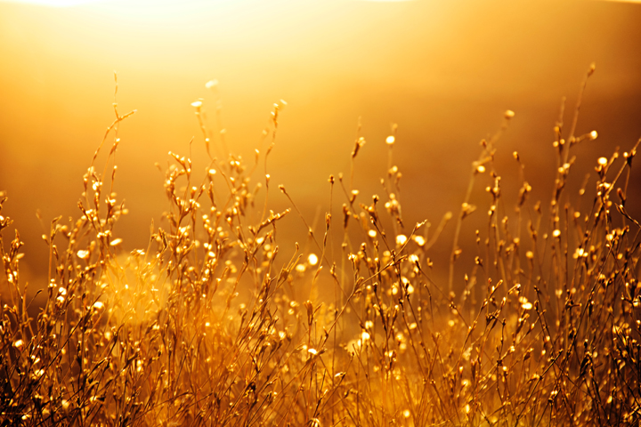
Some colors simply feel warmer than others. These are the colors we associate with sunlight and fire – such as red, orange, and yellow.
So, you can take a good guess at which colors fall into each category. Sometimes, I’ve known instinctively whether a color is warm or cool. But I couldn’t explain why until I looked deeper into the color theory of warm and cold colors.
Warm colors often look brighter and more vibrant. Compared to warm shades, cooler colors often look more muted and less saturated.
If you struggle with this, don’t worry! Keep reading, and you’ll soon be an expert on warm vs. cool colors.
The Origins of the Color Wheel and Warm vs. Cool Colors
Sir Isaac Newton created the color wheel in the 17th century. This discovery was the first time the colors had been displayed in this way. Before this time, people had many misleading and inaccurate views on color.
So, this visual representation revolutionized how people thought about color. By seeing the colors displayed in this way, color temperature became a much clearer concept.
So, people started dividing colors according to where they fell on the color wheel. As a result, the definition of warm vs. cold colors became well-known and widely used.
These definitions have been around for over 300 years. But we still divide colors into warm vs. cool nowadays. It’s a simple and effective way to understand and use colors in art, fashion, or interior design.
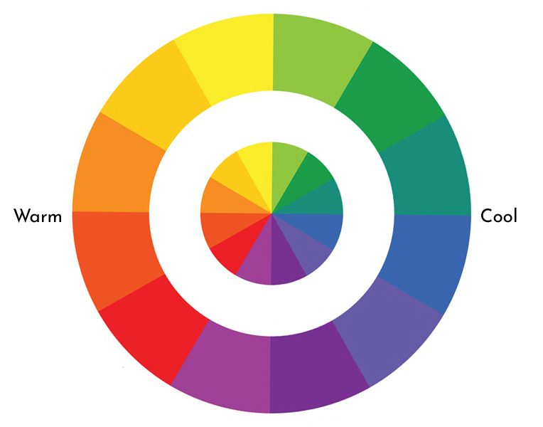
What are the warm colors on the color wheel?
If you look at a color wheel, you’ll see a clear distinction between warm and cool colors.
The warm colors are grouped on one side of the color wheel, from yellow to red-violet. These colors are bold, bright, and eye-catching.
And on the other side of the color wheel, you’ll see the cool colors. These range from green through to purple. These shades are often associated with water and are calming and tranquil.
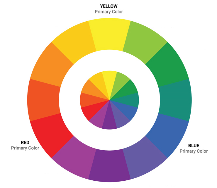
Primary, secondary, and tertiary colors all fall into one category or the other – warm or cool. So, the primary color red is a warm color, as is the tertiary color yellow-orange. We also call the colors grouped near each other on the color wheel analogous colors.
But interestingly, each color is also on a spectrum. So, you can get warmer shades of red vs. cooler shades (with a higher blue undertone). But every red is still classed as a warm color.
When a color has a heavier undertone, we also call this a color bias. So, for example, yellow can have a red or blue bias.
Understandably, that can get a little confusing. So, let’s take a closer look at each of the warm colors on the color wheel.
Color Psychology – The Effect of Warm Colors
Colors affect how we feel – we call this color psychology. A specific color can influence your emotions or create a particular mood. And so, colors are very powerful, especially in art.
Depending on the color you use, you can make people feel passionate, stressed, sad, or angry. Or you could create a calming, relaxed atmosphere.
So, every artist needs to understand how to use colors effectively.
For example, warm colors bring to mind fire, heat, the sun, and sunsets. They can also make you think of love, passion, and energy.
In contrast, cold colors often make us think of the sea and the sky. They are calmer and more tranquil – but not as inviting and welcoming.
Let’s take a closer look at each of the warm colors.
Red

Hex code: #FF0000
Red is one of the most vibrant, richest colors on the color wheel. It’s also often considered the warmest color. You can use the color red to portray passion and love, but also anger or danger. This color has a dark side, as it’s associated with power, blood, and violence. But in softer tones, it can be a warm, welcoming color.
Orange

Hex code: #FFA500
Orange isn’t as bold as red – but it’s still a gorgeous warm shade. The color orange has a lot of freshness and energy. It’s the color of fire, but also bright flowers and citrus fruits. It conveys warmth but also fun and playfulness. But you can also use the color orange as a warning signal to catch someone’s attention.
Yellow

Hex code: #FFFF00
Yellow is generally considered a happy, joyful color. We associate the color yellow with the sun – it’s bright and bold.
Maroon

Hex code: #800000
Maroon is a dark red – what you get if you mix red and black paint. This color is on the warm end of the spectrum, but it’s a little moodier and darker. But it can also feel safe and comforting, depending on how you use it.
Peach

Hex code: #800000
Peach is a fresh, bright color on the warm side of the color wheel. You can make peach by mixing orange and pink. It’s one of the softer colors that symbolizes vitality and femininity.
Gold

Hex code: #FFD700
Technically, gold is a neutral color, so it’s not always considered a warm color. But as it’s so close to yellow, it deserves mention on this list. We associate the color gold with riches, luxury, power, and pomp. Adding a little gold to your painting can have a big impact!
Using Warm Colors in Your Artwork
Understanding color temperature will help you become more confident as an artist.
It will also make it easier to mix colors and get the results you want. You’ll find it easier to pick the best shades to use together. For example, which shades of red and yellow will make a bright, vivid orange vs. a muted, dark orange.
The more you paint, mix colors, and learn about color theory, the more you’ll understand. And soon, it will all come naturally to you. You may also find a color mixing chart helpful as you experiment with different colors.
You’ll quickly be able to identify whether a color is a cool or warm color. You’ll also know what bias it has and where it falls on the spectrum. So, you can tell if a shade of yellow is warmer or cooler.
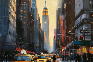
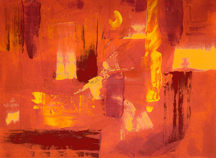
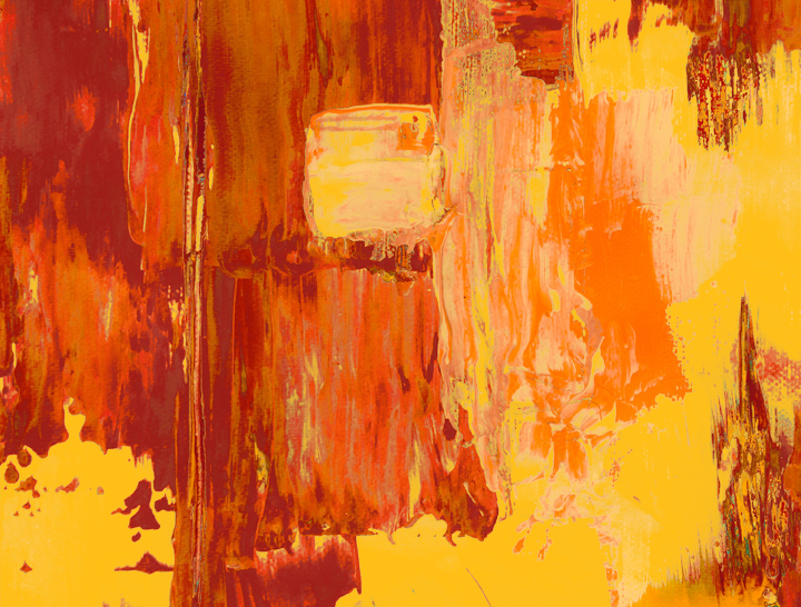
Warm colors are essential for artists. I’ve used them often in nature paintings to depict sunsets, fire, flowers, and more. But you’ll find them just as powerful in abstract art to create a mood. You can also use them to add a pop of color and grab the attention.
By understanding color psychology, you can choose the best color for your painting.
Keep in mind what kind of feelings you want to provoke in people with your art. Consider what reaction you want people to have when they see your work. In doing so, you’ll unleash the power of colors!
The Wrap Up
Now, you’re an expert on the warm colors on the color wheel. You know which colors are warm vs. cold and how to use them in your artwork.
Let me know in the comments section if you have any questions about warm colors.
And follow Proactive Creative on Pinterest for more creative content and tips about color theory.